
Spring mantels run from a single branch in a ceramic vase to a full garden display of terracotta pots and seed packet bunting, and the deciding factor is how much editing you’re willing to do after you set it up. The hard part is knowing when to stop; a bare mantel reads as a room mid-move, but one extra bowl can break the quiet you were after. I learned that the hard way last year, adding and removing pieces a dozen times before the arrangement finally held.
1. Rustic Spring Mantel

A few years back I stacked every rough texture I owned onto one mantel and the whole thing looked like a woodpile had collapsed indoors. The branches, the reclaimed barn board, the woven basket, the driftwood candle holder, all fighting for attention at once. One dominant rough piece per mantel keeps the look intentional; everything else should read as softer support.
Reclaimed wood works best when you actually know where it came from. A weathered board from a friend’s barn demolition, a driftwood candle holder pulled from lake-shore debris, a large branch from last weekend’s yard cleanup. These carry the story that makes rustic feel personal rather than purchased. The wood tree cutouts and spring branches layer in easily around a single anchor piece.
Greenery keeps the palette from going muddy. Fresh ferns, mossy details, or even high-quality faux stems tucked around the wood base stop the display from reading as all brown and beige. Small votive candles layered near the greenery warm the whole thing up for evenings when spring still carries a chill.
If you’re hunting on a weekend timeline, skip the antique malls. Drive a back road after a windstorm, check Facebook Marketplace for barn teardown listings, or walk the shoreline with a bag. The sourcing is half the project, and the piece you found yourself outranks anything shipped to your door.
2. Floral Spring Mantel
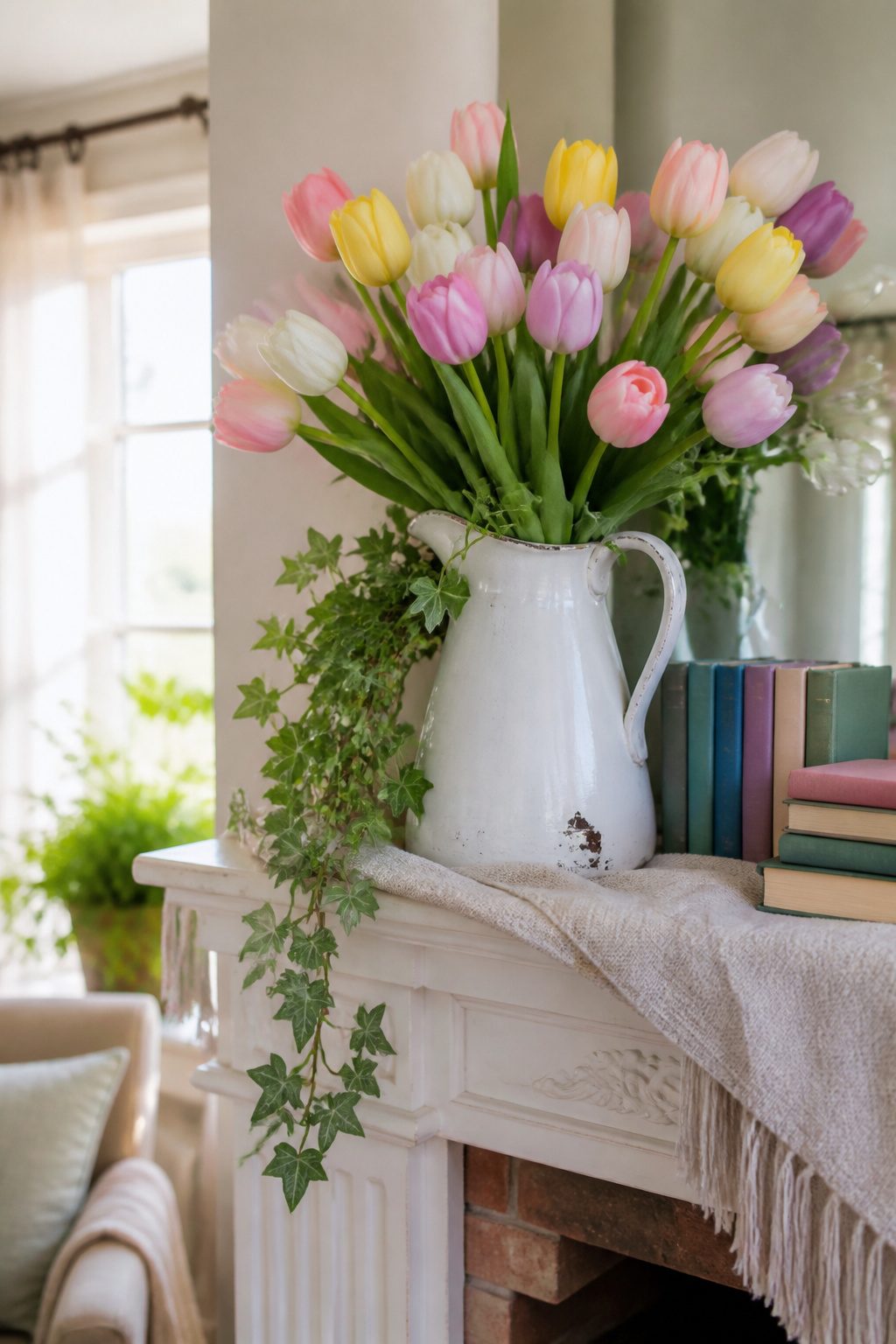
Tulips from the grocery store usually run $12 to $40 for a bundle, and they do bring that immediate spring hit of color. The catch is timing. Buy them Friday and they can wilt by Sunday, leaving you with a drooping mantel by the time guests arrive. Water changes help, but grocery tulips are already days into their short life.
Quality faux stems cost more upfront, yet they last years and carry the same soft pastels and floral hues through the season without the collapse. A vintage white pitcher or a simple glass vase works for either, and the mix of heights and textures matters more than whether the green is real. Trailing ivy, if you have a plant that survived winter, adds the layered depth that makes the display feel grown, not placed.
For a renter or someone mid-project, the math tilts toward faux if you refresh the mantel more than once a season. Fresh wins for a single weekend when you want the room to feel alive and unplanned. Either way, keep the palette to spring greens and soft pastels, and let one piece, pitcher or bloom, do most of the talking.
3. Easter-Themed Mantel
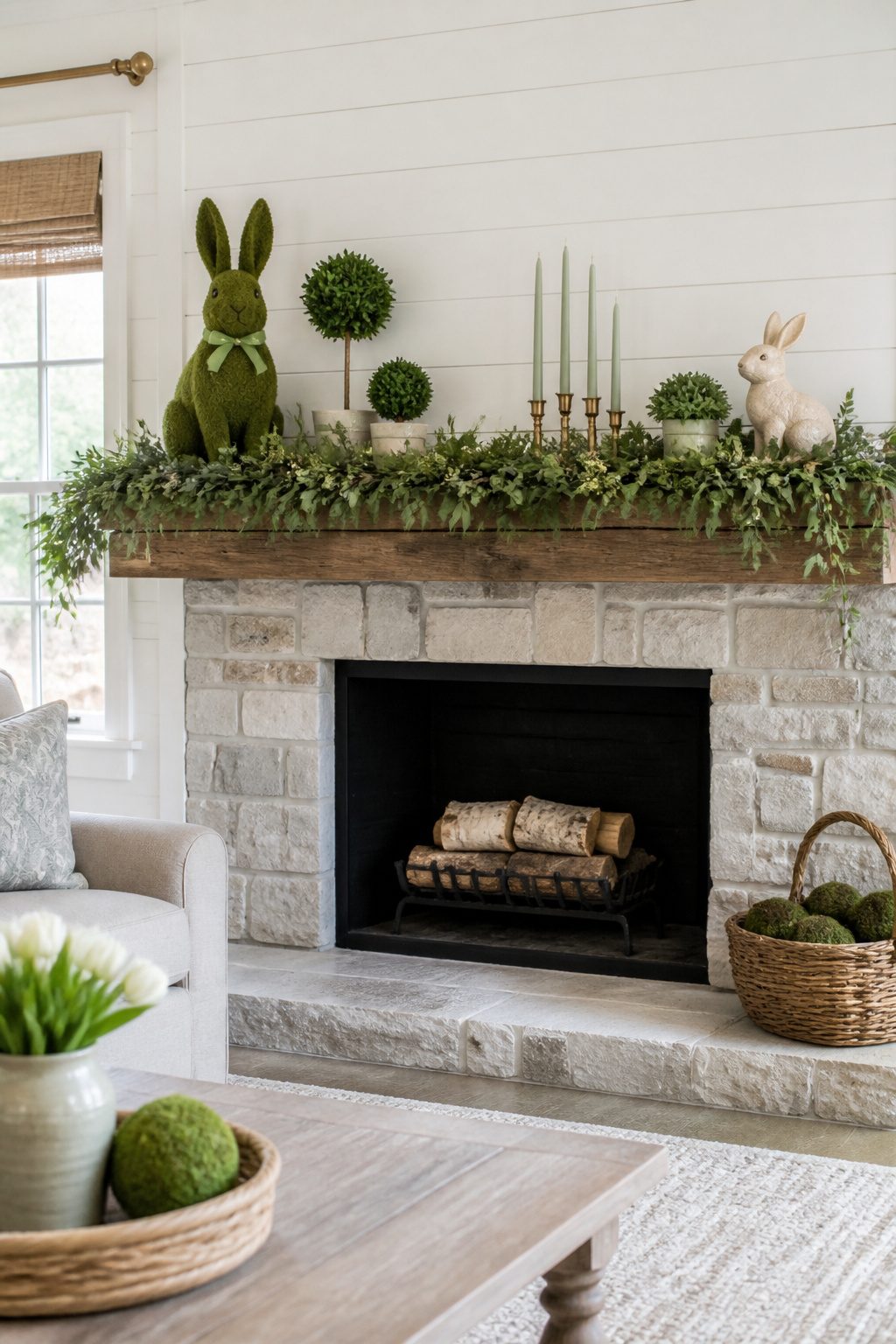
Ceramic bunnies at Target run $8–$15, and thrift stores usually land in the same range if you spot one with the glaze intact. That price makes them tempting, but the mistake is clustering too many on one surface, which pushes the mantel straight into children’s-party territory instead of seasonal decor. One bunny, maybe two at opposite ends, reads as a wink toward Easter. Three or more, and the eye starts hunting for jelly beans.
A single oversized piece changes the equation. One large moss bunny, even a handmade one, balances against a big paper flower bouquet or a preserved boxwood topiary without needing reinforcements. The scale does the work so the quantity stays low.
Greenery helps the transition from cute to collected. A dough bowl with moss spheres, a few clay pots, or a woven basket tucked behind the arrangement grounds the pastel palette. Battery-operated LED lamps rather than bright overhead light keep the display from feeling like a store window. The goal is a mantel that happens to be ready for Easter, not a mantel shouting about it.
4. Minimalist Spring Mantel
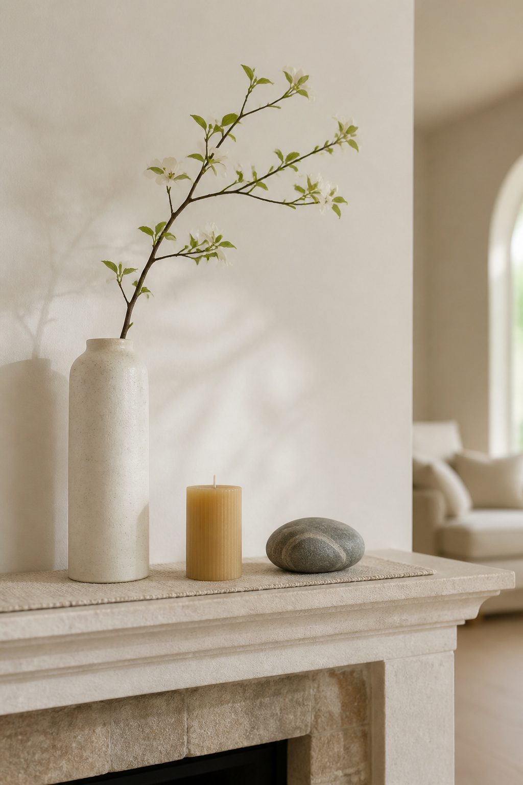
A single branch in a tall ceramic vase, one beeswax pillar, and a smooth stone you picked up somewhere: that is the whole arrangement. The hard part is knowing when to stop. I have walked past my own mantel a dozen times, added a book, then a small bowl, then removed both because the extra weight broke the quiet I was after.
The line between calm and abandoned is thinner than you think. A bare mantel reads as a room mid-move, not a choice. The single branch only works if the vase has heft, if the candle is wide enough to cast real light, if the stone is oddly shaped enough to invite a second look. Each piece has to earn its place by being slightly too interesting to ignore.
I keep a three-foot rule. Stand that far back and squint. If the mantel disappears into the wall, the scale is wrong or the contrast is too low. A pale branch against pale paint needs the warm candle between them, or the eye slides right past the whole thing. One weekend, one trip to a florist or a backyard trim, and maybe thirty dollars if you do not already own the vase. The time is spent in editing, not in building.
5. Colorful Spring Mantel
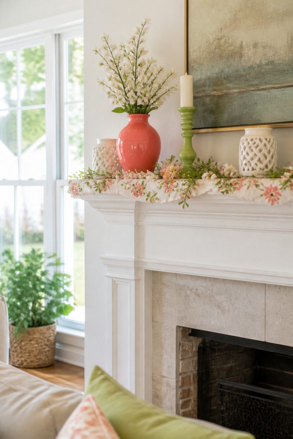
Spring color works best when you pick two or three hues and let everything else stay quiet. I learned that the hard way last year after setting out a lime green vase, a cobalt candlestick, a coral runner, and a yellow bowl of faux lemons all at once. The mantel looked like a garden center exploded. The palette that actually holds together draws from the same family: vibrant greens against soft pastels, or floral hues anchored by one deeper tone.
Books with colorful spines are the cheapest way to test a combination. I stack three or four, turn a few so the pages face out if the spine clashes, and treat them like a color block at one end of the mantel. A lightweight scarf or fabric runner in a floral print can carry the second color across the length, but stop at two colors plus a neutral. White candlesticks or a natural woven mat give the eye somewhere to rest. Fresh flowers or high-quality faux stems in a single bright shade finish it without competing. The mistake is treating spring as permission to use every bright thing you own. Choose your palette like you’d choose paint: two colors that talk to each other, not five shouting over the mantel.
6. Vintage Spring Mantel
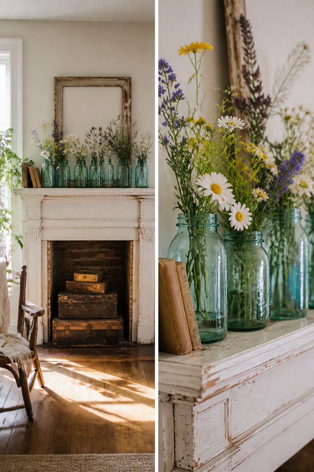
Vintage pieces carry a weight that reproductions rarely match. The scuffs on an old frame or the faded spine of a thrifted book hold years a factory finish only imitates. Spring light, still thin in early March, catches those honest marks differently than it catches something made to look worn last Tuesday.
The real trap is paying more for the imitation. A reproduction "vintage" frame at a big-box store can run double what an actual thrifted frame costs, and the thrifted one brings genuine age with it. Buy the real scuffs; they cost less and mean more.
Old books stacked backward or forward add height without clutter, and their worn covers soften a mantel’s line the way new spines never do. Vintage blue ball jars, each shade of aqua slightly different from the last, read as a collection rather than a matched set because they were never meant to match. A row of them in varied heights holds its own against a stone fireplace without fighting it.
The mistake is treating vintage as a style to purchase instead of a habit to build. One genuine piece, found and kept, outlasts three bought reproductions. The money saved on the first buys patience for the second.
7. Garden-Inspired Mantel
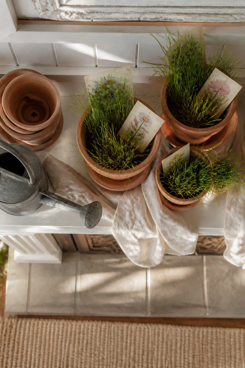
Terracotta pots run $2–$4 at most hardware stores, and three or four of them stacked at staggered heights do more than a single large planter ever could. I fill the top one with faux grass, tuck in a few seed packets facing outward so the artwork shows, and call it done. Greenery clipped from the yard or a cheap grocery-store bunch fills the gaps without looking too arranged.
The soil mistake is real. Last spring I tried using actual potting mix for authenticity. Dust tracked across the mantel for a week, and watering meant carrying the whole display to the sink. Faux grass or moss sits still, weighs almost nothing, and never needs that trip.
Vintage-style seed packet bunting strung across the top adds height without clutter. A small watering can or olive bucket at one end anchors the arrangement, especially if the mantel runs long. The garden tools work best when they look used: a little rust on a trowel reads as found, not failed.
8. Textured Spring Mantel
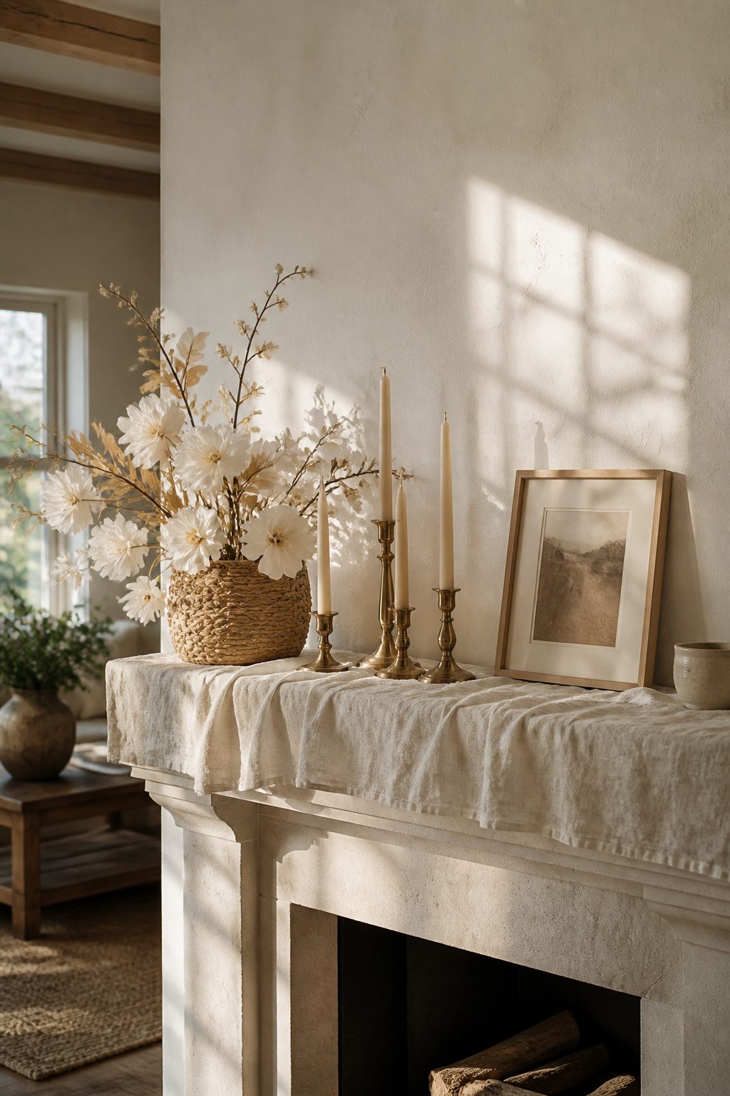
A linen runner laid the base for my spring mantel last year, and the difference between flat and layered became obvious fast. The weave caught afternoon light in a way painted wood never does, but it needed something harder against it. Brass candlesticks, thrifted and varied in height, gave that contrast without fighting for attention. Woven baskets came in third, tucked at one end to hold a paper flower bouquet. Three textures, one palette of warm whites and muted golds, and the mantel finally looked intentional rather than collected.
The mistake is adding a fourth or fifth texture before the color story locks in. Ceramic, metal, linen, and weave already speak different languages; without a unifying tone, the eye reads chaos. I tried it once with a speckled pottery vase against the brass, and nothing sat right until I swapped in a cream ceramic piece that picked up the linen’s undertone. Two ways to play this: start with your neutral fabric and let everything else echo it, or commit to a single metal finish and let the softer textures vary within that warmth. The fabric-first approach wins if your mantel changes seasonally, since runners and scarves store flat and cost less than replacing brass.
Layering Heights and Depths
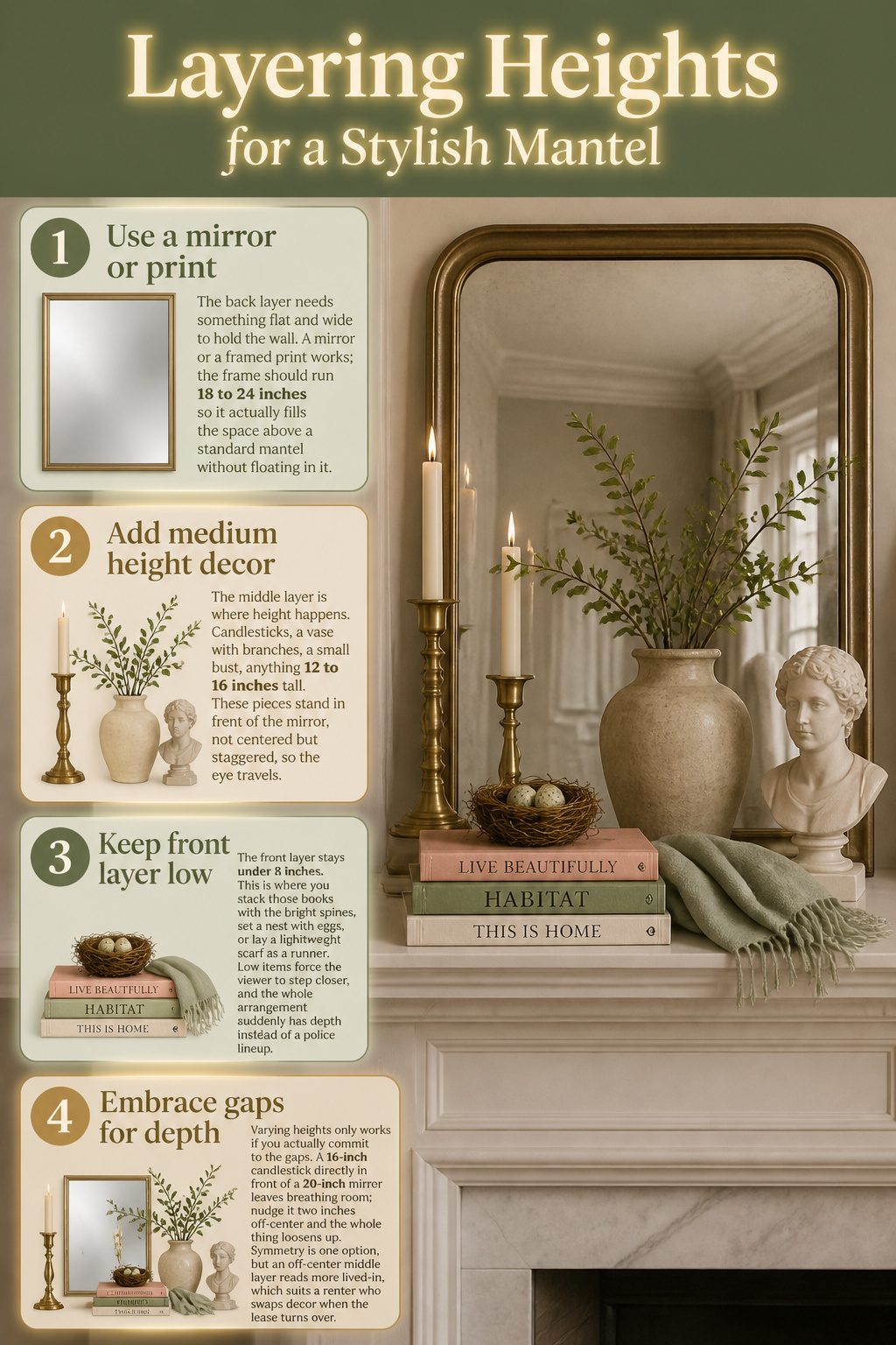
- The back layer needs something flat and wide to hold the wall. A mirror or a framed print works; the frame should run 18 to 24 inches so it actually fills the space above a standard mantel without floating in it.
- The middle layer is where height happens. Candlesticks, a vase with branches, a small bust, anything 12 to 16 inches tall. These pieces stand in front of the mirror, not centered but staggered, so the eye travels.
- The front layer stays under 8 inches. This is where you stack those books with the bright spines, set a nest with eggs, or lay a lightweight scarf as a runner. Low items force the viewer to step closer, and the whole arrangement suddenly has depth instead of a police lineup.
- Varying heights only works if you actually commit to the gaps. A 16-inch candlestick directly in front of a 20-inch mirror leaves breathing room; nudge it two inches off-center and the whole thing loosens up. Symmetry is one option, but an off-center middle layer reads more lived-in, which suits a renter who swaps decor when the lease turns over.
Color Schemes That Read as Spring
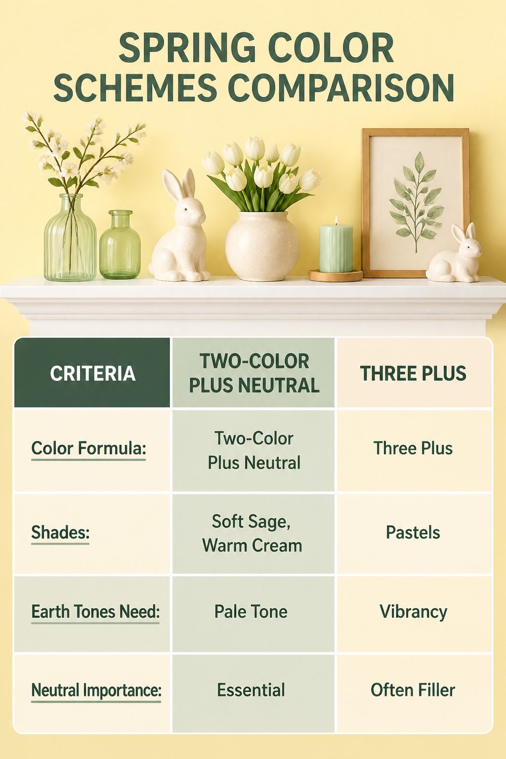
Spring color on a mantel falls apart fast without a rule to hold it. The two-color-plus-neutral formula keeps the palette from drifting into what I call the Easter egg effect: every pastel in the bin at once, competing for attention. Two deliberate colors, say a soft sage and a warm cream, anchored by white or raw wood, read as intentional. Three or more colors without that neutral brake start to look like the seasonal aisle at a craft store.
I learned this the hard way on a mantel two years ago. Lilac, butter yellow, mint, and coral all made it onto the shelf because each piece was pretty on its own. Together they canceled each other out; the eye had nowhere to rest. The fix was pulling everything off, keeping only the green glass bottles and the cream ceramic bunnies, and letting the white mantel itself do the rest. Earth tones work the same way: terracotta and olive need that third pale tone, maybe linen or weathered wood, or they go muddy. Vibrant palettes, like a clear turquoise with lemon, need it even more.
The neutral is not filler. It is the pause between notes. Without it, even two colors start to vibrate against each other. With it, you can use almost any spring shade and still feel calm.
DIY and Thrift Budget
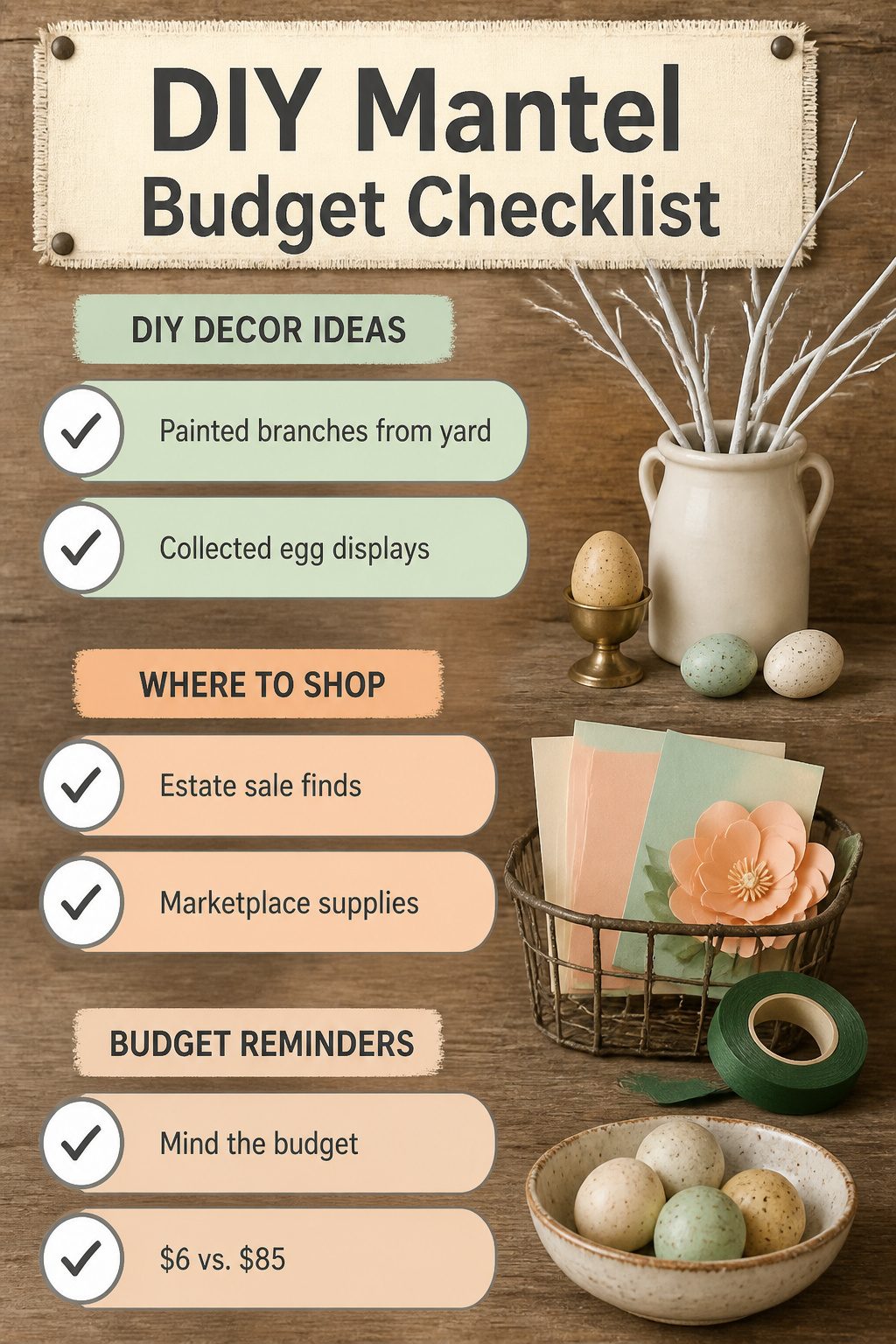
Painted branches are the cheapest way to fill a wide mantel without looking sparse. I cut a few from the yard last March, sprayed them with leftover white paint from a dresser project, and stuck them in a $4 estate-sale crock. The whole thing cost maybe $6 and stayed up six weeks. Estate sales on Saturday mornings are where you find those crocks and odd vases for almost nothing; by Sunday afternoon the good stuff is gone.
Facebook Marketplace on Sunday evenings is better for paper flower supplies. Someone’s always offloading bulk cardstock or a Cricut they used twice. I bought a bag of pre-cut paper petals for $8, wired them onto real branches with floral tape from the dollar store, and had enough left over for a jar on the entry table.
Collected egg displays are where I blew the budget. I started saving blown eggs from breakfast, which is free, but then I "needed" a brass egg holder I saw at a thrift shop. It was $12. Then another. Then a ceramic one that matched nothing. The egg display that should have cost $0 ran me $85 because I kept finding "perfect" holders instead of using a bowl I already owned. The painted branches at $6 looked better in photos anyway.
Personal Touches That Make It Yours
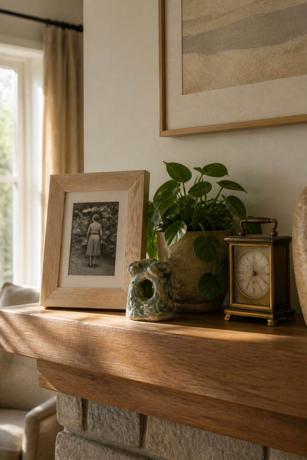
A mantel covered only in store-bought seasonal decor reads like a stage set. The pieces that make someone pause are the ones that carry weight: the chipped ceramic hand your kid made in third grade, the brass clock that sat on your father’s desk, the photograph you finally pulled out of a shoebox.
One personal object, scaled to the mantel’s width, anchors the whole arrangement. My grandmother’s portrait sat in a drawer for two years because every frame I tried looked too formal, too gilt, too aggressively "vintage." The one that worked was a plain maple frame from a craft store, stained darker with a $4 kit. It does not match the other wood tones exactly, and that mismatch is what keeps the mantel from looking assembled by algorithm.
The risk is sentimentality crowding out intention. A mantel is not a shrine; it is a shelf at eye level. Three objects with stories beats seven objects that fight for attention. Place the photograph off-center, let it lean rather than stand rigid, and surround it with breathing room. The eye needs somewhere to rest before it recognizes what matters.
Scent as a Layer
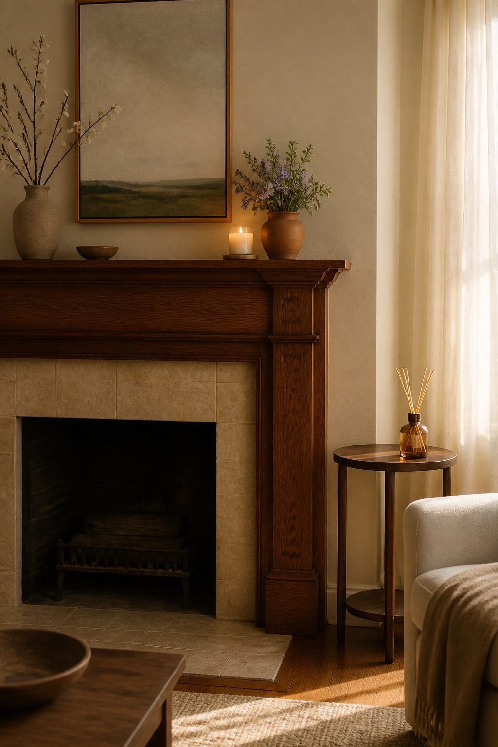
A $6 soy candle from the grocery store ended up outperforming the $22 one I tried from a specialty shop, which hit the room like lemon-scented floor cleaner. The cheaper candle used a softer wax blend and a smaller wick, so it threw just enough green-tea-and-violet to read as spring without announcing itself to the neighbors.
Placement matters more than price. Keep lit candles at least six inches from the mantel edge, and set a heat-resistant coaster or small tile underneath; paraffin in particular can soften finishes or leave a ring where the wax pooled. I skip diffusers on the mantel itself and tuck them on a side table instead, since oil residue drifts downward and can cloud painted surfaces over a season. Battery-operated LED candles solve the heat problem entirely, and the small ones with a warm-toned bulb look close enough to real flame in daylight that I have stopped explaining the switch to guests.
Frequently Asked Questions
What are some easy spring mantel decor ideas?
Start with one dominant rough piece like reclaimed wood or a large branch, then soften around it with greenery and small votives. For a simpler route, a single branch in a tall ceramic vase, one beeswax pillar, and a smooth stone is enough; the hard part is stopping before you overfill. Either approach takes about one weekend and costs under $30 if you already own the container.
How can I make my mantel look spring-like?
Stick to spring greens and soft pastels, and let one piece do most of the talking. Fresh ferns or high-quality faux stems tucked around a base stop the display from reading as all brown and beige. Keep the palette to two colors plus a neutral so it feels intentional, not like every pastel in the bin at once.
What are some budget-friendly spring mantel ideas?
Painted branches from the yard, sprayed with leftover paint and stuck in a $4 estate-sale crock, cost about $6 total and last six weeks. Estate sales on Saturday mornings yield cheap crocks and odd vases; Facebook Marketplace on Sunday evenings turns up bulk paper flower supplies. The article’s author spent $85 on collected egg displays by buying "perfect" holders, but the $6 painted branches photographed better.
How do I decorate my mantel for Easter?
Use one ceramic bunny, maybe two at opposite ends; three or more pushes the mantel into children’s-party territory. A single oversized piece like a large moss bunny balances against a big paper flower bouquet without needing reinforcements. Ground the pastel palette with a dough bowl of moss spheres or clay pots, and use battery-operated LED lamps rather than bright overhead light.