
Coastal decorating ideas range from a $30 curtain-rod fix to full-room palettes, and the deciding factor is usually whether you rent or own. The same seagrass rug that anchors a bedroom will shed fibers for a month if you skip the rug pad. That $89 IKEA weave, the one that reads like dried sand, only works if you accept the shedding phase as the price of texture.
1. Longer Curtain Rods for More Light
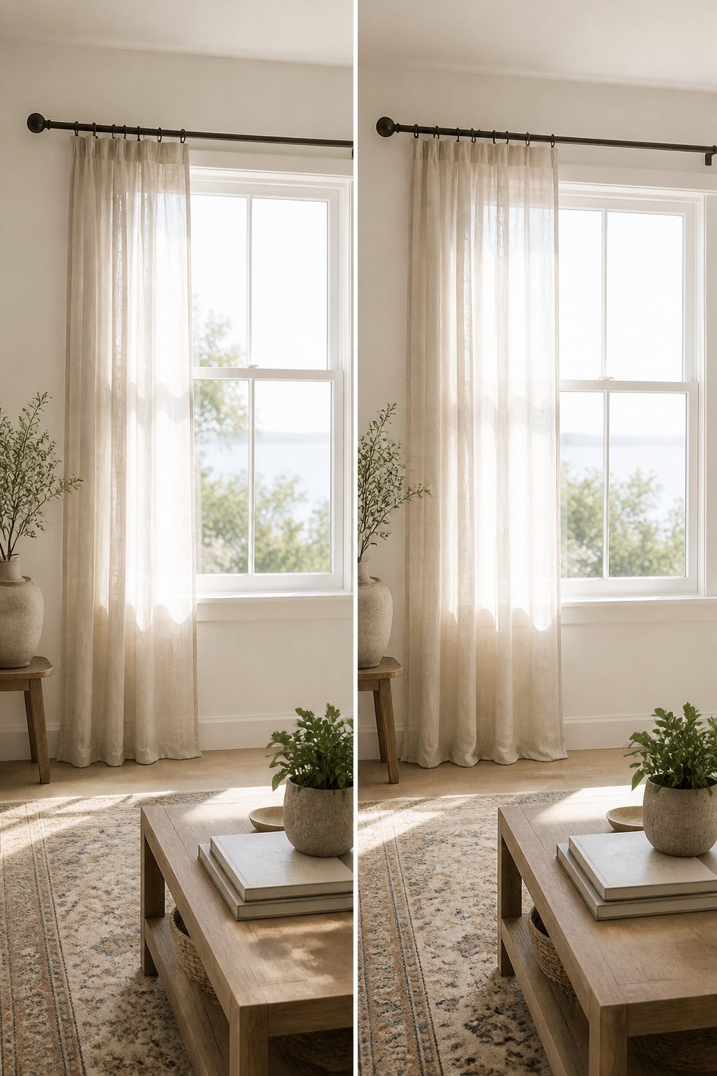
Extending the curtain rod 6 to 12 inches past the window frame on each side exposes more glass and trains the eye to read the window as larger than it is. The extra length gives the fabric somewhere to stack when open, so almost none of the glass stays covered. Sheer or minimal treatments finish the job; heavy panels would undo the whole point.
This was the first change I made in my own rental, and it cost under $30. The rods themselves were nothing special, just basic hardware, but the shift in light was immediate. The wall beside the window went from dead space to part of the frame, and the room felt wider for it.
2. Slipcovered Furniture
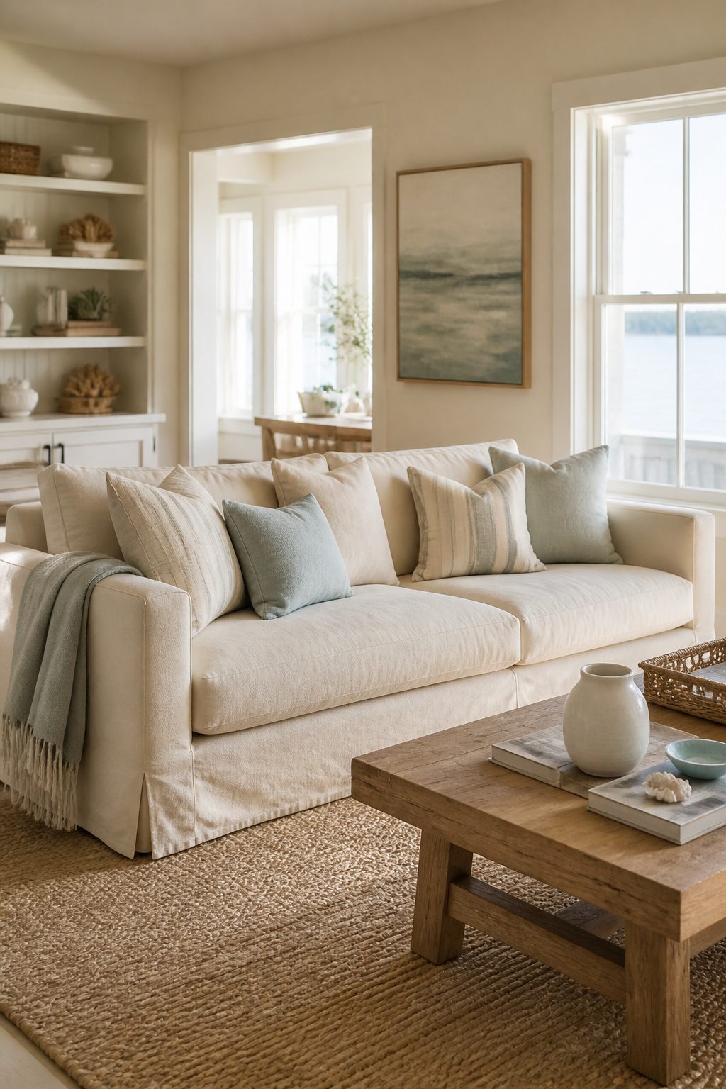
Washable slipcovers matter for a coastal look because the whole point is relaxed, lived-in ease, and nothing kills that faster than a stain you’re afraid to touch. Tailored covers for each cushion read intentional; baggy one-size-fits-all ones drift toward shabby chic in the wrong direction. The IKEA Ektorp line and similar sofas make this accessible, with full replacement covers running $79 to $150 versus the $600-plus a reupholster job starts at.
My own lesson came with a white linen slipcover that looked crisp for exactly one morning. Coffee, sunscreen, the dog, it showed everything. Switching to a cotton-poly blend with a tighter weave fixed the maintenance without losing the airy feel I wanted. Performance fabrics clean up easier still, and the difference is worth it if your sofa sees daily use.
3. Soft, Light Wall Colors
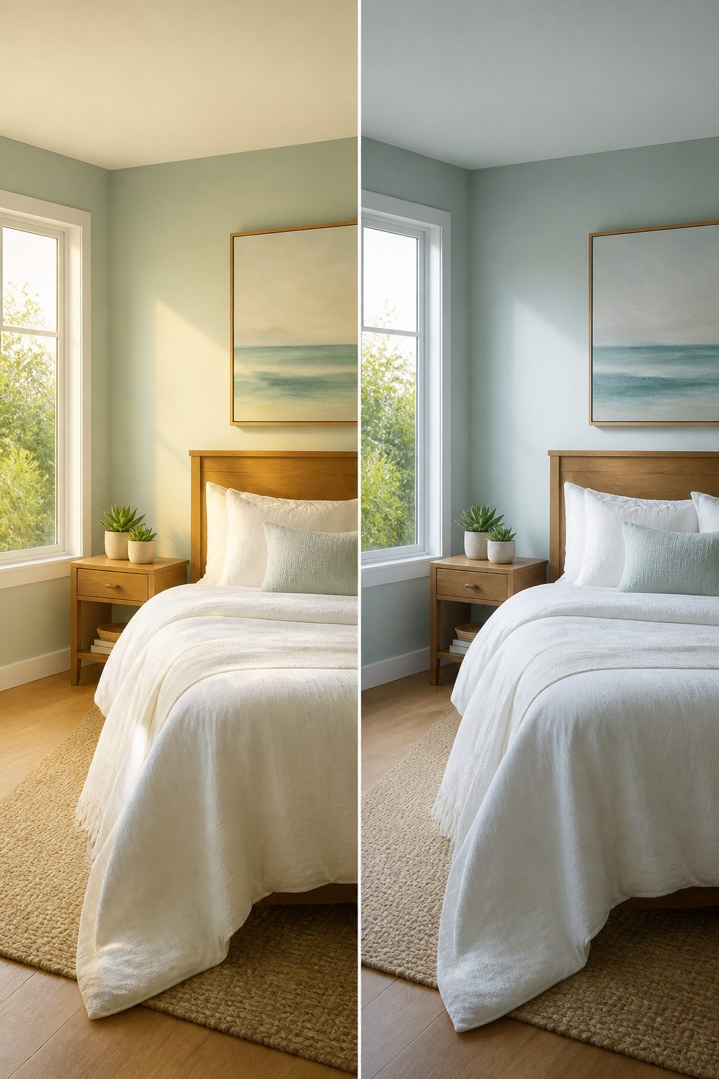
Sandy beiges and warm whites form the backbone of coastal walls, but the greens and blues do the heavy lifting if you want the room to feel like more than a rental blank. Benjamin Moore Beach Glass is the color that finally made it onto my bedroom walls after I painted three samples onto poster board and lived with them for a week. Morning light pulled it toward gray; by afternoon it turned distinctly green. The shift is dramatic enough that I would not have trusted a single swatch held up for thirty seconds.
For a safer neutral, Benjamin Moore Simply White or Classic Gray stays quiet across changing light. Sherwin-Williams Sea Salt and Watery read more overtly coastal; Watery in particular leans into the ocean reference without going dark. The poster-board week is the step I now refuse to skip.
4. Seagrass, Jute, and Natural Texture
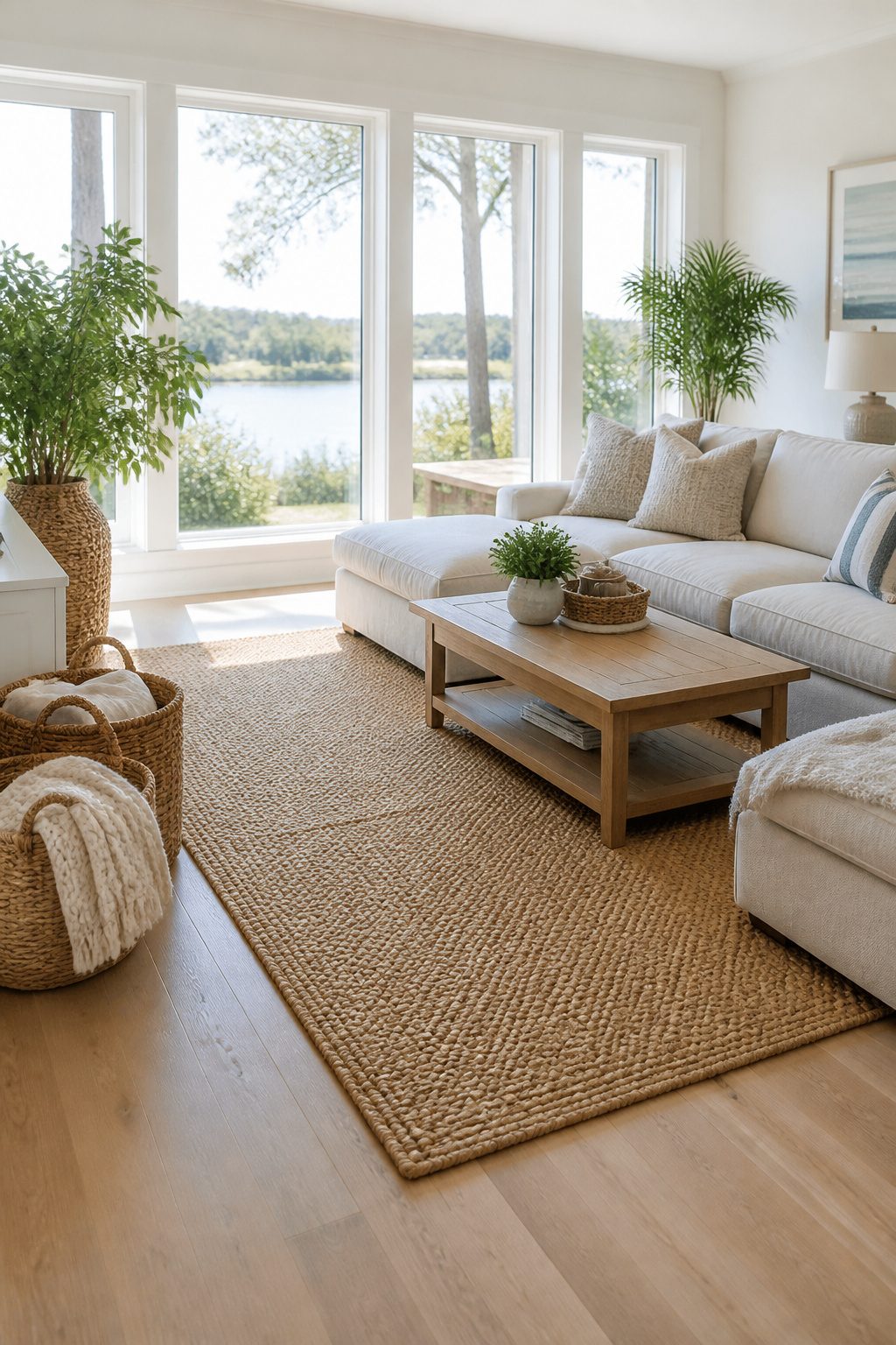
White walls and pale floors can turn cold fast without something organic underfoot. A 5×7 seagrass rug from IKEA at $89 fixes that: the weave is rough enough to feel like a dock, tight enough to sweep, and the tan color reads like dried sand rather than dyed straw. Mine sits in the bedroom where morning light hits it, and the room finally stopped feeling like a rental showroom.
Jute has more give, which makes it forgiving for baskets. The jute storage bins from Target run $12–18 each and hold the odd shape of throw blankets better than fabric cubes. What no tag tells you: raw jute sheds for the first month. Fibers work loose and collect in corners until the weave settles. A rug pad underneath stops the slippage that makes you trip, and the shedding phase ends faster when the rug isn’t sliding and grinding against the floor.
Driftwood pieces do the same job on walls or shelves. The bleached, salt-worn surface brings in the coast without the kitsch of rope signs or anchor motifs. Pair it with the cleaner lines of a modern room and the texture keeps the whole thing from going sterile.
5. Blue Tones That Read Coastal
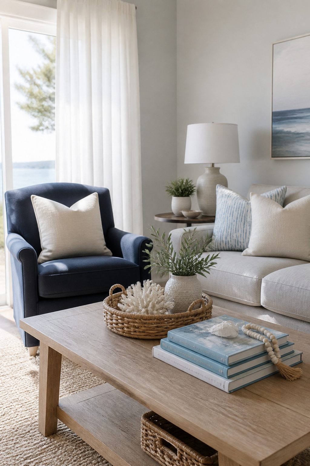
Blue reads coastal faster than any other color, which is exactly why it needs restraint. One navy piece is enough to anchor a room; more than that, and you are living in a gift shop at the marina. I learned this the hard way with a sofa I bought in a deep harbor blue. The swatch looked measured on the page, but the delivered piece swallowed the living room whole. Cream linen pillows helped, though not enough. What finally balanced it was swapping in a natural oak coffee table with visible grain; the warmth of the wood split the blue so the eye could rest. For walls, the softer tones from earlier in this series, something like a washed-out sky or the pale gray-blue of weathered shingles, carry the coastal feel without shouting it. Reserve the darker blues for single moments: a painted interior door, a ceramic lamp base, the binding on a stack of books. The rule I now follow is simple. If two blue objects can see each other across the room, at least one of them is coming back to the store.
6. Shiplap as a Classic Accent
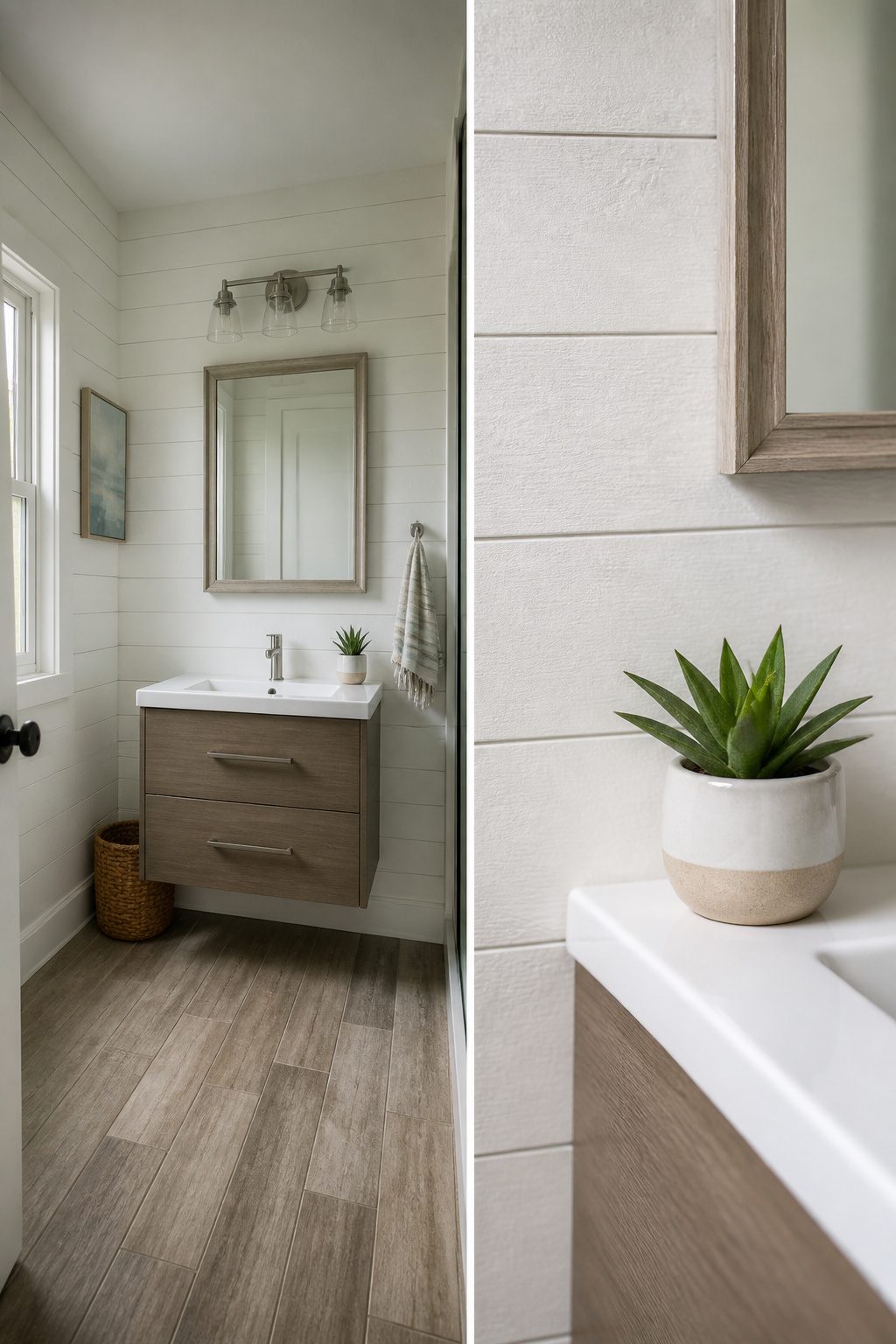
Real shiplap runs $8–12 per square foot installed, which puts a full accent wall past most weekend budgets. MDF panels split the difference, but they still need nails, sawdust, and a landlord who will not notice when you move out.
Peel-and-stick wallpaper that mimics the boards is the option that actually fits a rental. I used one in a bathroom with no vent fan, and the seams held through two years of daily steam before a single corner lifted. A $4 tube of wallpaper seam adhesive pressed it back down in ten minutes, and that was the only repair it needed.
At $1.50–$2.50 per square foot, the wallpaper costs less than the gas to haul real lumber home. The texture reads as shiplap from three feet away, which is the distance anyone actually stands from a bathroom wall. Up close the repeat pattern shows, so I kept it to a small room where guests do not linger.
7. Striped Textiles
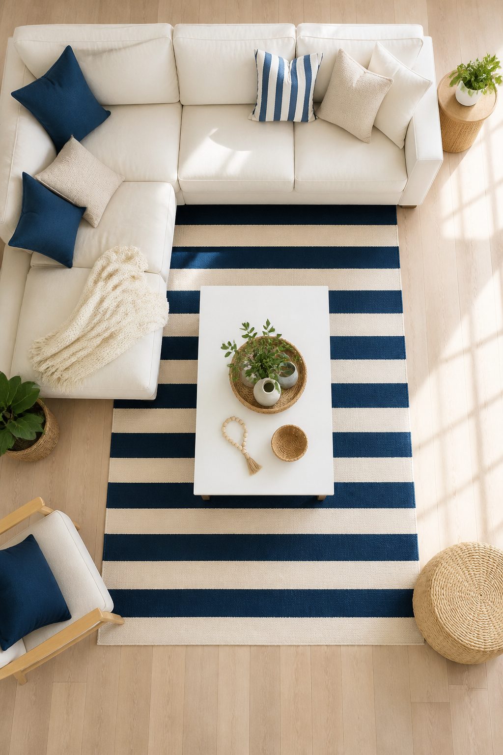
Striped textiles are the fastest way to signal coastal without repainting a wall. A single navy-and-white pillow on a sofa reads beach house; six of them read carnival tent. My own rule is one striped piece per seating area, and that restraint has saved me more than once.
Horizontal stripes on a rug or throw will widen a room visually, which helps in the narrow living rooms common in rentals. Vertical stripes on a pillow or curtain draw the eye up toward the light, a useful trick in low-ceilinged spaces. H&M Home and Target Threshold both carry cotton striped pillows in that $15–25 range, cheap enough to swap out when the look starts feeling tired.
I learned the hard way that scale matters as much as color. A two-inch stripe feels crisp and modern; a half-inch stripe starts looking like mattress ticking unless the rest of the room is very plain. Start with the pillow, live with it for a weekend, then decide if the room wants a second stripe or if the first one is doing enough work on its own.
8. Seashells With Restraint
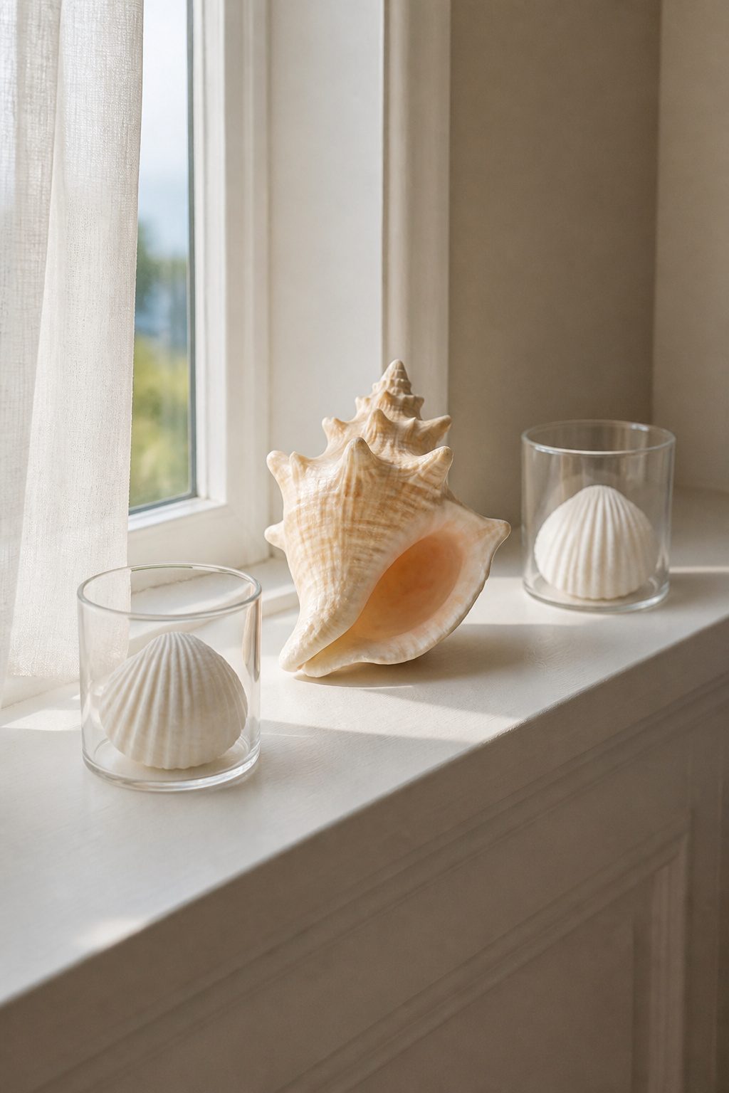
A single large conch on a stack of books reads intentional. A glass cylinder filled with uniform white cockles reads collected over time. One framed shadow box reads like art. These three moves share the same rule: one type of shell, one container, one place for the eye to rest.
I learned this after the mirror. I hot-glued shells around a cheap frame, every shape and size I had, until it looked like a craft fair explosion. The colors clashed, the textures fought, and from three feet away it dissolved into noise. I hung it in the guest room for two weeks before I admitted defeat.
What stayed was smaller. Three shells, the ones with the cleanest lines, now sit on a windowsill where the light hits them in the morning. No adhesive, no arrangement, just the shapes they already had. The conch came from a trip to Florida years ago; the other two were dollar-store finds that happened to match its tone. Together they do what the mirror couldn’t. They suggest the beach without screaming it.
9. Clean-Lined Furniture
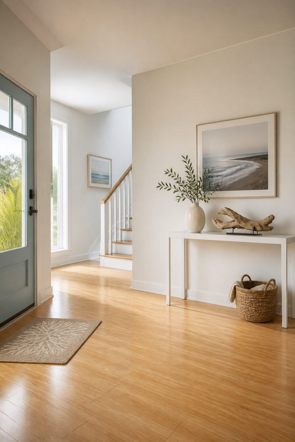
Low, clean-lined furniture keeps sightlines open in a way that ornate pieces simply cannot. When I was furnishing my own living room, I passed on a rolled-arm traditional sofa that I had already measured out with painter’s tape on the floor. The visual weight of those curved arms and that high back, around 36 inches, would have walled off the room from the dining area. The track-arm replacement sits 4 inches lower at the back, and the difference in how the light moves across the space is immediate.
For entryways or behind-sofa consoles, the IKEA LACK hack painted in soft white costs under $60 including primer and a quart of paint. It reads as intentional, not temporary. If the budget stretches closer to $300, the parawood console at World Market runs $299 and gives you actual grain under that pale finish. Either way, the principle is the same: legs you can see through, surfaces that sit below window sightlines, nothing that competes with the room’s best feature, which in a coastal space is usually the light itself.
10. Light Wood Finishes
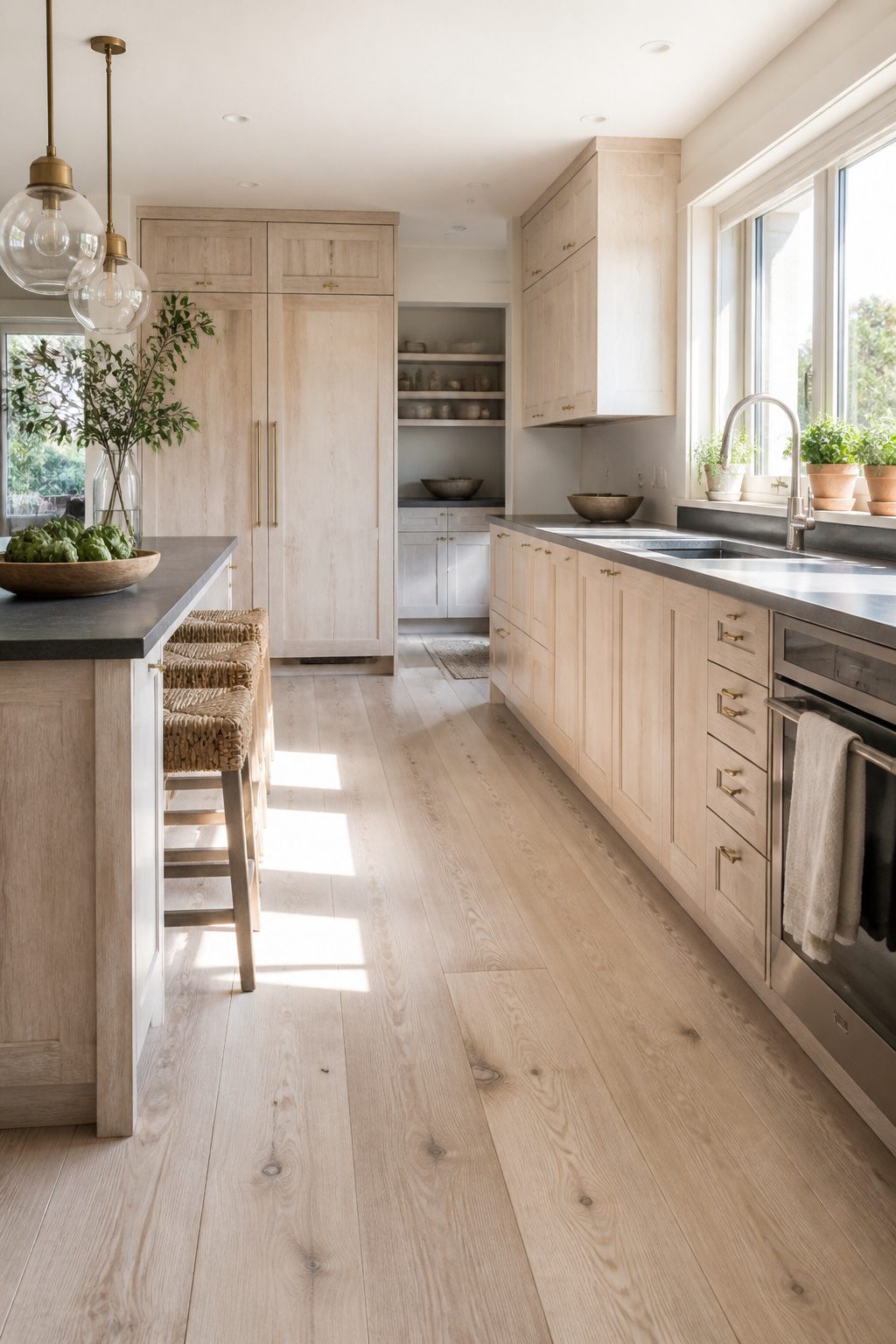
Oak and maple floors both read warmer than the gray tones that dominated coastal style five years ago, but they stay light enough to bounce sun around a room. Solid oak runs $8 or more per square foot installed, which priced me out of a previous rental. I laid a white-washed oak laminate instead at $2.80 per square foot, and the landlord signed off because it was lighter than the existing dark pine he was tired of. The planks clicked together over a weekend and the wear layer held up for three years.
For furniture you already own, bleached or limed finishes pull the same effect without replacing anything. A liming wax on maple or oak cabinets softens the grain without hiding it, and the process takes an afternoon. The trick is working in thin coats; the piece should look like it weathered on a porch, not like you painted it and changed your mind.
The Coastal Palette in Practice
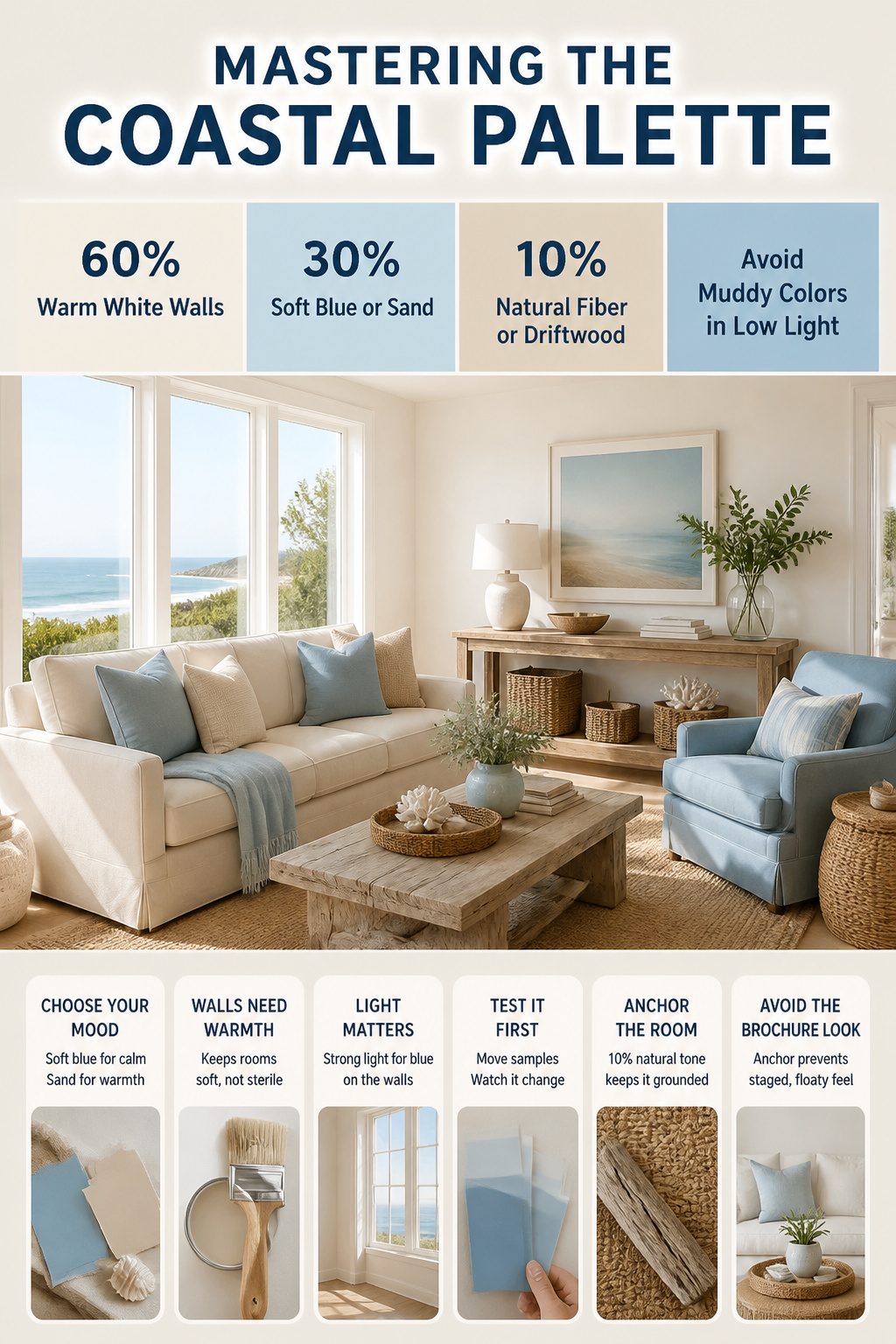
The coastal palette only works if you treat it as a system, not a shopping list of pretty colors. 60% warm white, 30% soft blue or sand, 10% natural fiber or driftwood tone is the ratio I actually use when I’m standing in the paint aisle trying not to panic. Warm white on the walls keeps a room from turning sterile; Benjamin Moore Simply White or Sherwin-Williams Classic Light Buff both read soft rather than clinical, and that warmth matters more than the exact swatch. The 30% is where you choose your mood: soft blue if you want the watery calm of a morning tide, sandy beige if you want the dry shore instead. I go blue in bedrooms, sand in living rooms where I already have too much competing light. The remaining 10% is the grounding element, a raw jute tone or weathered wood that keeps the whole thing from floating away. Without that anchor, you end up with a room that looks like a rental staged for a brochure. Sources split on whether to put the blue on walls or keep it to textiles; my own rule is walls only if the room gets strong natural light, because Sherwin-Williams Languid Blue can turn muddy by lamplight. Test it first, and move the sample around. Colors shift with the hour more than any photo predicts.
Natural Materials Beyond the Obvious
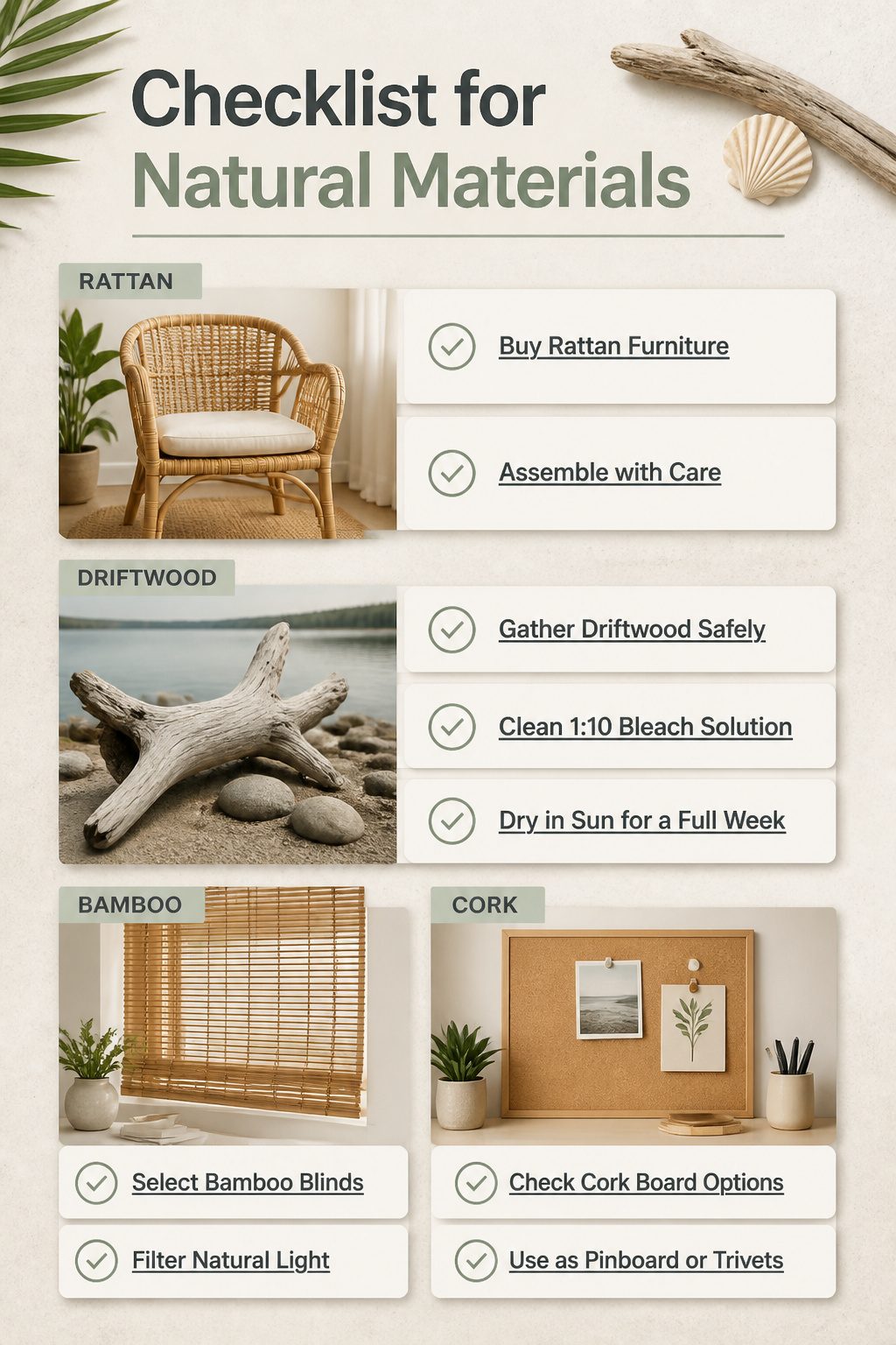
Rattan furniture has come back in flat-pack form at IKEA and Urban Outfitters, which puts it within reach of a weekend budget. I assembled a rattan chair from one of those lines last spring; the joints creaked for two days, then settled.
Driftwood does not require an ocean. Mine came from a lake in Michigan, bleached pale gray from winters of freeze and thaw. Clean it with one part bleach to ten parts water, scrub with a stiff brush, and let it dry in the sun for a full week before bringing it inside. Skipping the drying step leaves a musty smell that no amount of coastal breeze will fix.
Bamboo blinds and cork boards are the less expected options that read coastal without screaming it. Cork works best as a pinboard above a desk or cut into trivets; bamboo blinds filter light the way sheer curtains do, but with more texture and less fabric to maintain.
Keeping It From Going Kitsch
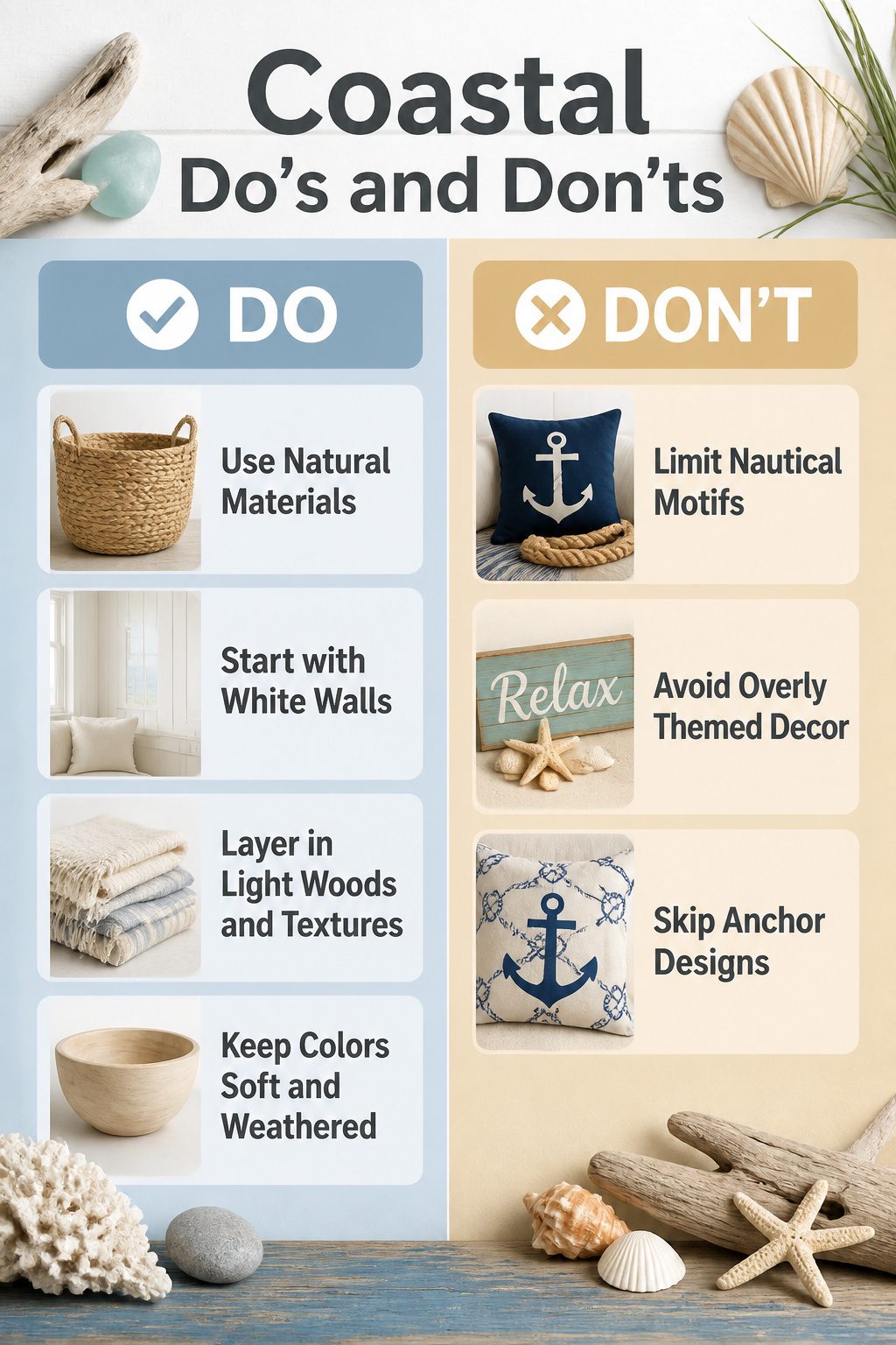
The line between coastal and costume is thinner than most people think. I learned this the hard way with a rope-print pillow that looked charming in the store and like a cruise-ship gift shop on my sofa. If an item has an anchor, a rope print, or the word "beach" on it, it does not come home. That single rule has saved me more times than I can count.
Natural materials do the work that symbols try too hard to do. A bleached-wood bowl or a basket with actual salt-air wear reads coastal because it carries real texture, not a printed imitation of one. The same goes for color. Navy and primary red shout nautical; weathered driftwood grays, soft sands, and muted greens like beach grass or sea glass whisper it. One stripe on a tabletop can nod to the water without turning the room into a marina gift shop.
The sources I trust on this all land in the same place: start with white walls, add cotton or linen in casual weaves, then layer in light woods and found textures through rugs and throws. Let the feeling of the coast come through sunlight and material honesty rather than through lobster motifs or signs that say "Relax." A little nautical can go a long way, but usually it goes too far.
DIY Coastal Art That Actually Works
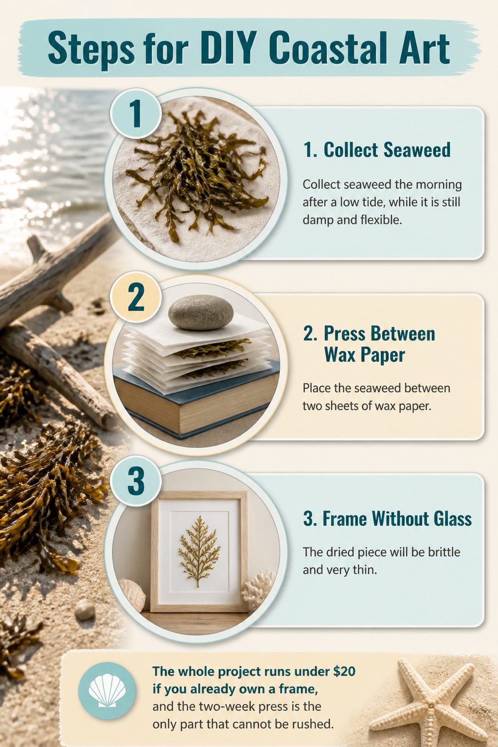
Pressed seaweed has the flat, papery look that reads coastal without screaming beach house. I tried the resin route first; the piece yellowed inside six months and the whole thing went to the basement. The method that replaced it costs almost nothing and has held up for two years now.
- Collect seaweed the morning after a low tide, while it is still damp and flexible. Rinse it in fresh water and lay it on a towel to take off the excess.
- Place the seaweed between two sheets of wax paper, not plastic wrap; the wax breathes just enough. Slide the stack into a heavy book, then weight the book with something solid and leave it alone for two weeks.
- The dried piece will be brittle and very thin. Float it inside a standard 11×14 frame with a white mat, no glass contact, so the texture stays visible and the paper does not buckle against the pane. A drop of archival adhesive at two points on the mat is enough to hold it.
The whole project runs under $20 if you already own a frame, and the two-week press is the only part that cannot be rushed.
Seasonal Shifts for Coastal Rooms
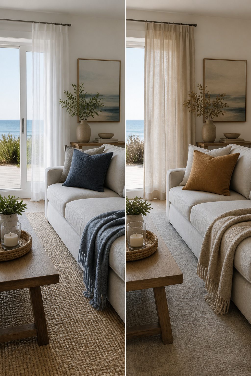
Most coastal rooms look abandoned by February because the summer palette fights the gray light outside. I swap the pale blue throw pillows for a deeper sand tone around mid-November, which reads warmer against shorter days without buying anything new in pattern or shape. The cotton blanket on the sofa gets folded into storage and a heavier linen throw takes its place by mid-October; same footprint, different weight. In January the seagrass mat by the door comes up and a low-pile wool rug goes down, mostly because salt and slush wreck natural fiber and the wool shakes out. Each change takes under an hour because the base stays neutral, and none of these swaps runs past $60 since the shapes stay identical and I hunt the off-season bins. The room keeps its coastal bones but quits pretending it is July.
Frequently Asked Questions
How do I decorate coastal without looking all Margaritaville?
Stick to natural materials, soft weathered colors, and actual texture instead of printed symbols. The hard rule: if it has an anchor, a rope print, or the word "beach" on it, leave it at the store. Bleached wood, jute rugs, and linen weaves read coastal because they carry real history, not a graphic imitation of one.
What are some good coastal paint colors?
Benjamin Moore Beach Glass shifts between gray and green across the day, while Simply White and Classic Gray stay quiet in any light. Sherwin-Williams Sea Salt and Watery read more overtly coastal; Watery leans into the ocean reference without going dark. For a warm white that avoids sterility, Sherwin-Williams Classic Light Buff reads soft rather than clinical. Test any color on poster board and live with it for a week before committing.
How can I maximize natural light in my home?
Extend curtain rods 6 to 12 inches past the window frame on each side so the fabric stacks clear of the glass when open. Pair that with sheer or minimal treatments; heavy panels undo the whole point. The shift makes the wall beside the window read as part of the frame, and the room feels wider for it.