
Cozy beach cottage decor ranges from a $6 grocery-store bouquet to a full room painted in sun-washed tones, and the single factor that decides which idea fits yours is how far your space already leans coastal. The trap is not cost or effort; it is knowing when to stop before the room starts quoting the beach instead of whispering it. Ann Osborn proved the style works ten hours inland in a Texas farmhouse, using warm whites and thrifted finds while the rest of her house stayed stubbornly landlocked.
1. Soft, Sun-Washed Color Palette
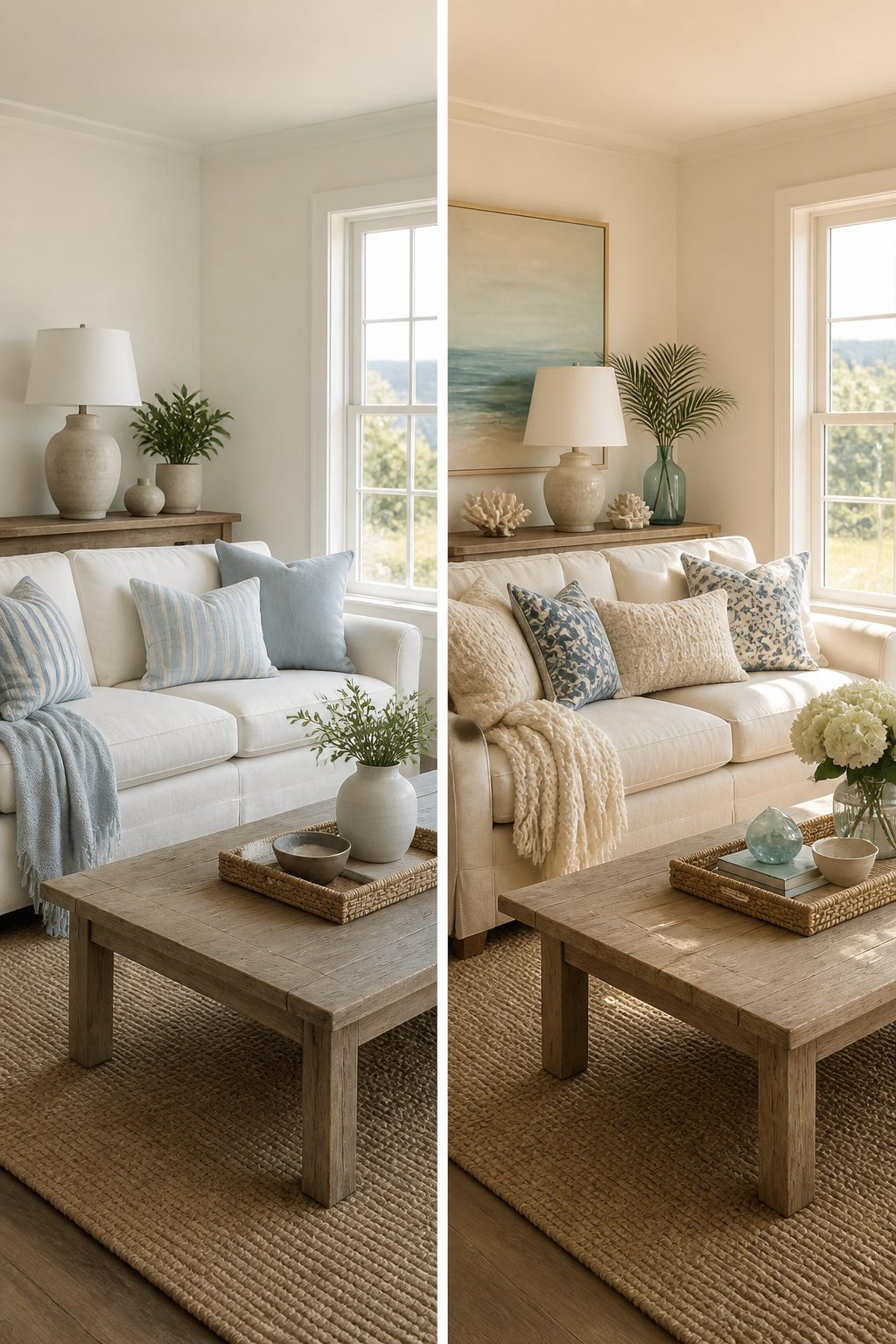
Creamy whites, sandy beiges, and pale blues set the tone for a beach cottage that feels lived-in rather than staged. Benjamin Moore Simply White warms up walls without going yellow, while their Beach Glass carries a grayed-green note that reads as sea foam in afternoon light. For a slightly bolder move, Sherwin-Williams Languid Blue works on cabinets or an accent wall without tipping into nautical cliché.
The mistake is buying a gallon based on a two-inch chip under fluorescent store lighting. Paint shifts dramatically against your actual floors and the sun your windows get. Samplize peel-and-stick samples come in 9" × 15" or 15" × 18" sizes, large enough to read true. You can peel them off, stick them to another wall, and watch them across a full day before deciding. I have moved samples from room to room and been glad I did; the color that looked soft in the living room turned harsh where the kitchen gets eastern morning light.
The goal is restraint. Three tones, maybe four if you count the natural wood you are probably keeping. Any more and the house starts quoting the beach instead of whispering it.
2. Layered Natural Textures
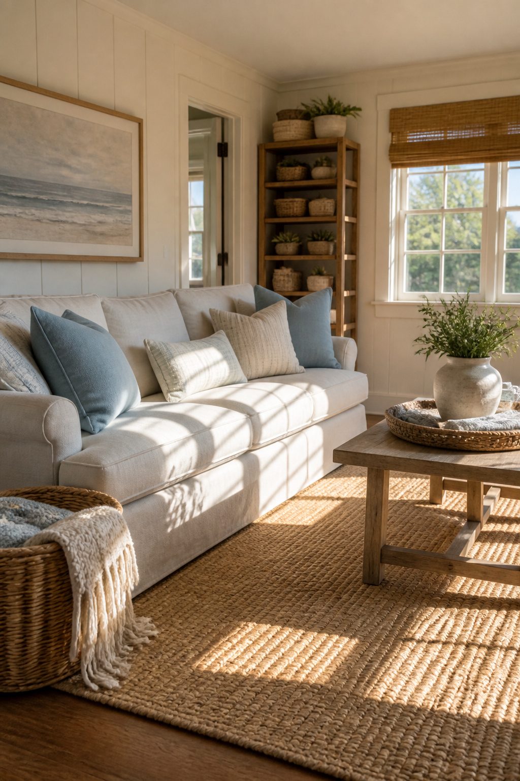
Linen, jute, and wicker each do a different job, and that difference is what keeps a beach cottage from reading like a showroom. Linen softens hard edges and catches light without throwing it back aggressively. Jute grounds the room with something you can actually feel underfoot. Wicker adds structure that still breathes. Stack all three in a single space and the room gains depth without demanding attention.
The mistake is leaning too hard on one of them. A few years back I covered nearly every surface in jute: rug, basket, pendant shade, even a lampshade experiment that did not survive a full summer. The room went from coastal to storage shed in about six weeks. The texture that reads as relaxed in a single dose turns oppressive when it repeats everywhere you look.
Balance matters more than matching. A white couch against a jute rug, as Ann did in her living room, works because the crisp upholstery fights the rough weave just enough. Add linen pillows in a muted coastal tone, maybe a rattan shade on a reading lamp, and the mix starts to hold together. The neutral backdrop lets each material claim its own space without competing for color attention.
One woven element per sight line is the rule I settled on after that jute overload. Standing in any doorway, your eye should hit one major texture, not three wrestling for dominance. The restraint reads as intentional; excess reads as theme park.
3. Classic, Timeless Furnishings
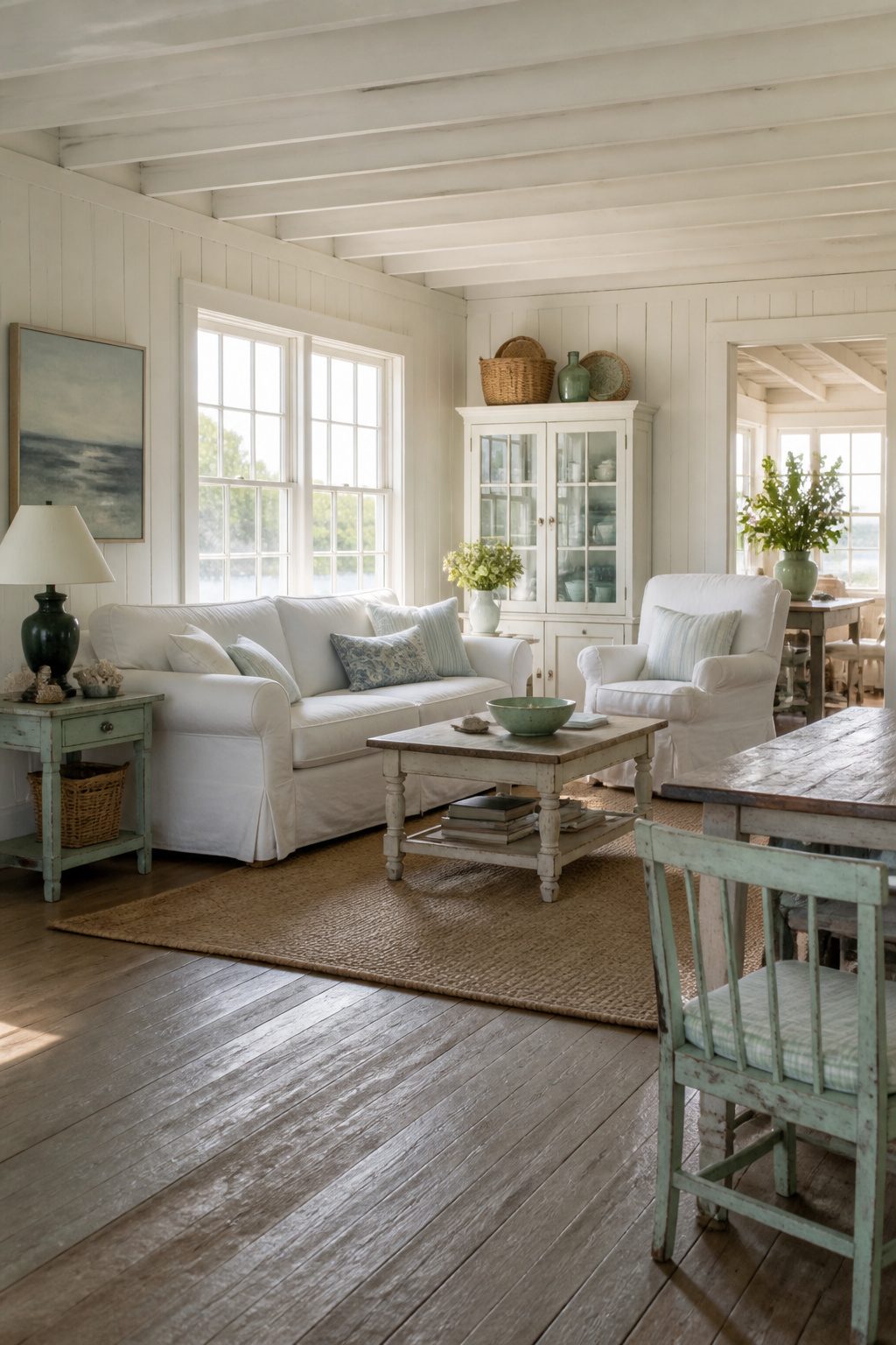
A slipcovered sofa is the first piece to get right, because it sets the tone the rest of the room has to follow. English roll-arm shapes work best; the arms curve low and the whole thing looks like someone has already lived on it for years. The cover should be cotton or linen, something you can throw in the wash after a weekend of sandy feet. White reads coastal, but a very light grey or natural undyed linen keeps the same bounce of light without the pressure of every spilled coffee showing.
Painted wood pieces keep the mood relaxed too. Most of my furniture came from thrift stores and got a coat of white paint, though I leave a few pieces in their natural state when the wood already has a good patina. That peely, shabby contrast keeps all that white from going flat. Spindle-leg coffee tables and skirted side chairs fit this look without fighting anything else in the room.
The shapes that fail are the ones that demand a no-food rule. Anything with sharp corners, high gloss, or a white-glove finish will read wrong in a beach cottage. Low arms, soft edges, and finishes that can take a scuff are what make a room feel lived-in from the first Saturday you spend there.
4. Charming, Collected Kitchen
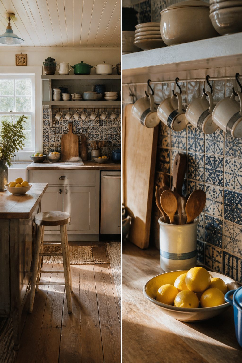
The blue tile backsplash in my own kitchen came from the same leftover batch I’d used for a bathroom job the year before, a trick I borrowed from a couple who built a Carolina rental property out of their main cottage’s scraps. Their kitchen runs those same blue tiles straight up the wall behind the stove, and the slight variation from one batch to the next actually helps the room look settled rather than showroom-fresh. I hung a few mugs that spell out “Beach” on hooks beneath the cabinet, which sounds cuter than it has any right to be, but the irregular spacing keeps it from reading like a gift-shop display.
Open shelving carries the same logic. Mismatched dishes, a few enameled pots left out, wooden cutting boards propped against the backsplash, and glass jars with the lids off all signal a kitchen that grew over years instead of arriving in a delivery truck. Nancy Meyers kitchens work this way: the bowl of lemons, the stack of cookbooks, the small lamp in the corner. Each piece is doing a job, not posing for a photograph.
The collected look costs almost nothing extra. The tiles were already paid for, the dishes came from three different thrift trips, and the jars held pickles last summer. What you spend is time: living in the space long enough to figure out what you actually reach for, then leaving those things where the eye can find them.
5. Cozy Coastal Touches
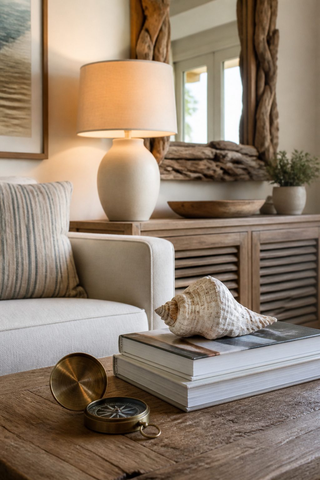
Seashells and driftwood look like souvenirs the second they multiply. I learned this after filling a glass hurricane with shells from a Cape May weekend, then adding a starfish, then a piece of coral a friend sent. The hurricane sat on my entry table for two weeks before I admitted it read as a gift shop display, not a home.
Three pieces per surface is the limit that actually works. I took everything out, kept one weathered whelk shell with a hole worn through it, and laid it on a stack of books beside a lamp. The driftwood went to the bathroom, where a single piece props up a hand mirror. The coral went to a closet.
Nautical decor tightropes the same line. A rope-framed mirror can feel collected; a rope-framed mirror plus anchor hooks plus a "Beach House" sign feels like a restaurant chain. I keep one literal reference per room at most. In my living room, that is a brass compass that actually works, sitting in a drawer most days and coming out when I need it. The rest of the coastal story gets told through color and texture, which do not age into kitsch the way symbols do.
6. Bringing the Outdoors In
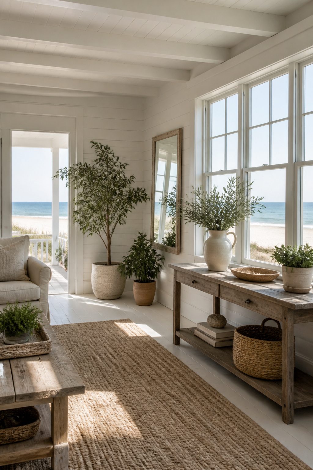
The best coastal cottages never feel fully shut off from the shore. Natural light does most of that work, and the rest comes from greenery that can survive the reality of a cottage interior.
Olive branches, eucalyptus, and hydrangeas in a simple ceramic pitcher give that loose, just-clipped look without trying too hard. For actual potted plants, leafy varieties that tolerate lower light are the practical choice. I learned the hard way with a fiddle-leaf fig that demanded more sun than my north-facing bedroom could give it. The leaves yellowed and dropped within a month, and I replaced it with something more forgiving. Now I stick to plants that do not need a greenhouse to stay alive.
Mirrors help where the architecture does not. An old mirror with some patina bounces whatever light you have around the room and adds the weathered character that fits this style. The effect is less about doubling the sun and more about softening the edges between inside and out.
7. Blue and White Accents
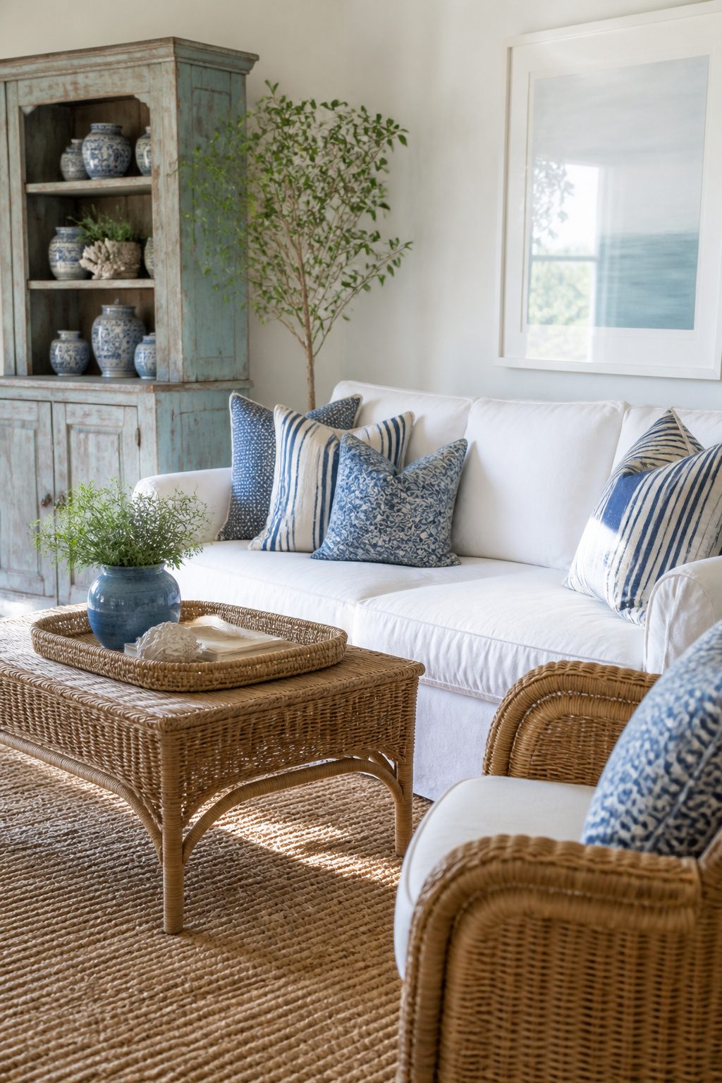
Blue and white keeps the coastal reference readable without turning the room into a souvenir shop. The trick is keeping white at roughly two-thirds of the surface area, whether that means walls, slipcovers, or a painted table, and letting blue live in the smaller pieces that are easier to swap out. Ann at Grace Beach Cottage used this exact balance: light-aqua walls with white furniture, or white walls with blue-striped pillows made from tea towels. Stripes help the pairing feel relaxed rather than formal, especially when they show up on rugs, napkins, or throw covers in navy and cream rather than a single saturated shade. Where the stronger blue goes matters. A deep tone on a large sofa or an entire wall can overtake a small living room, but the same blue on a pair of pillows, a ceramic lamp, or a single striped rug grounds the space without shouting. If you want more color, paint the walls in a beachy blue like Benjamin Moore Beach Glass or Sherwin-Williams Languid Blue, then balance it with crisp whites and natural textures in the furniture. Test first with peel-and-stick samples, because coastal blues shift dramatically with the light.
8. Personal Touches
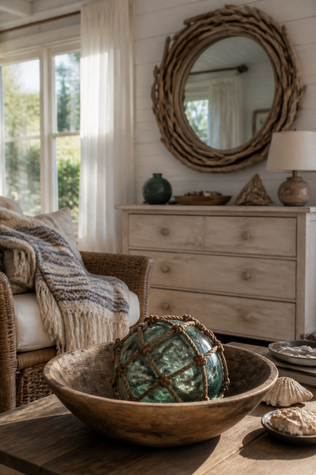
The driftwood mirror above my dresser came from a trip to Cape Cod ten years ago. My sister and I spent an afternoon collecting pieces from the tide line, and a local shop owner drilled the holes for five dollars while we waited. That mirror carries the room in a way no catalog shell arrangement ever could.
Family heirlooms work the same way. My grandmother’s ceramic fishing floats, the ones she bought at a yard sale in the seventies, sit in a wooden bowl on the coffee table. They are not "authentic" anything, but they are authentic to her, and that warmth transfers to anyone who picks one up.
Travel finds beat purchased coastal decor because they already hold a story. The reader does not need the backstory to feel it; objects with actual history have a different weight in the hand, a patina that new paint cannot replicate. One piece with real provenance does more for a room than six matching items from a themed collection.
The risk is over-curating. I once cleared a shelf for "the Cape Cod look" and the room felt like a rental staging. The fix was simpler than I expected: I put back the chipped mug my mother gave me, the one that never photographed well, and the room relaxed.
9. Vintage Elements
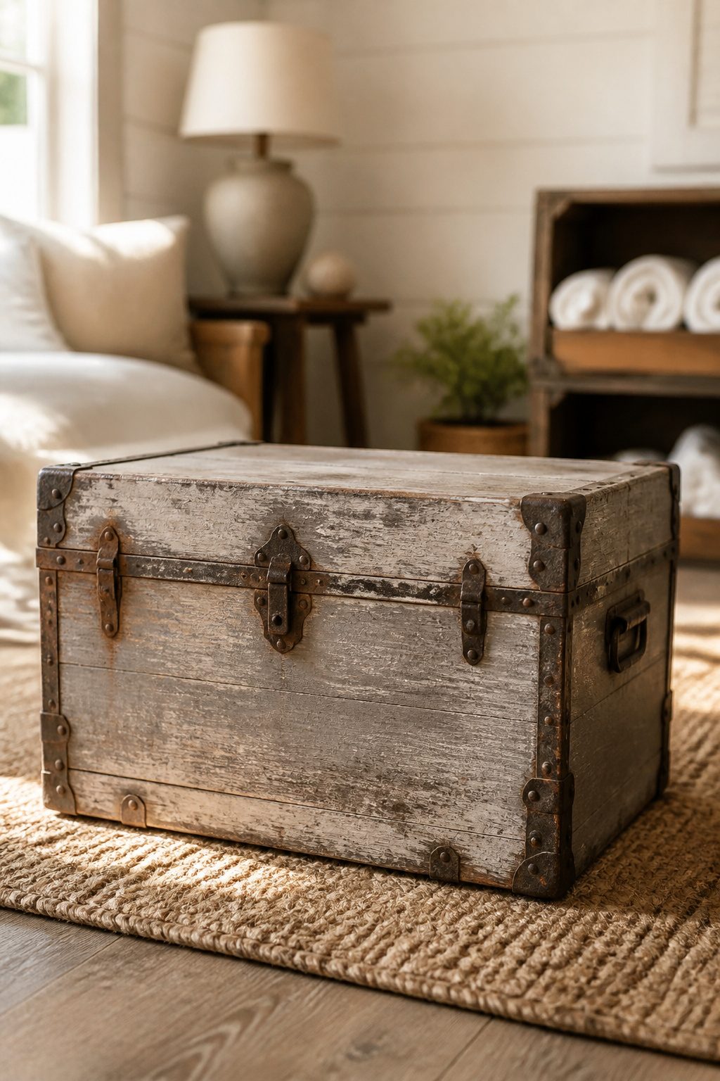
Old trunks and wooden crates do the heavy lifting in a beach cottage, and the best ones show their age without trying too hard. Genuine weathering has soft edges, uneven color, and wear exactly where hands or feet would have touched it for years. Factory distressing looks carved in straight lines or sanded in patterns that real use never makes.
I look for rust on trunk hardware that still moves, water stains inside that prove the piece lived somewhere damp, and crate stamps or shipping labels that place it somewhere coastal. A lantern with original marine paint in layers of blue, green, or red beats a fresh coat every time. The glass should be wavy or slightly bubbled; flat, perfect glass means reproduction.
Before buying, check that trunk lids close flat and that crate bottoms are not rotted through. Battery-operated candles or a low-wattage Edison bulb convert old lanterns to safe indoor lamps without drilling holes that hurt the piece. A trunk at the foot of a bed stores spare blankets. Crates stacked on their sides become cubbies for books or rolled towels.
10. Floral Arrangements
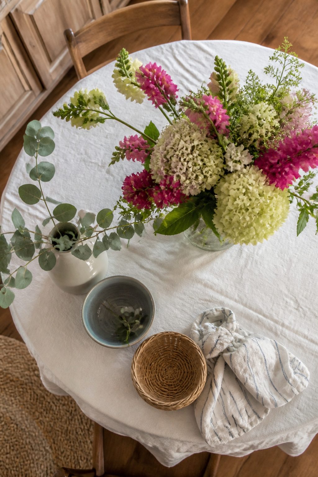
Grocery store flowers in a plain mason jar beat a formal arrangement every time in a beach cottage. The salt air and open windows work against anything too styled; a $6 bunch of daisies or whatever is in season just looks like part of the weekend.
Single-variety bunches, or maybe two kinds mixed with some garden herbs or lavender, hold up better than complex bouquets. Olive branches and eucalyptus do the heavy lifting if you want greenery without the maintenance of a houseplant. Ceramic pitchers work fine as vases, but so does the water glass you already own.
The flowers that survive a beach weekend with the windows open are the sturdy ones: hydrangeas, simple leafy greens, anything with a thick stem. Delicate stems wilt fast in that air. A loose, casual bunch is the look you’re after, not the tight dome the florist builds. That loose shape reads as the effortless warmth that makes a cottage feel lived in rather than staged.
11. Coastal Stripes and Polka Dots
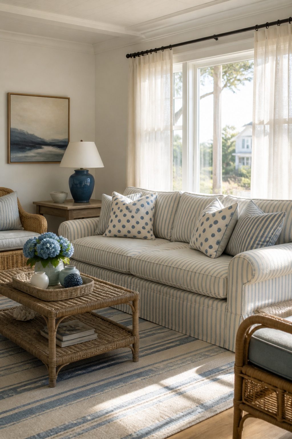
Stripes and polka dots carry a coastal room only when you know where to stop. A stripe wider than an inch on a sofa reads motel, not cottage, so I keep the bold bands for throw pillows and runner rugs where they move across the floor and disappear. Upholstery wants a finer line, something you notice after you sit down, not before you walk in.
Polka dots fail into nursery territory at small scale and high contrast. The ones that work here are loose and hand-drawn looking, at least the size of a quarter, in sand or driftwood on cream rather than crisp black and white. I tried a tight navy dot on a chair once and my sister asked if I was babysitting. That chair got re-covered.
The safest mix is one pattern per plane: stripes horizontal at the windows, dots nowhere larger than a pillow, solids everywhere else. Your eye needs a place to rest or the room starts shouting.
12. White as a Base Color
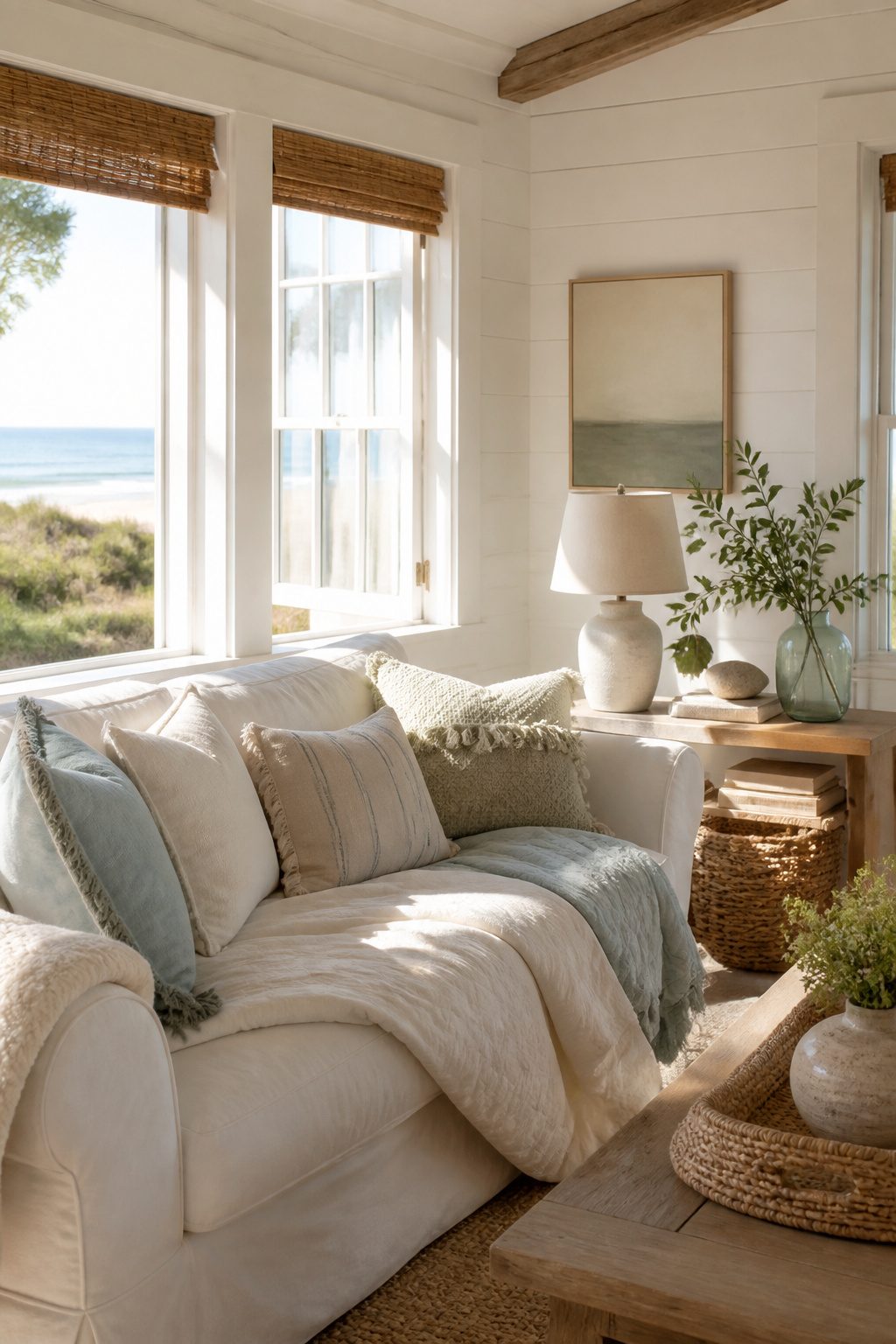
White walls do the heavy lifting in a beach cottage, but the undertone matters more than the name on the paint chip. Warm whites with a hint of cream or buff keep the room soft and livable; cool whites can read sterile once the furniture arrives. I learned this the expensive way in our last rental. I grabbed a can labeled "Simply White" without testing it first, and under the north-facing windows it went almost blue-gray. The wicker and driftwood accents I had planned looked muddy against it, and the whole room felt like a dentist’s office with shells on the table.
The fix was a warmer white, closer to Classic Light Buff, but I wasted a weekend and two gallons getting there. Now I stick peel-and-stick samples on every wall that gets light at a different time of day. Move them around, live with them for a morning and an evening. A white that glows at 10 a.m. can flatten out by dusk, and in a beach cottage you want that glow to hold through dinner. Once the walls are right, the sandy beiges and pale blues you add later actually look coastal instead of accidental.
What Beach Cottage Decor Means
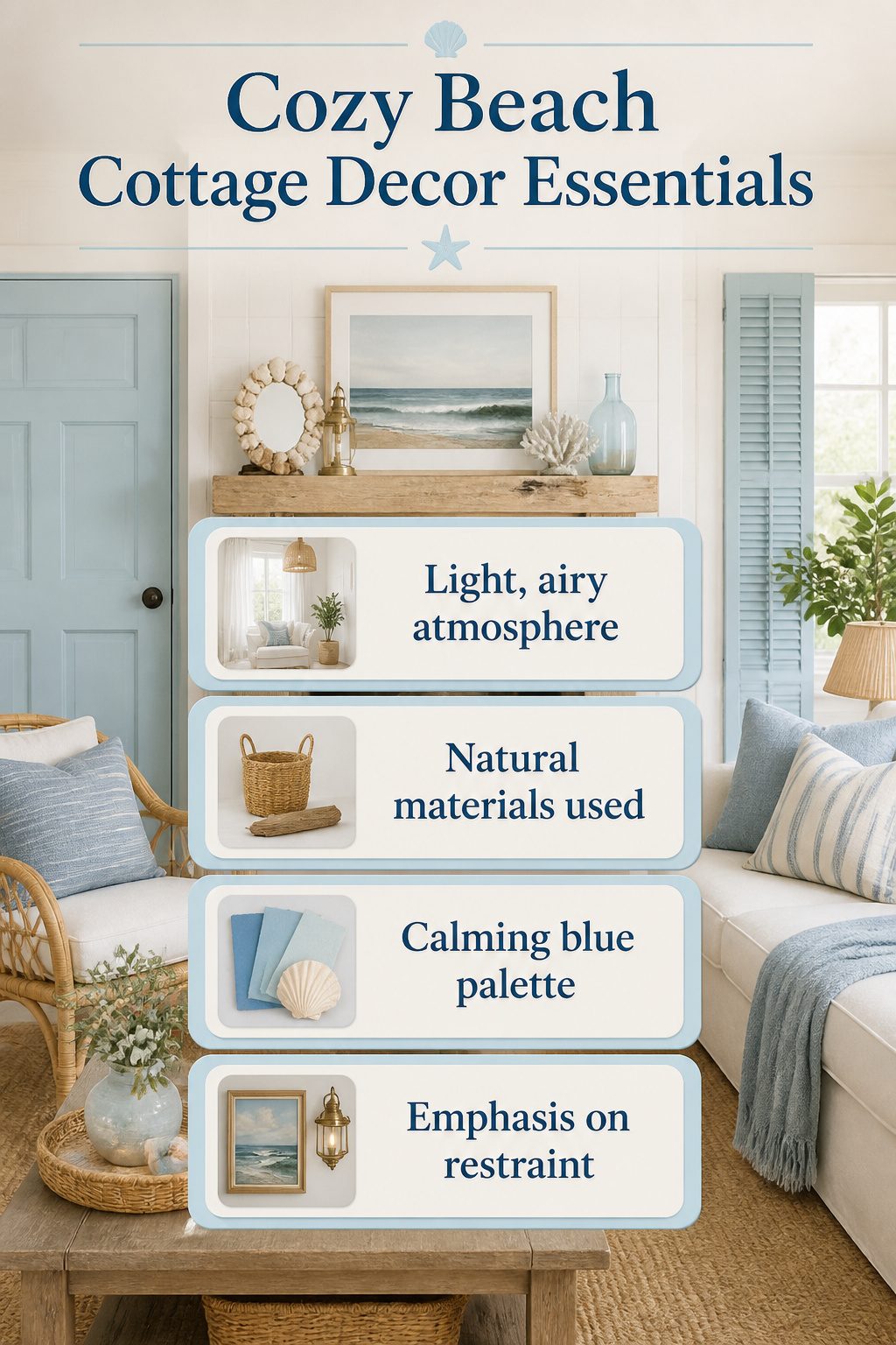
The whole point of cozy beach cottage decor is that you do not need an ocean outside your window to pull it off. Ann Osborn proved this from a traditional Texas home ten hours from the coast, carving out one room as her "beach room" with coastal paint colors and thrifted finds while the rest of the house stayed stubbornly landlocked. She painted the door a coastal color, swapped in coastal-style shutters, and hung ocean-themed art above a custom aged-wood mantel until the place felt like a prayer answered.
The style works anywhere because it borrows from coastal living rather than copying it. Light and airy rooms in warm white, natural materials like wood and rattan, brass finishes, and all shades of blue create the exhale without the salt air. I have seen the same approach work in a 230-year-old German farmhouse and a run-of-the-mill Dutch family home. The restraint matters more than the location: a few framed seascapes, a seashell mirror, some ship-worthy lighting, and you stop before it drifts into kitsch. Geography is optional. The materials and palette do the actual work.
How I Test Paint Colors
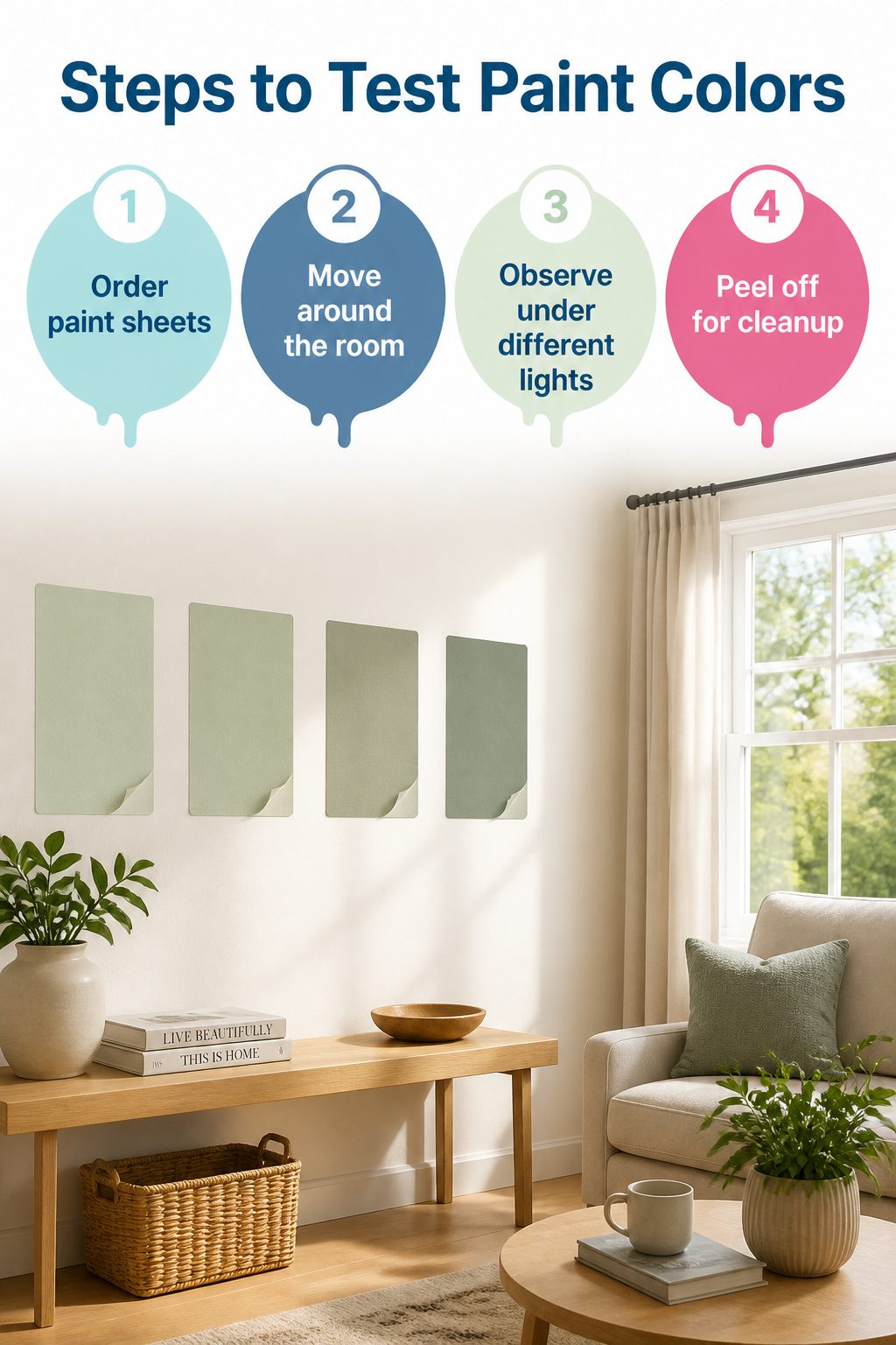
Paper paint chips lie. The color that reads as soft sage under fluorescent store lights turns muddy gray on your actual wall, and by then you have a gallon you do not want. Samplize sends real paint on peel-and-stick sheets, the same latex the can contains, so what you see is what dries.
I order three to five colors at a time and move them around the room across a full day. Morning sun from the east hits differently than afternoon light from the west, and neither tells you how the color behaves under the bulbs you flip on after dinner. The Samplize sheets let you live with each option through all three conditions without opening a single can.
Cleanup means peeling and tossing. No brushes, no trays, no quarter-pints drying out in the garage. For a weekend project with a hard stop, that matters more than I expected.
Where I Find Vintage Pieces

Old trunks and crates with real age usually sit in three places: estate sales near the coast, the back corners of salvage yards that also sell reclaimed lumber, and the booths of dealers who specialize in maritime salvage rather than antiques. The maritime dealers price for collectors, so ask whether the piece came off a working boat or out of a shore house basement. Boat-sourced stock is often cheaper because the salt damage scares serious collectors, but a weekend of sanding and linseed oil can stabilize it for a living room.
For lanterns, skip the nautical boutiques and check the stalls at regional flea markets where commercial fishermen sell off gear. The brass has dents, the glass is wavy, and that is exactly the point. Structural soundness means checking that hinge pins on trunks are original and not yet loose, and that crate bottoms still hold weight without splitting along the grain. If a dealer quotes a price that assumes you are furnishing a second home in the Hamptons, counter with the cost of the repairs you will need to make. Most will drop thirty percent once they realize you are actually going to use the thing.
Mistakes That Read as Theme Park
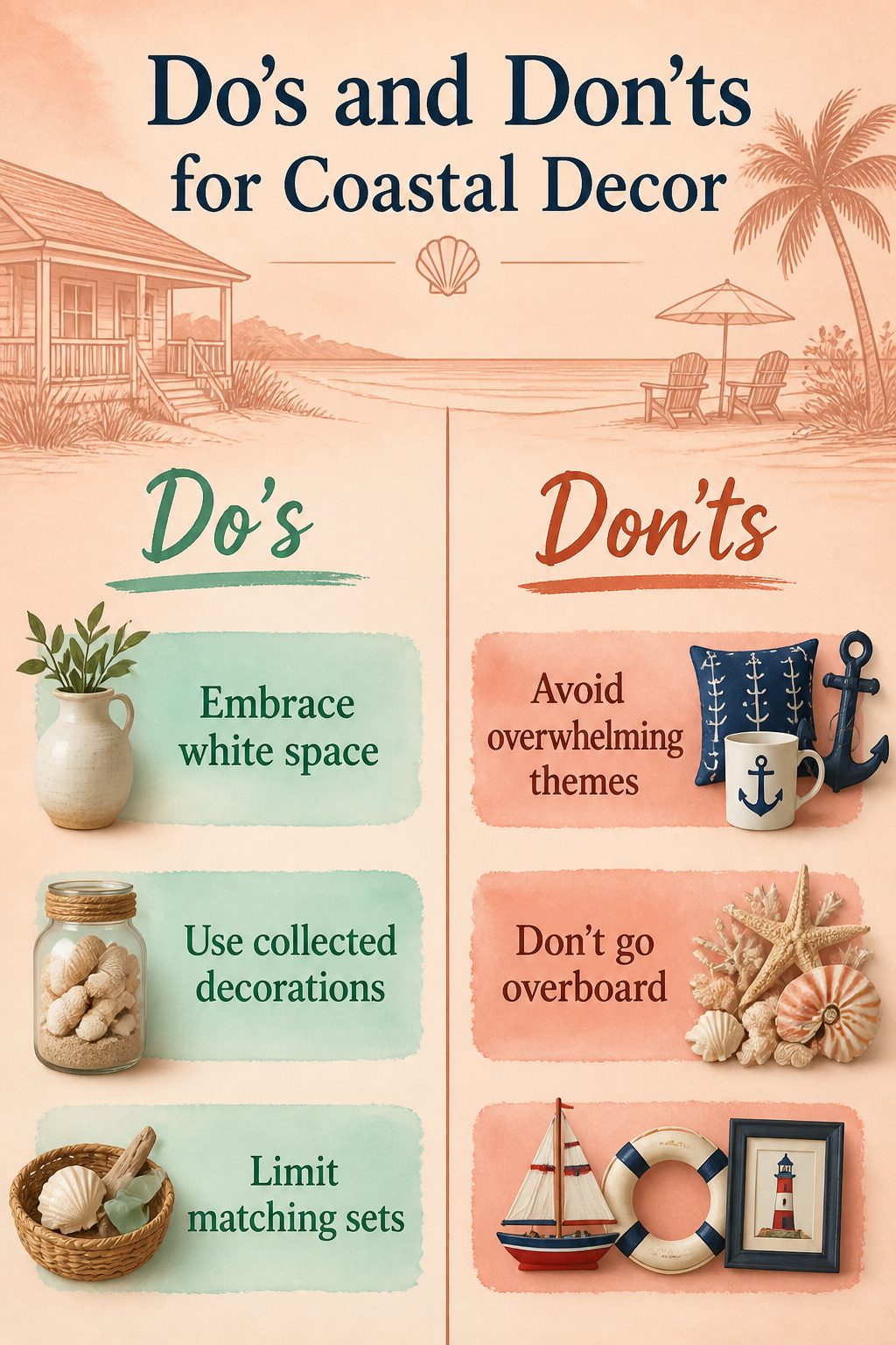
The fastest way to kill a cozy beach cottage look is to let one motif take over every surface. Anchors belong on actual boats, not on your throw pillows, wall hooks, and coffee mug rack all at once. Matching sets of seashells lined up like trophies read as a gift shop display rather than a found collection. The eye needs somewhere neutral to land, and white is that resting space; without it, even soft blues and sandy taupes turn into a single overwhelming tide of color.
I learned this the hard way in my first rental after scattering shells on every flat surface the way some sources suggest. The room felt less like a cottage and more like a seafood restaurant’s theme night. I packed most of them into a single glass jar on the mantel and let the white walls do the work. The difference was immediate. Coastal decor works when it whispers about lazy days at the beach; nautical decor, with its military reds and regimented anchors, shouts about boats. One is relaxed, the other is costume.
Weekend Projects Under $200
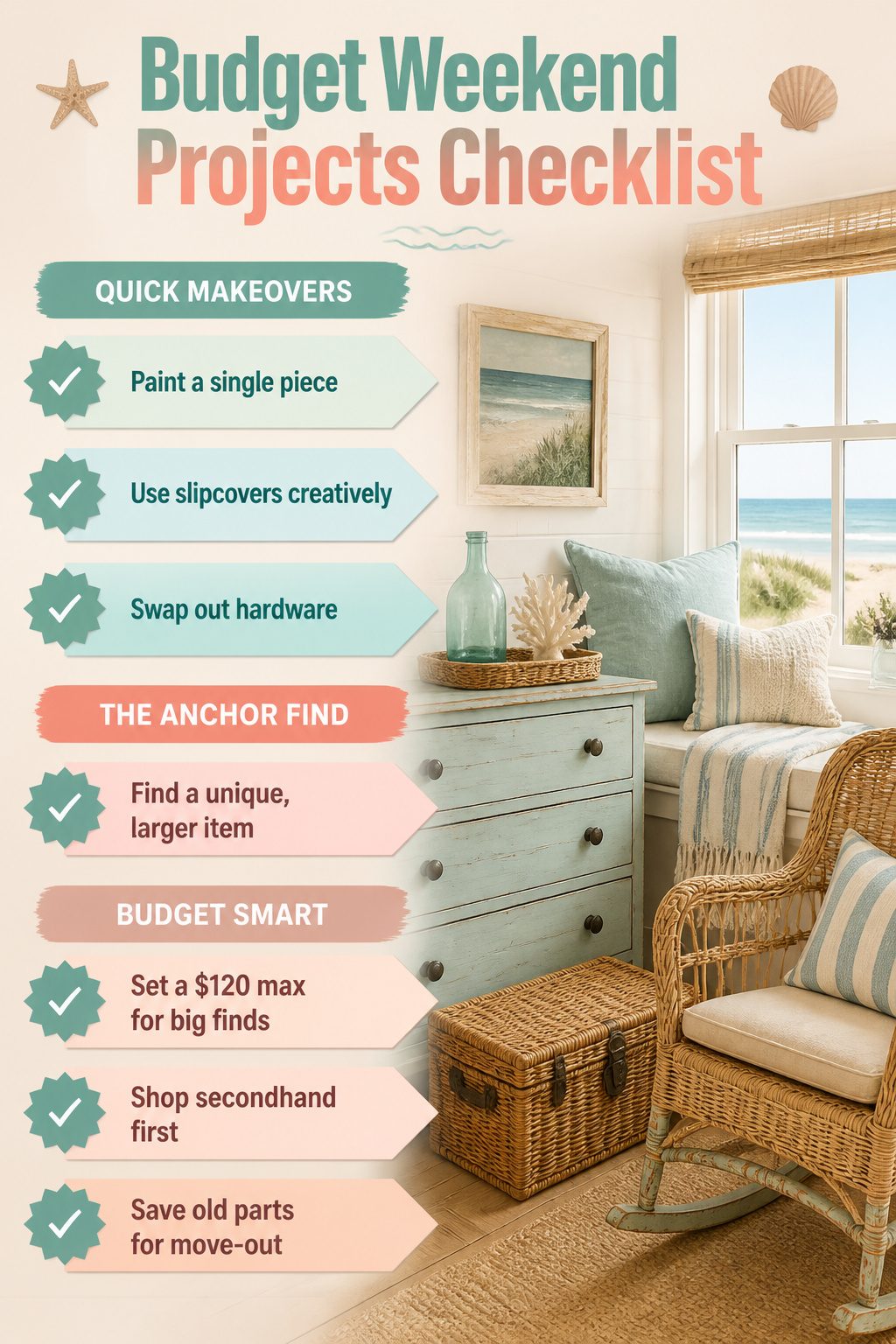
Most weekend wins in a beach cottage room come from paint, fabric, and hardware, with one bigger find anchoring the whole thing.
- Paint a single piece in a sun-faded blue or warm white. A dresser, a pair of nightstands, or the back panel of a bookshelf takes two quarts and a Saturday. Sand lightly, prime if the old finish is glossy, and roll two thin coats rather than one heavy one. The difference between a streaky job and a keeper is usually patience in the drying time.
- Slipcover what you already own. A sofa or two armchairs in washed cotton or linen-blend duck cloth shifts the whole room toward the coast without a new frame. Wash the fabric once before cutting so it shrinks where it matters, not later on the chair. I have had better luck with separate covers that tie or zip than with the drape-and-tuck versions that read as dorm room after a month.
- Swap hardware on cabinets, dressers, and doors. Ceramic knobs with a crackle glaze, simple brass pulls with a little tarnish, or rope handles on a kitchen island cost less than dinner out and read as collected rather than installed all at once. Keep the old pieces in a labeled bag for move-out day if you rent.
- One larger find from a flea market, estate sale, or the back corner of a secondhand shop gives the room its story. A weathered wooden mirror, a painted trunk, or a wicker rocker with one loose strand you can glue yourself. The hunt is part of the project; set a hard ceiling of $120 so you do not talk yourself into a "deal" that swallows the budget.
Frequently Asked Questions
What colors are best for beach cottage decor?
Stick to creamy whites, sandy beiges, and pale blues that feel sun-washed rather than saturated. Benjamin Moore Simply White and Beach Glass, plus Sherwin-Williams Languid Blue, are paint colors that actually read coastal instead of nautical. Test them with large peel-and-stick samples on your own walls before buying a gallon, because store lighting lies and coastal blues shift dramatically across the day.
How do I replicate the beach cottage look without living by the beach?
You do not need an ocean outside your window. The style works anywhere because it borrows from coastal living rather than copying it. Light, airy rooms in warm white, natural materials like wood and rattan, brass finishes, and all shades of blue create the exhale without the salt air. Keep the restraint: a few framed seascapes, a seashell mirror, some ship-worthy lighting, and stop before it drifts into kitsch.
How can I add vintage elements to my decor?
Look for old trunks, wooden crates, and marine lanterns with genuine weathering: soft edges, uneven color, and wear exactly where hands or feet would have touched for years. Estate sales near the coast, salvage yards, and maritime flea market stalls are where the real pieces hide. Check that trunk lids close flat and crate bottoms still hold weight, then use a trunk at the foot of a bed for spare blankets or stack crates on their sides as cubbies.