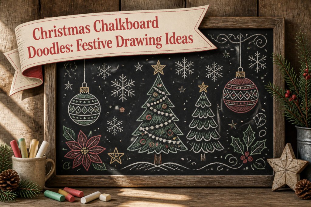
Christmas chalkboard doodles are festive drawings made with chalk, usually on a blackboard or chalkboard surface, that celebrate the holiday season with simple, hand-drawn illustrations. The trick is that they only look effortless once you know the pressure and angle that keep the lines clean; rub too hard and the chalk crumbles, too light and it vanishes by morning. Engineer prints, those large-format black-and-white copies that run a few dollars at office supply stores, let you transfer printed outlines straight onto the board so freehand skill never has to be the gatekeeper.
1. Snowflake Cluster
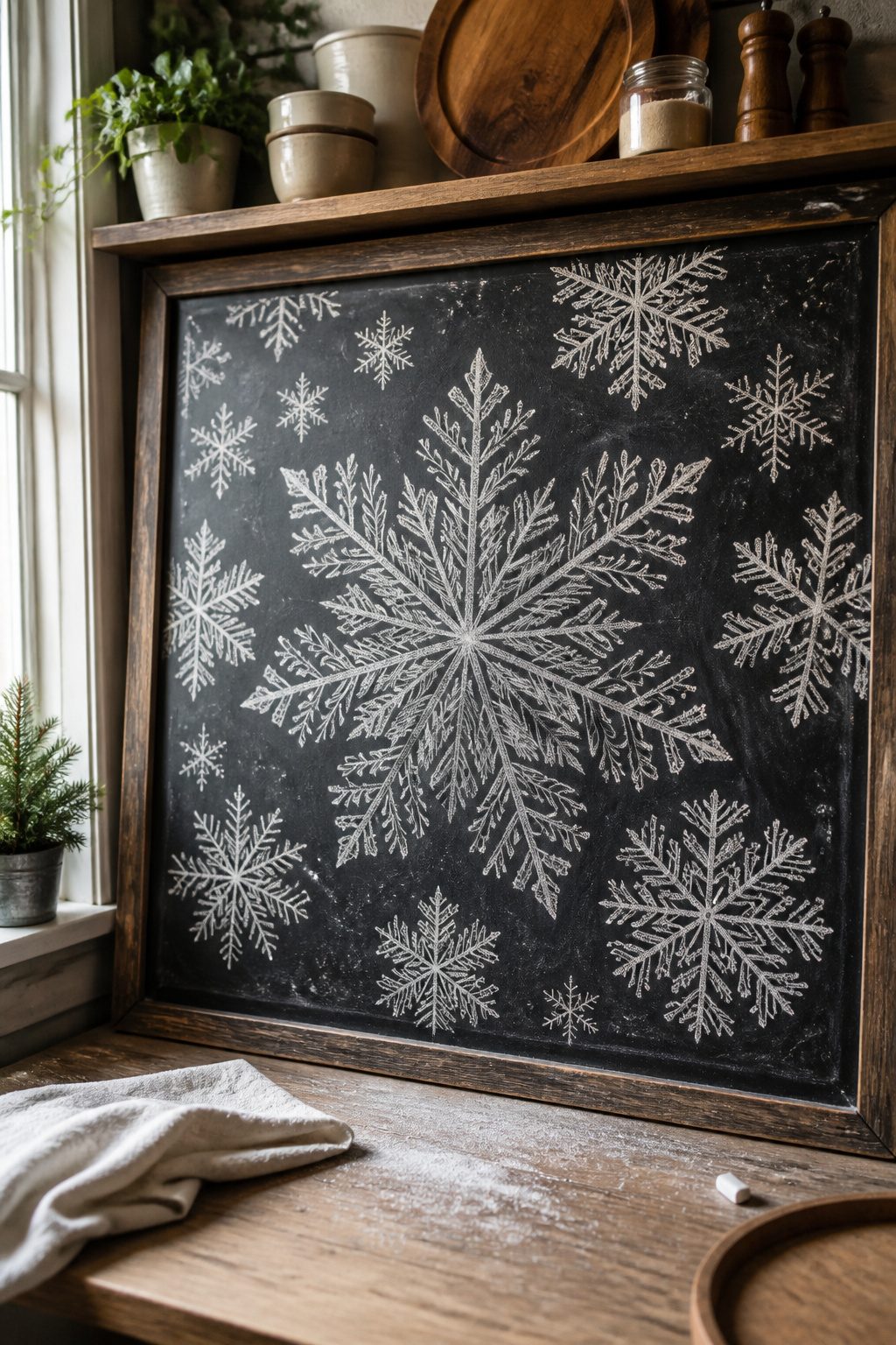
A single large snowflake in the center of the chalkboard gives the whole design its anchor, and smaller flakes fill the gaps without the layout ever feeling crowded. The trick is overlapping them at different angles so no two look copied.
If freehand symmetry makes you nervous, printed outlines solve it. Engineer prints run cheap at copy shops, and bold black-and-white clip art transfers cleanly. Rub chalk across the back of the print, tape it chalk-side-down, and trace the lines with a pencil. Lift the paper and you will see faint chalk guides ready to darken. A damp paper towel wipes away the dust and any lines you decide to lose.
I have learned to keep the central flake slightly off-center rather than perfect middle; the asymmetry reads as intentional once the smaller ones cluster around it.
2. Candy Cane Greeting
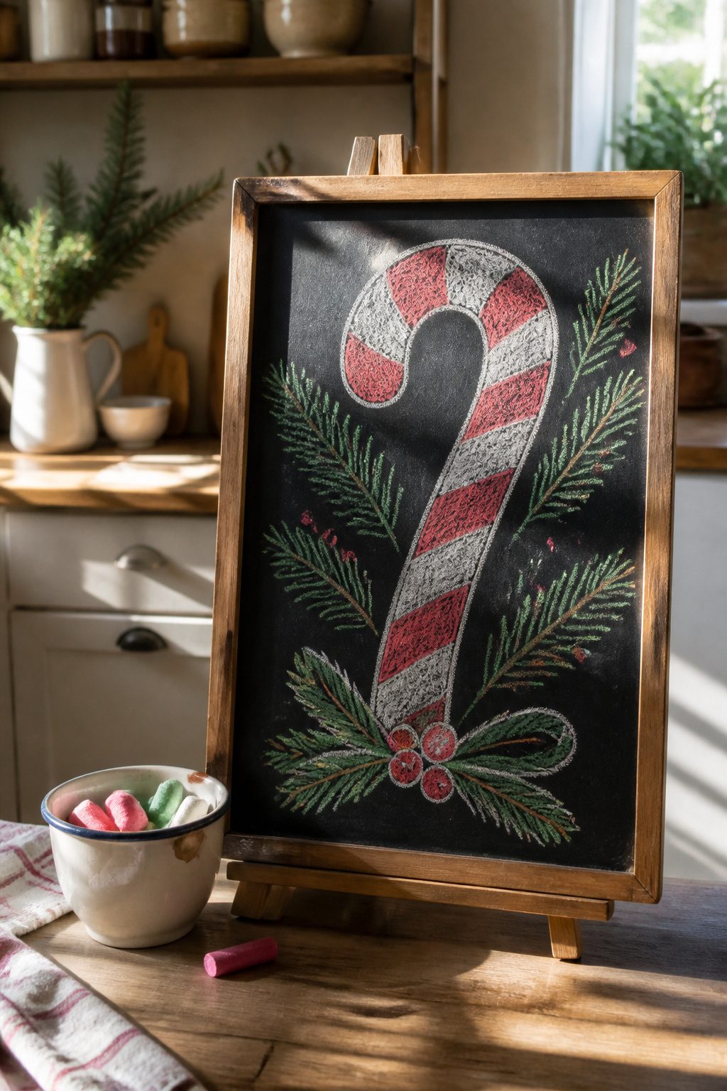
The candy cane greeting works best when the phrase sits inside the curve, not above it. Draw two parallel arcs first, like a parenthesis lying on its side, then connect the ends with a short straight line for the hook. Alternate red and white chalk in half-inch bands for the classic stripe, or keep the whole thing in white if your board is already busy with other doodles.
Red chalk can look muddy against a black background, so pressing harder than you would with white helps the pigment read. I learned that after a few passes where the red barely showed up in photos. For a cleaner edge, draw the stripe boundaries in white first, then fill the gaps with red rather than trying to stripe freehand.
The minimalist version, all white, takes about three minutes and still reads as festive because the shape itself carries so much holiday weight. Either way, the cane makes a natural frame for a short word like "Joy" or "Hi" tucked into the curve.
3. Snowflake Magic
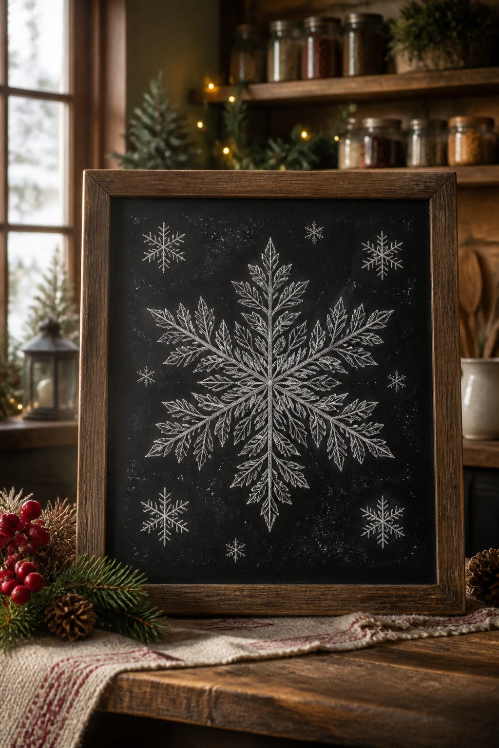
A single large snowflake can carry a whole board if you give it enough detail. I start with a light cross in the center, then add the smaller branches at 45 degrees so the arms look lacy rather than stick-straight. The branching pattern matters: each main arm gets three sets of V-shaped notches, and every notch gets its own tiny fork. That density reads as "impressive" from across the room where a sparse flake would look half-finished.
I place this one dead center, usually above a mantel or the serving table where people actually pause. The cluster approach from the other section works better along a border or above a doorway, where viewers are moving past. One detailed snowflake demands stillness and a few seconds of attention, so give it a spot that earns that pause. White chalk on matte black is enough; metallic or colored accents on the branching tips tend to muddy the geometry at a distance.
4. Festive Bow
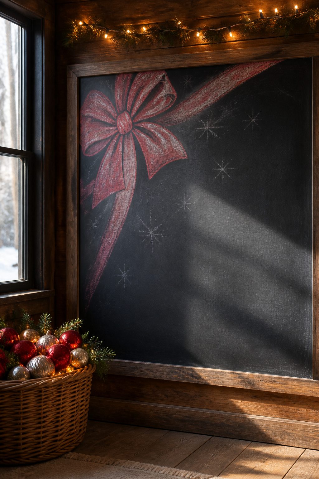
A ribbon bow reads as fabric rather than flat ribbon when the loops overlap and the tails fold back on themselves. I draw the central knot first, then sketch two loops that bulge slightly at the top and pinch where they tuck behind it. The tails hang down with a gentle curve, one crossing in front of the other so the back tail shows only at the edges.
Chalk makes the soft shadow almost automatically. Where the loop passes behind the knot, I rub the edge with my fingertip while the chalk is still fresh. The same smudging works where the tails overlap: a light drag of the side of the chalk stick, then blend with a dry cloth. The front surface stays clean and bright, the hidden parts go gray, and the bow lifts off the board without any real shading skill.
The mistake is drawing every edge crisp. A bow that looks folded needs blurred edges where fabric presses against fabric, so I stop myself from lining the back loop too sharply. One or two soft passes beats five careful outlines.
5. Gift Box Delight
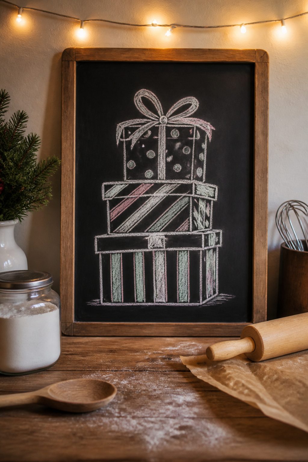
A pile of presents reads as three-dimensional once you nail one angle: draw the top face of every box as a rhombus, not a rectangle, then let the side faces angle down from its corners. Two parallel lines for each visible edge do the trick; the eye fills in the rest.
For wrapping-paper patterns, skip detail and go with repetition. Candy stripes need only three or four diagonal strokes per box face. Polka dots become rows of small circles, staggered so the second row sits in the gaps of the first. Gift ribbon gets two loops and a short tail, drawn loose so it looks like it was tied in a hurry.
The stack works best with three boxes, largest on bottom, each offset so a corner of the box below peeks out. That peeking corner is what sells the depth; hide it and the pile flattens into a cutout.
Chalk smudges easily here, so the pattern marks should stay simple enough to redraw if your sleeve drags. My first attempt at plaid took twenty minutes and vanished the moment I leaned in to add a bow. Stripes took under a minute per box and survived the whole evening.
6. Snowy Words
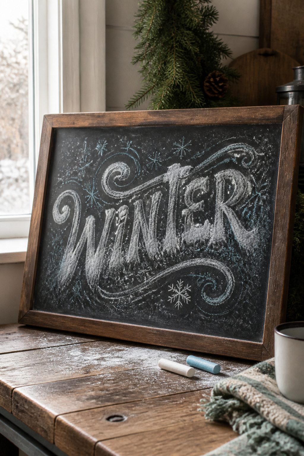
Snowy words work best when the letters themselves look like they are accumulating drifts. I start with a heavy line weight at the base of each character, then taper the stroke upward so the top third is barely there. A soft pencil sketch underneath helps, since chalk dragged over a rough board will skip and fight a shape that is not already settled.
The dusting effect comes from the side of the chalk, not the tip. I lay the stick almost flat and flick upward from the baseline, letting the pigment break apart into scattered particles. On a black board, white chalk alone reads as flat and graphic; pale blue or a whisper of lavender underneath the white catches the cool shadow that real snow throws, and that is what makes it look like weather rather than decoration. Green chalkboards are trickier. White can turn yellowish against that background, so I reach for a light mint or a barely-green gray as the underlayer, then tap white over it with a cotton ball so the edges stay soft.
The weighted-bottom style suits short words: "NOEL," "JOY," "WINTER." Longer phrases start to look like they are sliding off the board if every letter carries that same heavy base, so I alternate, giving only the capitals the full drift treatment and keeping the lowercase lighter.
7. Snowman Sketch
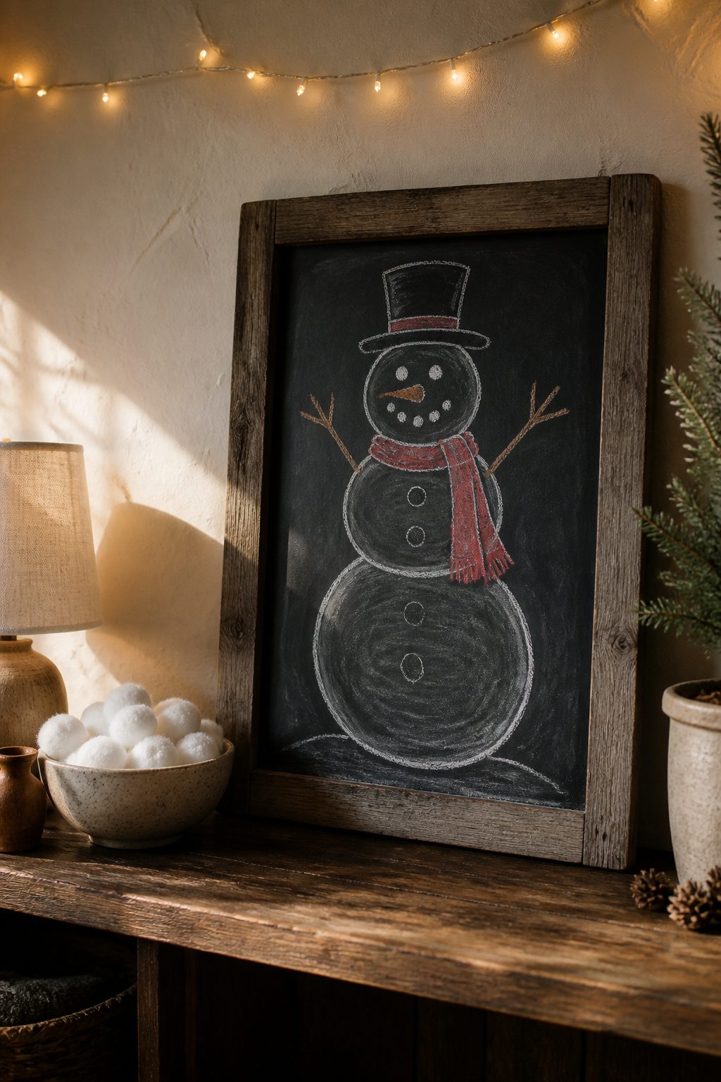
Three stacked circles, two stick arms, and a face made of coal dots still reads as a snowman even when the drawing is rough. A bright chalk scarf in red or teal does the real work of making the figure lift off a dark board, since the white chalk body alone tends to sink into the background. I learned the button placement the hard way: dead center down the middle circle looks tidy on paper but reads as a spine on a chalkboard. Offsetting the buttons slightly to one side, as if the snowman is turned a quarter view, gives the body weight and keeps the whole thing from looking like a diagram. The arms angle best when they reach upward rather than straight out; it suggests the surprised, pleased posture that makes a snowman feel alive instead of posed.
8. Stocking Trio
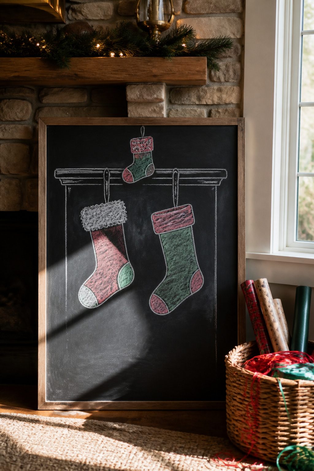
Stockings in graduated sizes read better on a chalkboard than three identical shapes. The smallest hangs about two inches below the mantel line, the medium another inch past that, and the largest drops lowest so the group forms a loose triangle. The mantel itself is just a straight horizontal rule, maybe with a few short vertical strokes suggesting hooks, and the weight of the stockings does the rest.
Each cuff needs its own texture so the eye can tell them apart from across the room. One gets simple crosshatching for a knit look, another a row of loose loops for fur, the third a scalloped edge. The empty stocking body hangs in a clean elongated U; the stuffed version gets one bulge low and center, like a toe heavy with an orange. I draw the empty shape first in chalk, then add the bulge if the board has room, since the stuffed silhouette can crowd its neighbors if the spacing is tight.
9. Nativity Scene
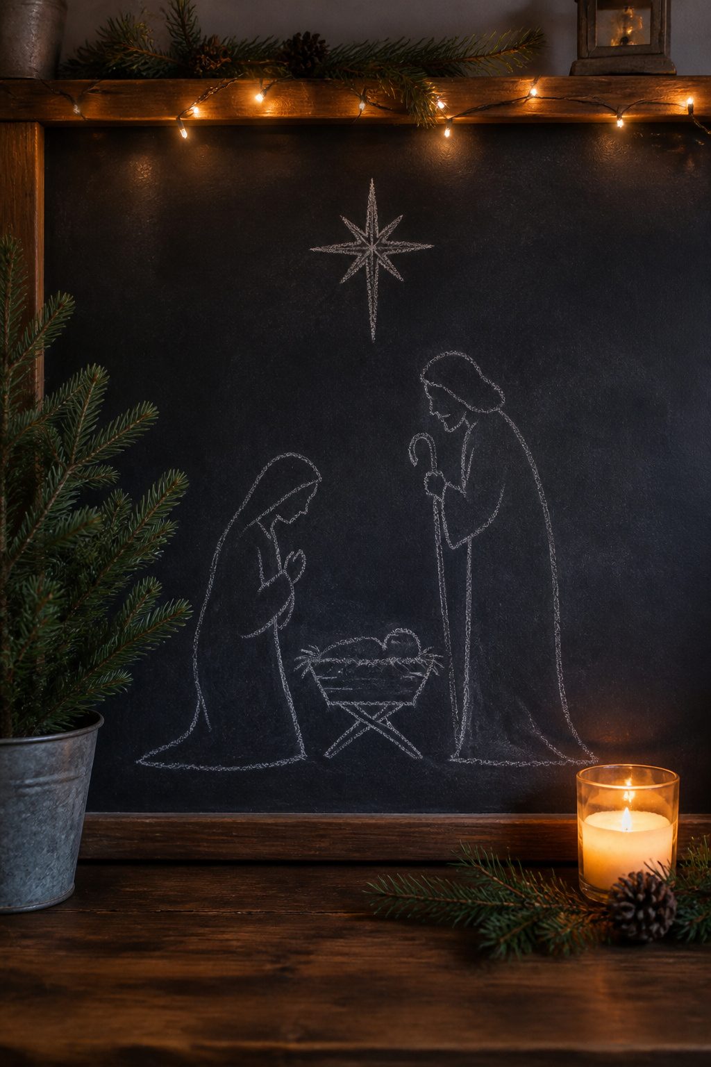
A nativity scene on chalkboard carries a different weight than the snowmen and candy canes. The religious meaning sits right there on the surface, and the figures, Mary, Joseph, the manger, ask for a dignity that a cartoon reindeer doesn’t. Freehand those human forms and the proportions slide wrong fast: heads too large, bodies too stiff, the whole group looking like a child’s stick drawing rather than a quiet scene.
Tracing fixes this without requiring art-school anatomy. Engineer prints, the large-format black-and-white copies that run about a few dollars at office supply stores, let you blow up nativity clip art to chalkboard size. Rub chalk across the back of the print, tape it face-up to your board, and trace the lines with a pencil. Lift the paper and faint chalk outlines remain, ready to darken.
The stable itself is simpler: three angled lines for a roof, two more for walls. I keep the animals basic, a block body and stick legs for the donkey, a hump and neck for the camel. The human figures are where the tracing pays off most. A damp paper towel cleans stray chalk dust when you finish, and the board erases clean in January.
10. Pinecone Frame
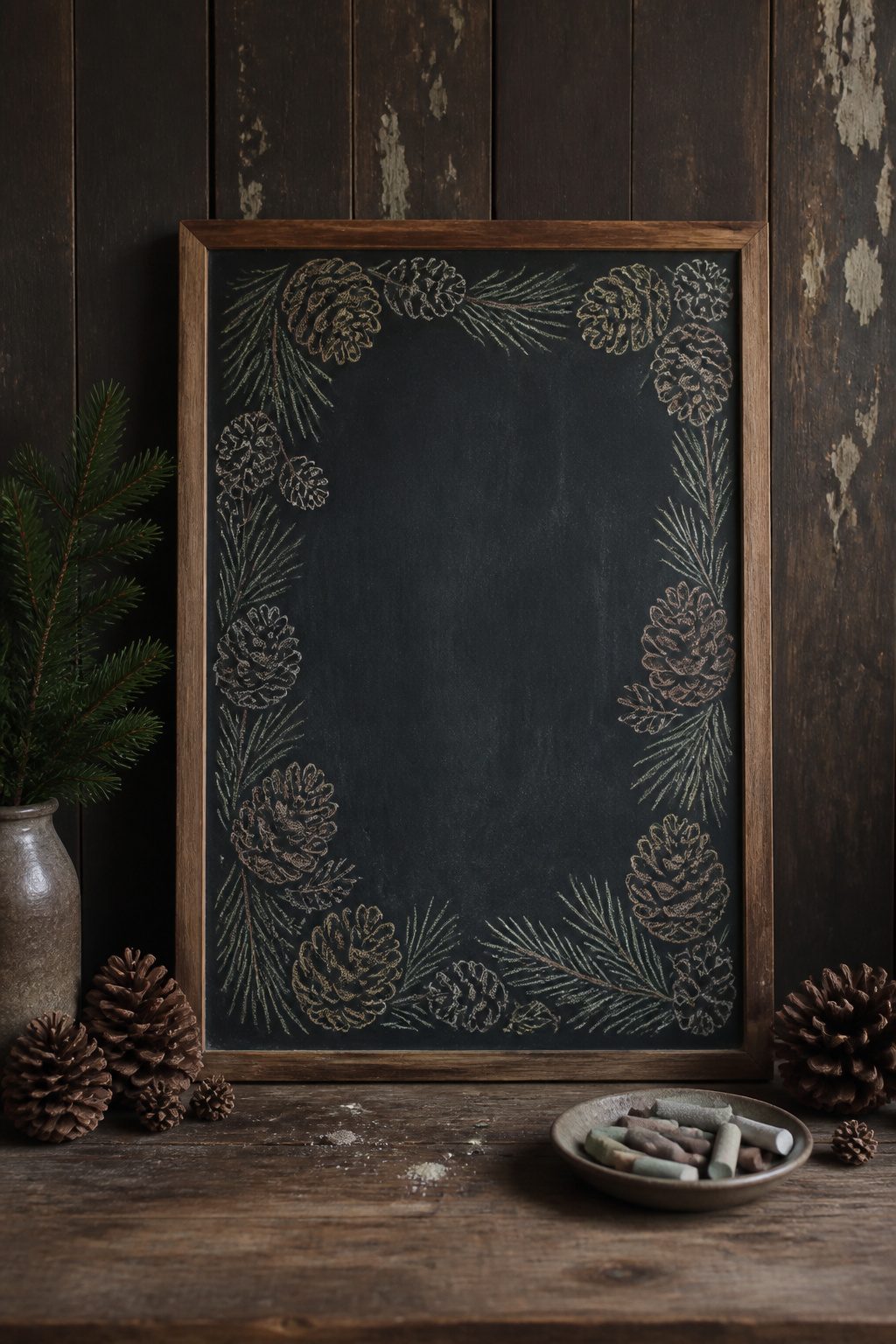
A border of overlapping pinecones and needles can frame any central message, but scale is the detail that makes or breaks it. Draw the pinecones too small and they read as brown blobs from three feet back; too large and you run out of board space before closing the rectangle. I learned this the hard way on a 24-by-18-inch kitchen chalkboard where my first attempt left the bottom right corner empty except for a single needle and an apology.
The sweet spot for a standard rectangular board is pinecones about the size of a real chicken egg, roughly two to three inches tall, with clusters of three to five needles fanning out between them. At that scale, eight pinecones handle a short top border, twelve to fourteen complete a full frame with corners that overlap convincingly. The needles hide the gaps where cones do not quite meet, so you draw fewer cones than you think you need and let the foliage do the closing work.
Start at a corner, not the center. Work outward in both directions so the overlap pattern stays consistent, and step back after every third cone to check the weight. The chalk dust on your sleeve will remind you that this is hands-on work, not a sketch to perfect in isolation.
11. Ho Ho Ho
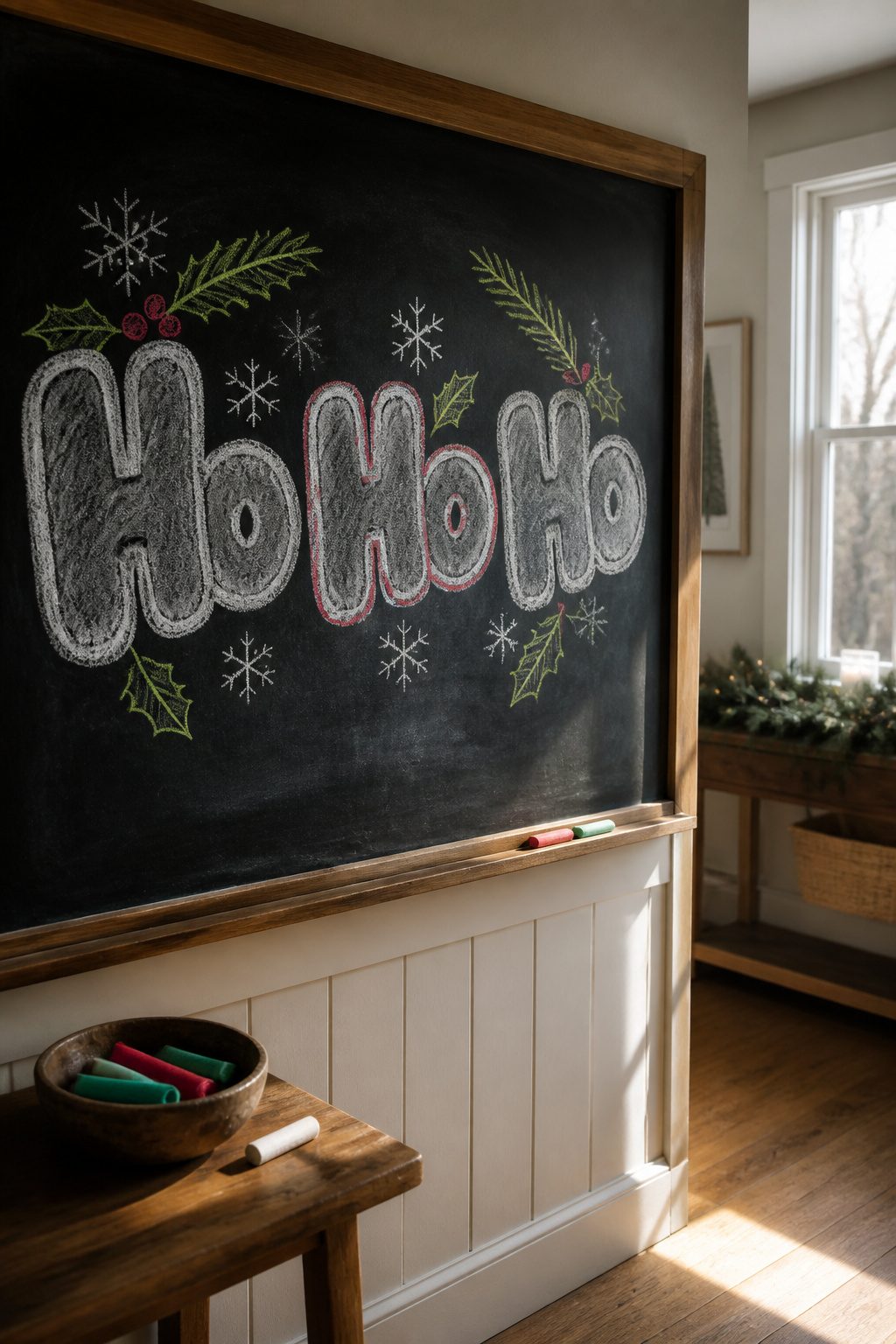
The phrase "Ho Ho Ho" lives or dies by the belly curve you put into each letter. I start with the middle H, swelling the crossbar outward so the whole word looks stuffed, then echo that shape in the first and third repetition. Three identical forms create a rhythm your eye reads left to right like a waltz, but the natural resting point lands on the middle syllable. That center O-shaped space is where a single accent color, usually a thin red line tracing the inner curve of the belly, stops the eye without breaking the flow.
Spacing trips people up. The words need to kiss close enough that the three H’s share a visual weight, but not so tight that the repeated curves muddy together. I leave about half a letter width between each word, then step back: if my eye bounces evenly across all three, the rhythm works. If it sticks on one end, the spacing is off.
The accent belongs only on the middle "Ho," never on the first or last. Color on either end arrests the motion; in the center it becomes the beat the other two syllables move around. I learned that after trying red on the last "Ho" and watching the whole phrase read backward, like a door swinging the wrong direction.
12. Elegant Swirls
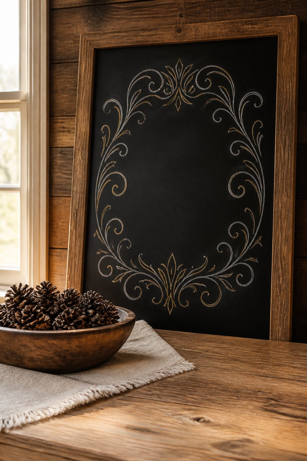
Filigree corners frame a simple "Merry Christmas" better than any wreath border, because they stay out of the way of the words themselves. White chalk on a black board, with one metallic gold or silver accent line threading through the curls, gives the eye somewhere to travel without demanding it stop. The metallic catches window light at certain hours and seems to glow against the matte white.
Where these go wrong is in overgrowth. I have watched boards where the flourishes crawled so far inward that the greeting shrank to a timid center line, almost apologizing for its presence. The rule that saved my own attempts: keep the corner ornaments inside an imaginary two-inch margin, and let the center stay open as breathing room. The swirls should feel like they are holding the words up, not climbing over them to steal attention.
A single metallic chalk costs about the same as the standard pack, so the upgrade is painless. The harder discipline is restraint. Stop one curl earlier than the sketch in your head suggests, and the whole board reads as intentional rather than crowded.
13. Christmas Pudding
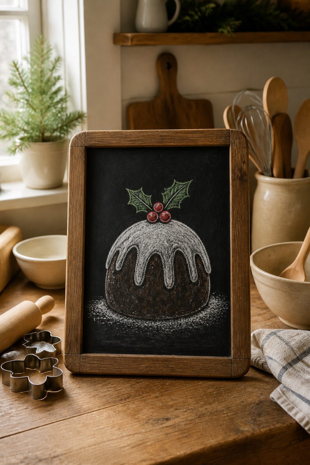
The rounded dome of a Christmas pudding reads instantly on a chalkboard, even to viewers who have never tasted one. I drew the basic shape first, a squat circle with a slightly flattened bottom, then added the dripping white icing as a thick line that pools at the base. A single sprig of holly on top, with three pointed leaves and two berries, gives the eye somewhere to land without cluttering the board.
British iconography owns this image, and most Americans recognize it from holiday cards or period films rather than their own dinner tables. That unfamiliarity works in your favor on a chalkboard; guests pause to look closer, which is half the point of the medium. The brandy flame effect surprised me. I expected to draw upward flickers in orange and yellow, but the actual source material I studied showed a low blue haze hovering just above the pudding surface, almost like a reflection. The blue chalk layered over white reads more convincingly than the warm colors I had planned. I kept the flame small, a thumb-sized smudge of color, so it would not compete with the bold pudding outline.
14. Pine Branch
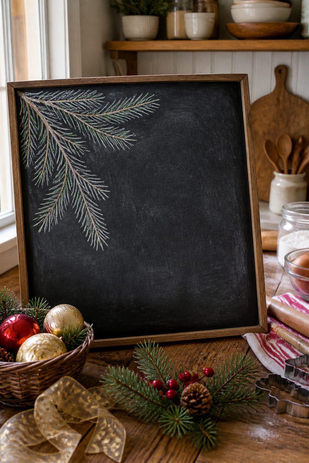
A single pine branch anchors almost every Christmas chalkboard I do, either tucked in a corner or repeated into a loose garland across the top. The mistake most people make is drawing each needle separately, which takes forever and ends up looking spidery. The stroke that saves time is a flicking motion with the chalk edge, not the tip: hold the stick almost flat against the board and pull outward in short, grouped bursts. Three or four flicks clustered tight at the base read as a needle bundle from a foot away, while individual lines only read as nervousness up close.
For a corner accent, start with a curved central stem, then add clusters on alternating sides so the branch hangs naturally. If you want a garland effect, draw two branches meeting at a gentle V and repeat that unit; the negative space between the Vs does half the visual work. White chalk works fine, but mixing in a pale green or even a dusty blue on every third cluster gives depth without complicating the palette. The chalk dust that collects at the base of each flick can be left alone; it softens the edges and reads as shadow.
15. Penguin Pal
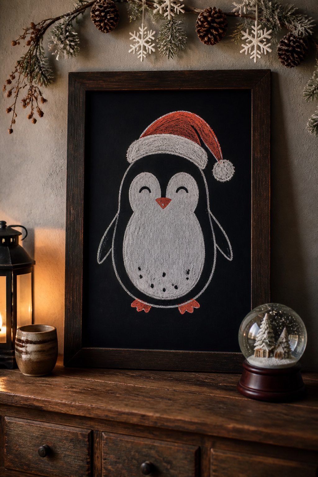
A single penguin in a Santa hat reads faster on a chalkboard than most full scenes because the shape is so simple, but the body has to be an oval, not a circle, or the whole thing turns potato-shaped and loses the cute factor. The first time I sketched one, I went almost perfectly round and the result looked like a surprised bowling pin. The oval should sit taller than it is wide, with the head merging into the body without a real neck.
The beak placement is the other trap. Instinct puts it dead center of the face, but it belongs higher, roughly where the white belly patch meets the darker back color. Too low and the penguin looks permanently confused; too high and it reads as a nose instead of a beak. I aim for about one-third down from the top of the oval, angled slightly upward.
The Santa hat is just a soft triangle flopped to one side, with a pom-pom sketched in loose loops. Keep the brim narrow; a thick band overwhelms the small head and throws off the proportions you just fixed. Three colors, four shapes, and you’re done in ten minutes.
16. Star of Joy
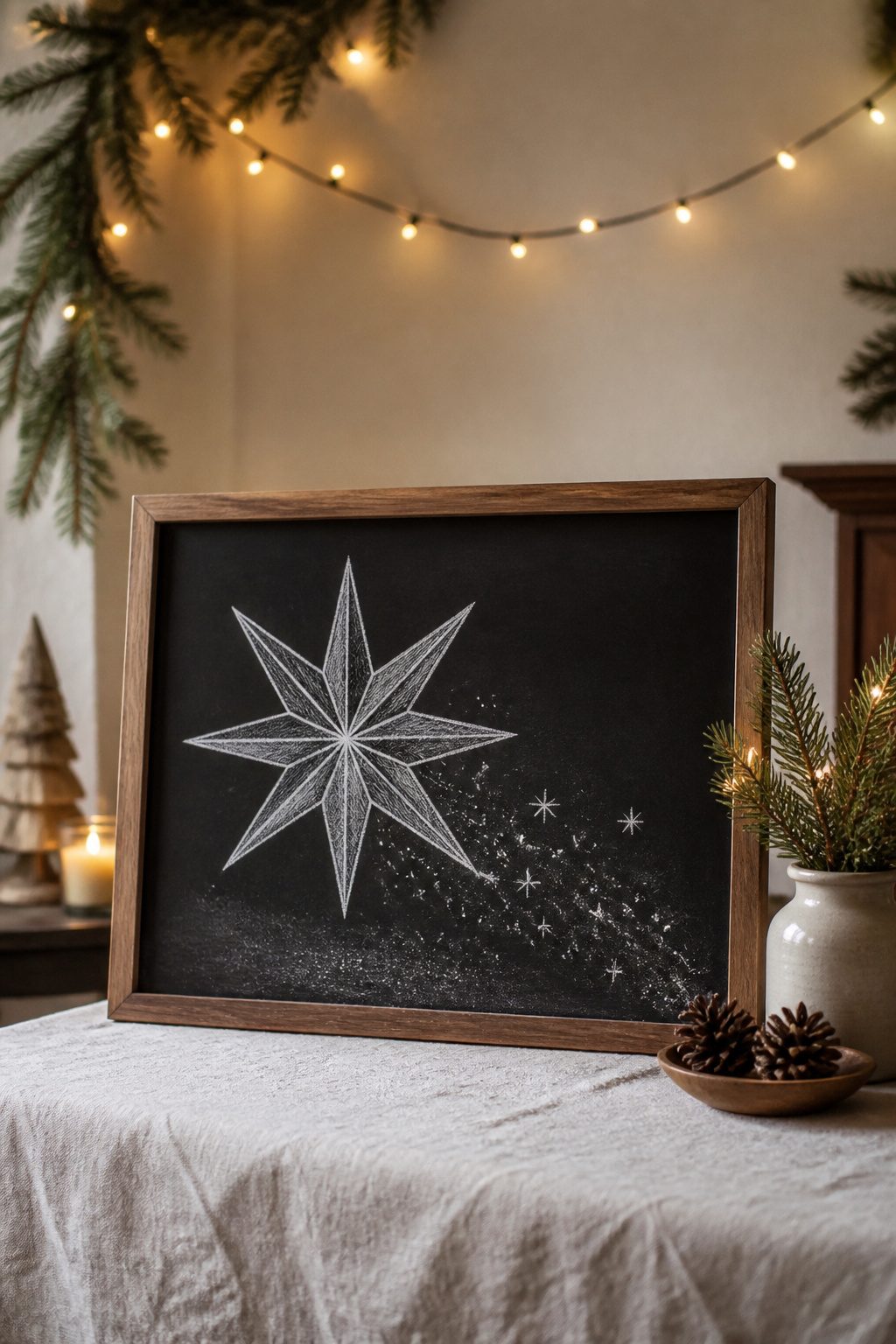
A multi-point star reads as dimensional on a chalkboard when the shading lands in the right spots, and the fastest way to get there is starting with a plus sign and an X instead of freehanding eight points around a circle. The two lines give you the skeleton, and connecting the outer intersections builds the shape in about thirty seconds. I draw the plus a little taller than it is wide so the star points upward naturally; the X crosses at the same center, and where those eight lines hit your intended edge is where the star takes shape.
The dimensional part comes from picking one light direction and sticking to it. I shade the faces that would sit in shadow, usually the lower-right planes if my light source is upper left, and leave the upper-left faces bright. A trailing light effect behind the star is just a series of smaller, fainter stars or dashed lines tapering off, drawn with the edge of the chalk rather than the tip so the line breaks up. On my first attempt I shaded every other point randomly and the whole thing flattened out; the light has to move across the shape consistently or the eye reads it as decoration, not depth.
17. Christmas Bow Charm
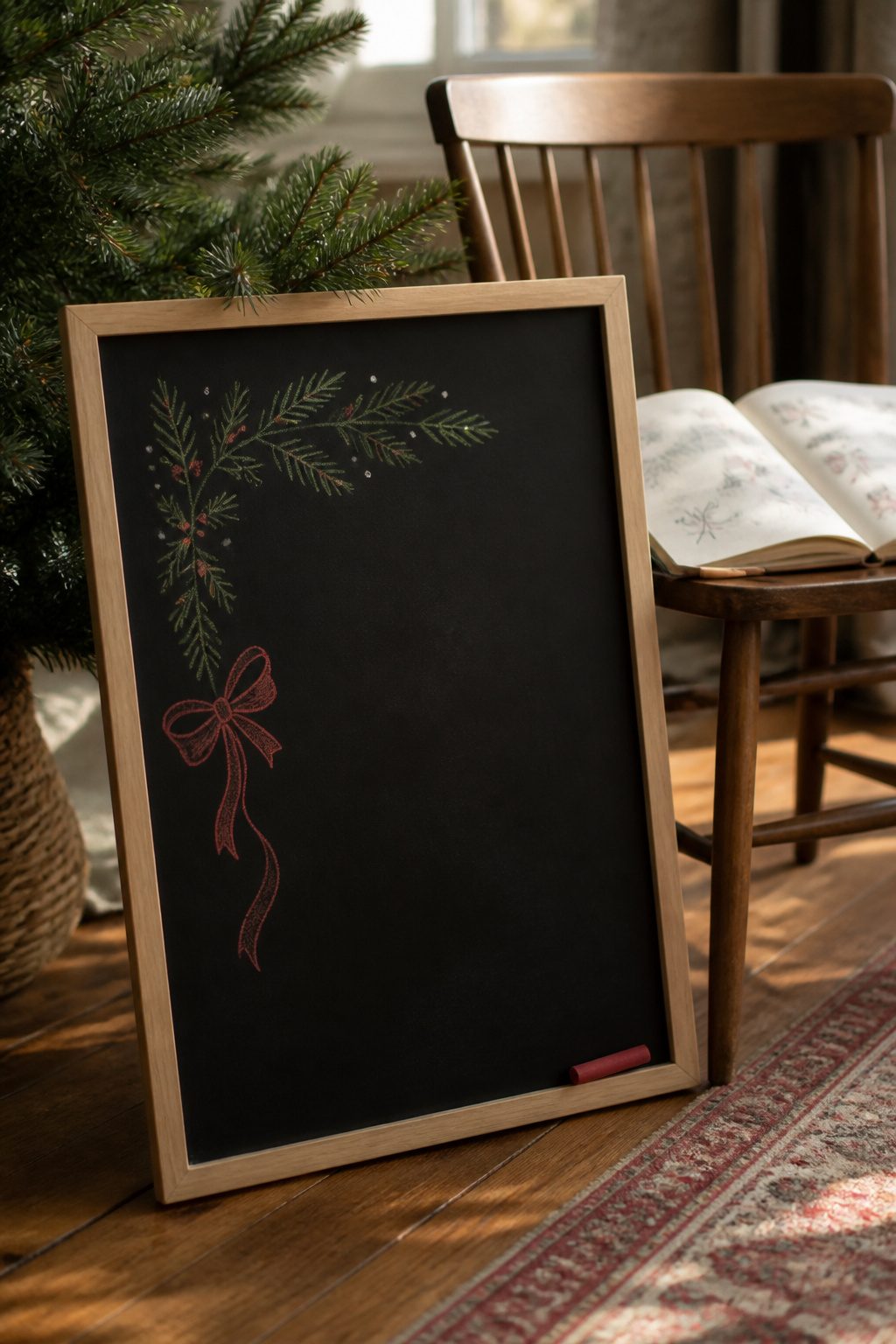
A small bow lands differently than the showpiece kind. Where the Festive Bow wants center stage, this one belongs tucked beside lettering or tied to a corner, repeating quietly across a border.
I learned the scale by accident last year. My corner bow started life the same size as a standalone ribbon, and it swallowed the "NOEL" beside it. Redrawing at about one-third that scale fixed the proportion. The loops stay simple, two or three curved strokes each, with a single tail curling away from the text so nothing competes for the eye.
Placement matters more than detail here. Tied to the upper left of a menu board, the bow reads as a gift tag. Run in a loose row down a margin, it becomes wrapping paper logic without the fuss of full boxes. Chalk smudges work in your favor: a slightly softened edge helps the bow sink back while your lettering stays crisp.
The repeat pattern is where this design earns its keep. Four or five bows scattered around a grocery list or countdown corner fill space without demanding a full scene. Keep the direction random, some tails left, some right, so the rhythm stays hand-drawn rather than mechanical.
18. Merry & Bright Magic
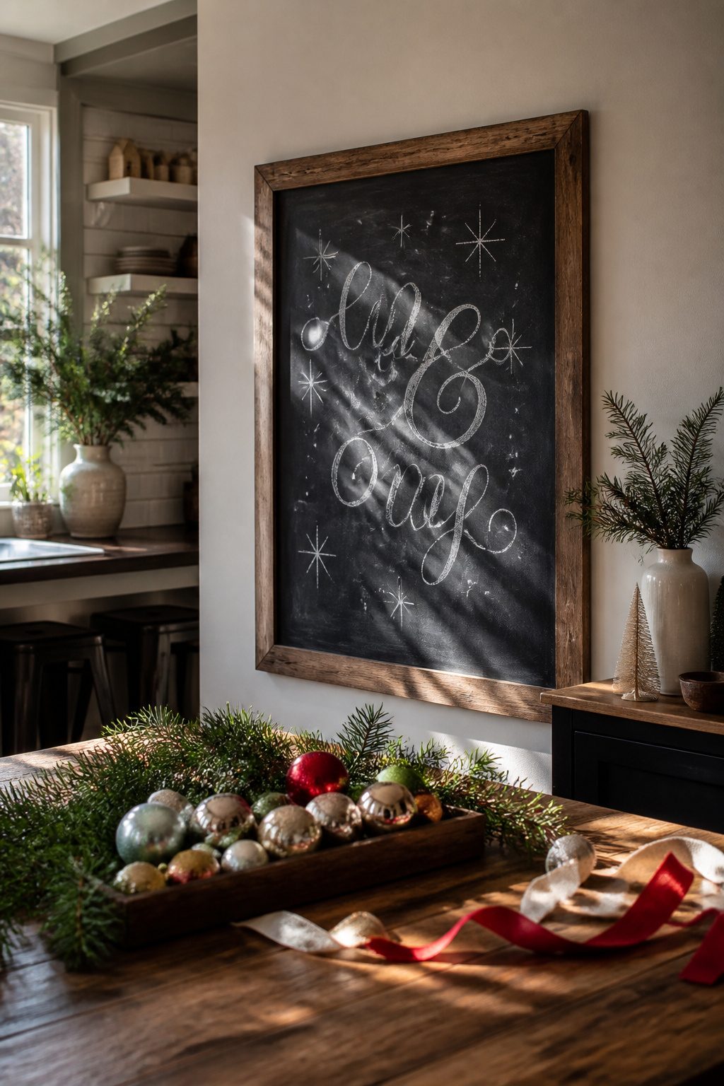
The ampersand in "Merry & Bright" does the heavy lifting, so the words around it can stay simple. I drew mine too small the first time, crowding all three elements into the center of the board like a logo stamp. The letters touched and the ampersand lost its shape entirely.
Space between the words matters more than the letters themselves. Give "Merry" and "Bright" room to breathe, almost as if the ampersand is a piece of furniture between two walls. I now leave about two finger-widths of blank board on each side of the &, then fill that gap with tiny stars or dots that trail outward like sparks. The negative space makes the phrase read instantly from across the room, which is what you want on a kitchen chalkboard someone glances at while grabbing coffee.
For the ampersand itself, a single-stroke loop with a small curl at the baseline reads cleaner than the fancy double-loop version. I tried the elaborate one once; from ten feet away it looked like a pretzel.
19. Snow Globe Wonder
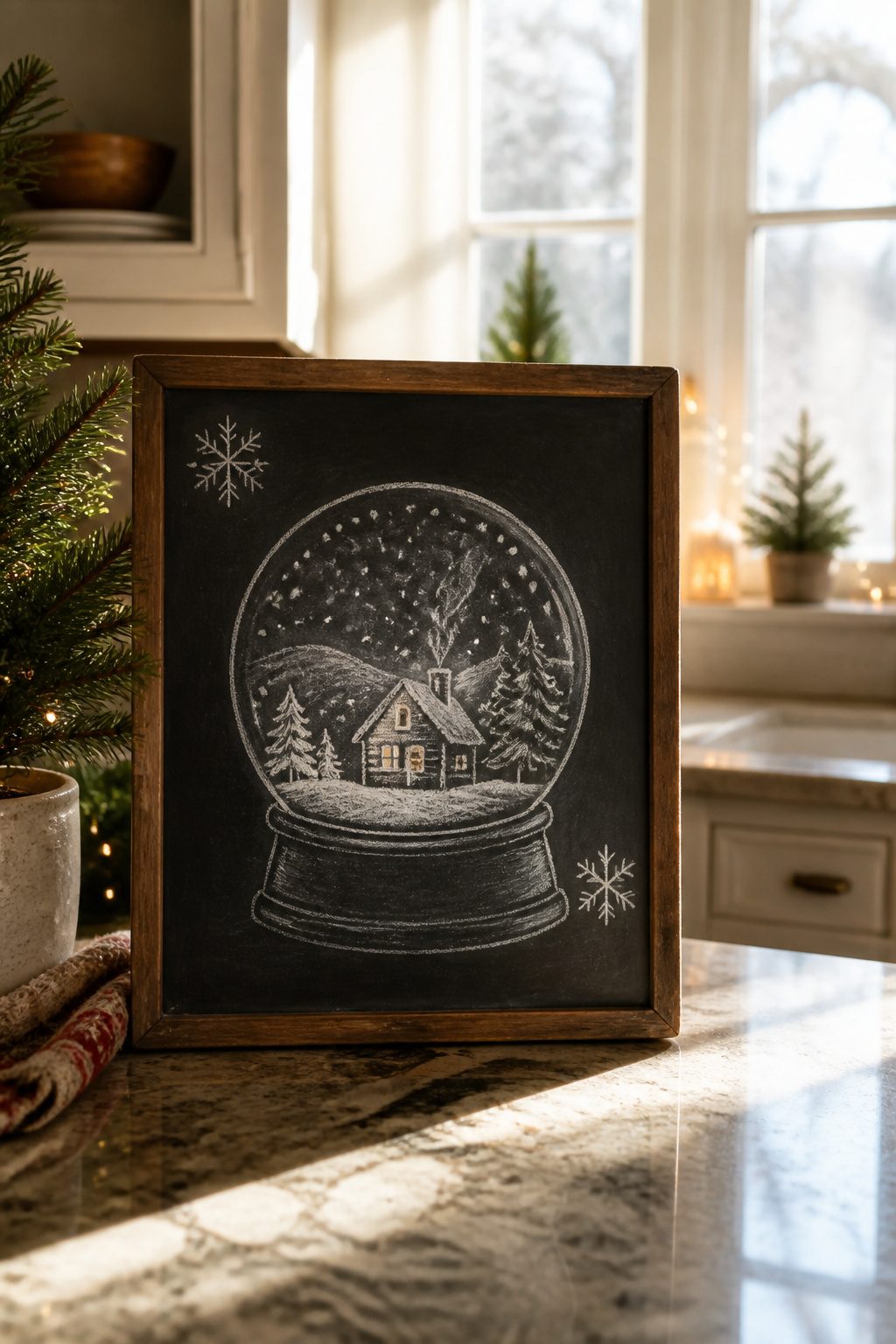
A snow globe is one of the most forgiving shapes on a chalkboard because the curved glass does the perspective work for you. The rounded edge naturally softens any wobble in your rooflines or tree angles, and the base gives the whole drawing a place to sit so it never feels like it’s floating.
I usually start with the base, a simple rectangle with a slight curve to suggest the wooden stand. The globe itself is a circle, and I freehand it rather than tracing anything because a perfect circle looks machine-made against chalk’s texture. Inside, three layers of depth read instantly: a back layer of distant hills in pale gray, a middle row of trees in medium green, and a single cottage or figure up front in white with a warm window glow.
The trick that saves the composition is keeping the snow heavy at the bottom and sparse toward the top. Real snow globes settle that way, and your eye expects it. A light tap of white chalk on a fingertip, flicked downward, gives you falling flakes without the mess of drawing each one.
The base also hides your worst smudges. By the time you’ve added the snow, your lower edge is usually chalk-dusty, and that dusty band becomes the shadow under the globe’s rim.
20. Evergreen Delight
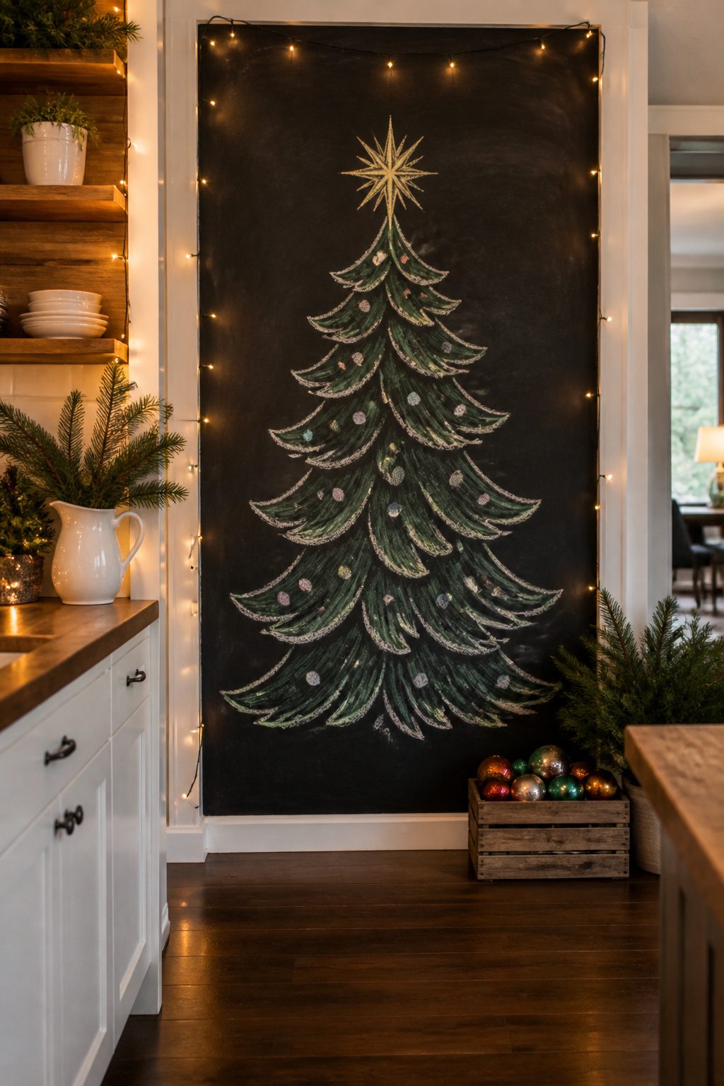
A full Christmas tree fills a chalkboard better than any other single shape because the branches give you built-in texture. I start with the trunk, a short rectangle at the bottom, then build upward in three or four stacked tiers of wavy horizontal lines. Each tier gets slightly narrower as it climbs, and the top tier pinches to a soft point. The wavy edges are the needles; keep them loose and irregular, not sawtooth perfect.
The ornament mistake took me two holiday seasons to stop making. I used to draw the circles and diamonds first, then try to wrap branch lines around them. The result looked like ornaments pasted onto a flat triangle, not a tree with depth. Branches first, ornaments second is the only order that works. The branch lines run behind the ornaments naturally, and the overlapping gives the whole shape weight.
For ornaments, six to ten simple dots or short ovals scattered across the tiers read clearly from across a room. A single star or bow at the top finishes it without crowding the board. White chalk handles the whole drawing; if you want one accent, a pale green or gold for a few ornaments is enough.
21. Silent Night Serenity
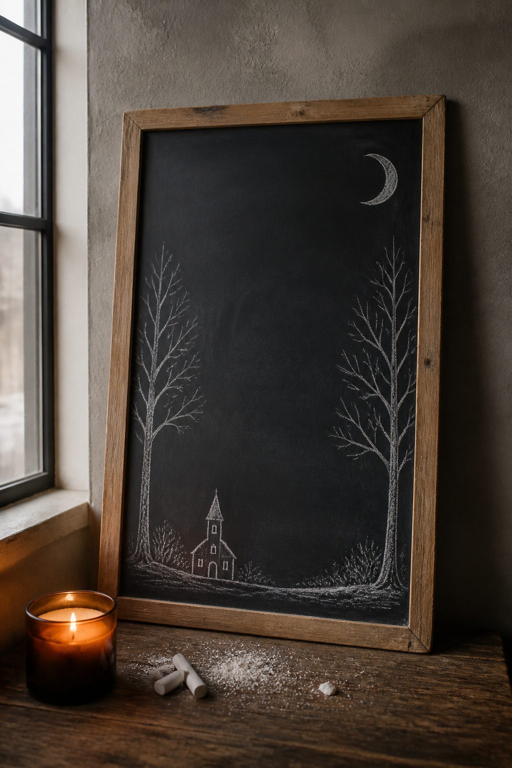
The black board itself does the work in this design. Instead of filling every corner, you leave most of it untouched, and the chalk marks read as moonlight, bare branches, and maybe a small church spire off to one side. The negative space is the point. What convinced me, looking through dozens of these boards, is how much harder that restraint is than covering the surface. A single thin crescent moon, two or three skeletal trees with branches drawn in quick white strokes, and a tiny dark silhouette of a chapel roof near the bottom edge. That is all.
The trees want a dry, almost scratchy line. Press too hard and the chalk goes powdery and thick; a light hand gives you the brittle look of winter branches against actual night sky. The board stays black for about seventy percent of the surface, which also means this is the fastest design to refresh if you smudge a branch. A damp cloth on just that corner, ten minutes to redraw, and the rest stays intact. I would skip any border or frame; a line around the edge would turn the board back into a picture hanging on a wall rather than sky you are looking into.
22. Gingerbread Garland
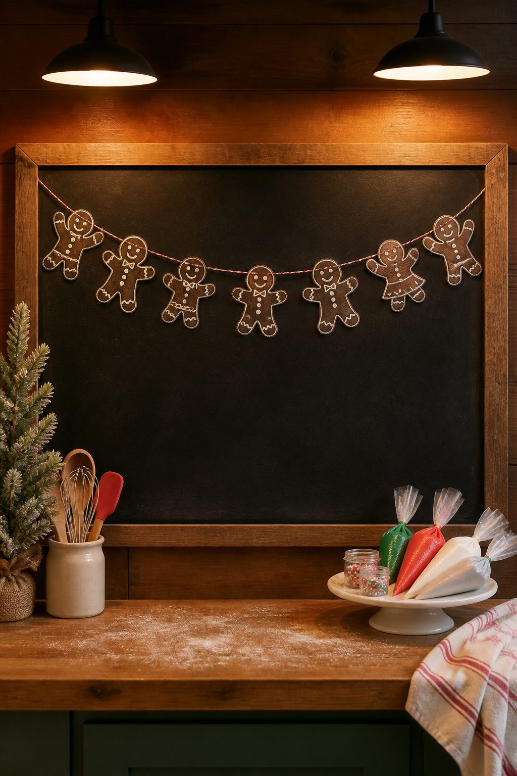
A string of gingerbread figures strung across the chalkboard reads like a holiday bakery window, but the charm fades fast if every cookie looks stamped from the same cutter. Trace your first figure faintly for each neighbor, shifting the arm position or the tilt of the head just enough that the row feels hand-drawn, not cloned.
I start with one full-detail gingerbread person in the center: two dot eyes, a squiggle smile, three buttons down the front. For the next figure, I lay a piece of scrap paper over the original and rub lightly with chalk to pick up the outline, then transfer that ghost shape an inch or two to the left. The tracing gives me the same proportions so the garland hangs level, but I redraw the face freehand. One gets a surprised O mouth, another a bow tie instead of buttons, a third has one arm raised like it’s waving. The repetition keeps the composition tight; the variation keeps it alive.
The buttons are the quickest way to add personality. A line of three dots, two offset squares, or a single row of short chalk dashes each read as different cookie batches. Icing drips at the wrist or ankle take ten seconds and break up the silhouette even more. The whole garland, six to eight figures across a standard chalkboard, takes maybe twenty minutes once the first shape is settled.
23. Reindeer Welcome
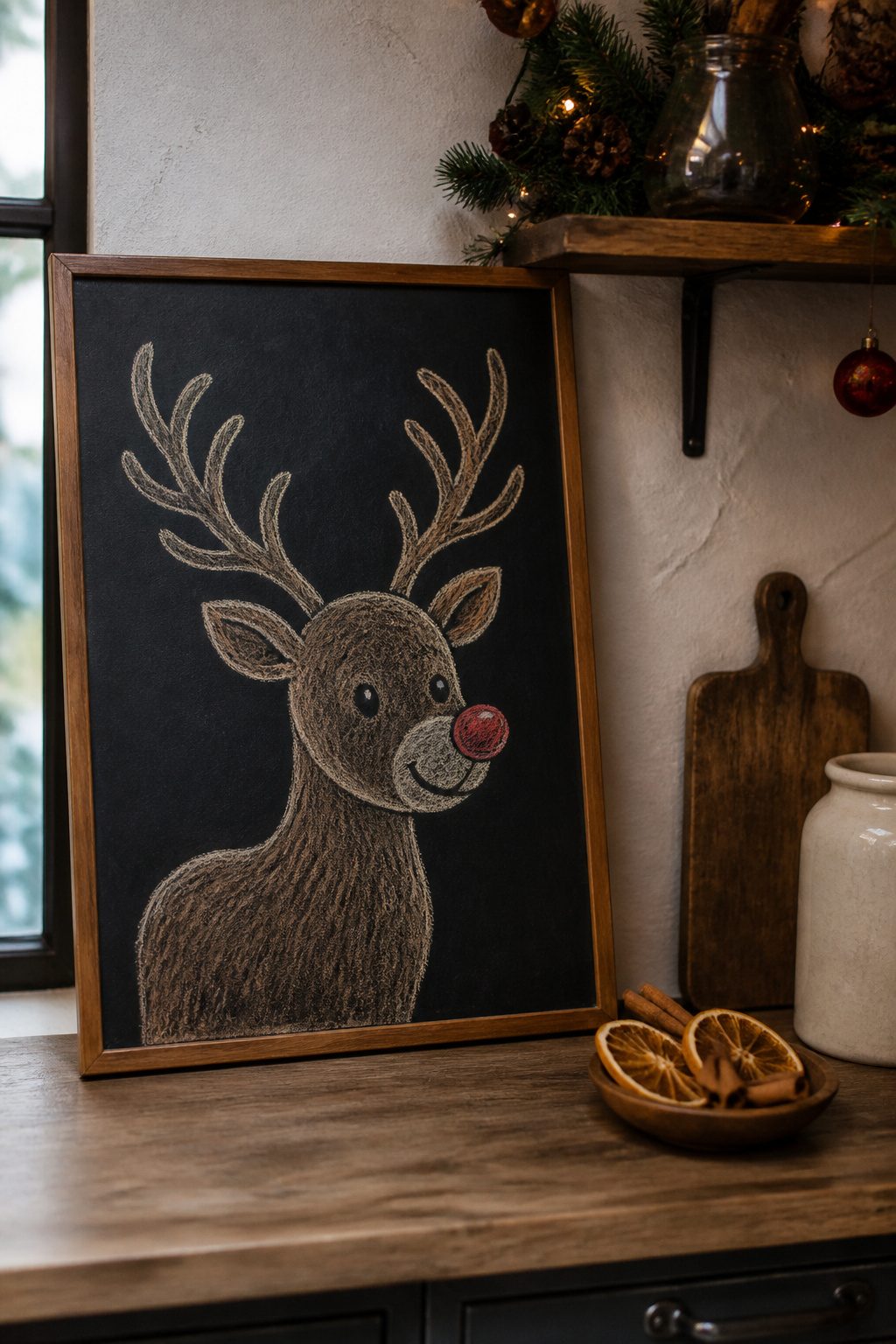
The antlers on a reindeer chalkboard doodle are what separate the cute from the chaotic. I learned this the hard way after free-handing a set that looked like two different animals had shed them on my board. The branching pattern that saves symmetry without a ruler starts from a single upward V, then adds a smaller V inside each arm, and one more inside those. Three levels deep is enough for a small board; four looks busy unless you have thirty inches to work with.
The red nose is optional, but placement isn’t. Set it slightly lower than where you think the nose should sit; a reindeer’s muzzle angles forward, and centering the nose on the circle of the head gives you a pig. I drew mine with a white chalk pencil first, then filled the nose with red chalk pastel so it would actually pop against black.
For the full figure, the legs are simple tapered lines until you reach the hooves, which are just flattened ovals. The body is an egg shape tilted forward, with the neck rising from the front third rather than the center. I tried centering the neck once and the reindeer looked like it was falling backward.
The printable outline I keep on my phone saved a board I was about to wash clean last December. I had drawn a wreath, hated it, and was reaching for the wet rag when I remembered the reindeer template. I laid my phone on the counter, traced the outline in white pencil through a piece of thin paper, and had the skeleton of something better in four minutes. The board stayed up through New Year’s.
Tracing and Transfer Techniques
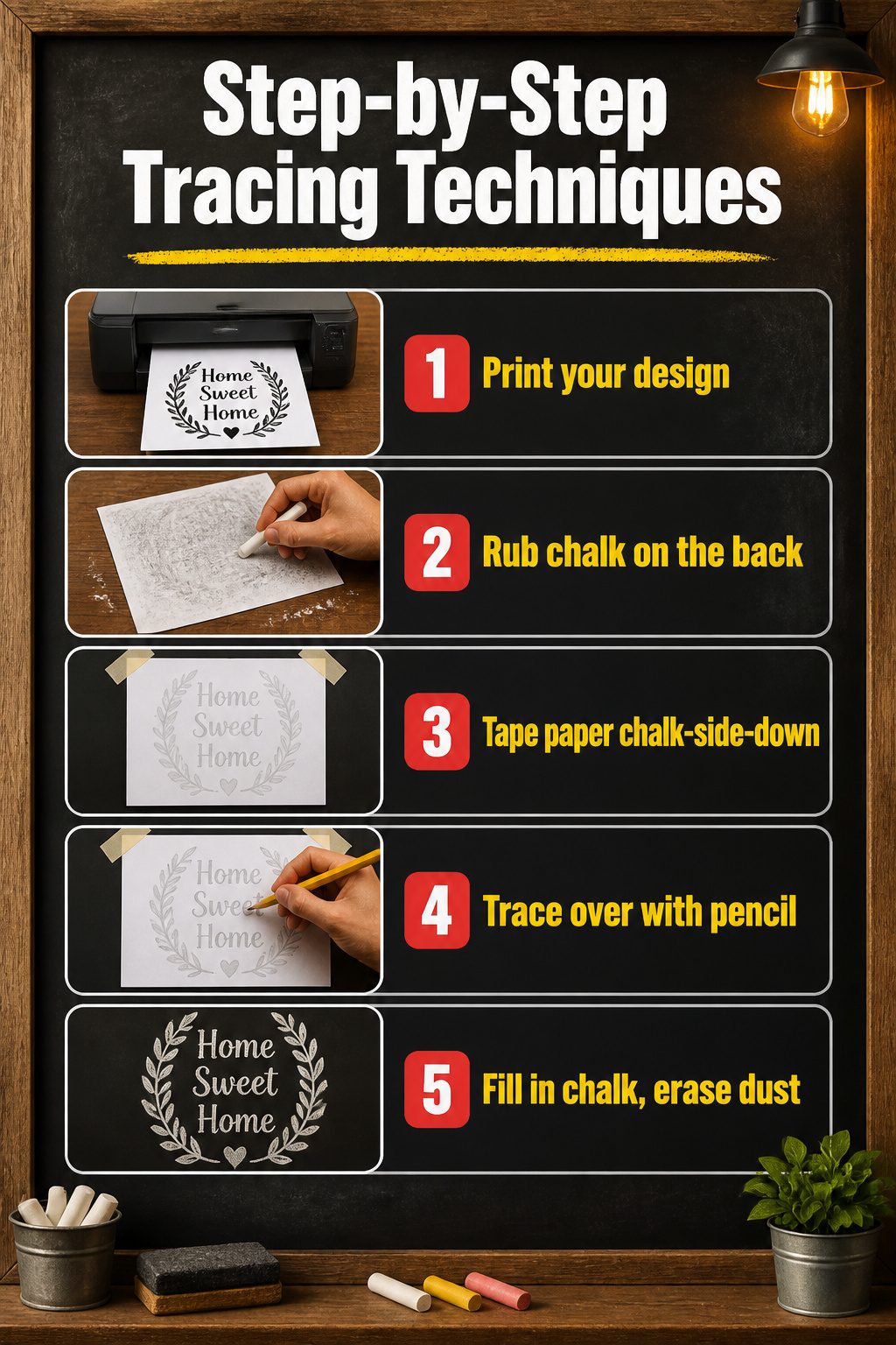
Freehand drawing isn’t a requirement for any of the designs above. A printed outline and a stick of chalk will transfer even complicated shapes onto the board with no guesswork.
- Print your design at the size it needs to live on the board. Engineer prints run cheap at copy shops, and bold black-and-white clip art transfers cleaner than gray-scale. Print any wording right-side up; the image lands on the board exactly as you see it on paper.
- Rub chalk across the entire back of the print. The dusting should be thorough and a little messy.
- Tape the paper chalk-side-down onto the board. A pencil traced firmly over every line leaves a faint chalk imprint underneath.
- Lift the paper and draw over the ghost lines with chalk, filling in solid areas as you go. A barely-damp paper towel wipes away stray dust or lines you decide against.
- The board stays up until you’re ready to erase and start the next design.
Color and Seasonal Mood
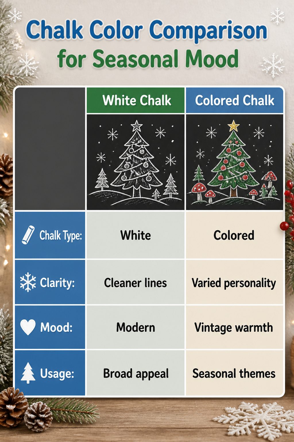
Chalk color does more work than the drawing itself. A Christmas tree sketched in soft white or pale gray reads as Scandinavian restraint, the kind of look that fits a rental kitchen with stainless appliances and no permission to paint the walls. The same tree in red and green chalk shifts the mood toward vintage holiday cards and the familiar warmth of a grandparent’s house. Cool blue and white pairings pull the scene into winter proper, less Christmas morning and more January frost, which suits households that want seasonal decor without the full Santa palette.
White chalk alone is the safest bet for modern spaces, but it demands cleaner lines since there is no color to hide a waver in the hand. Colored chalk, the dusty kind sold in packs of twelve for a few dollars, lets the gnomes and mushrooms and tiny forests gain personality through variation rather than precision. The sources favor keeping figures varied in size or color so they do not blend together on the board, and that rule applies whether the palette is muted or bright. A single-color scheme actually makes this harder, because every element competes at the same visual volume. The fix is to vary line weight instead, pressing harder for the foreground tree and barely touching the chalk for the background hills.
Family Board Nights
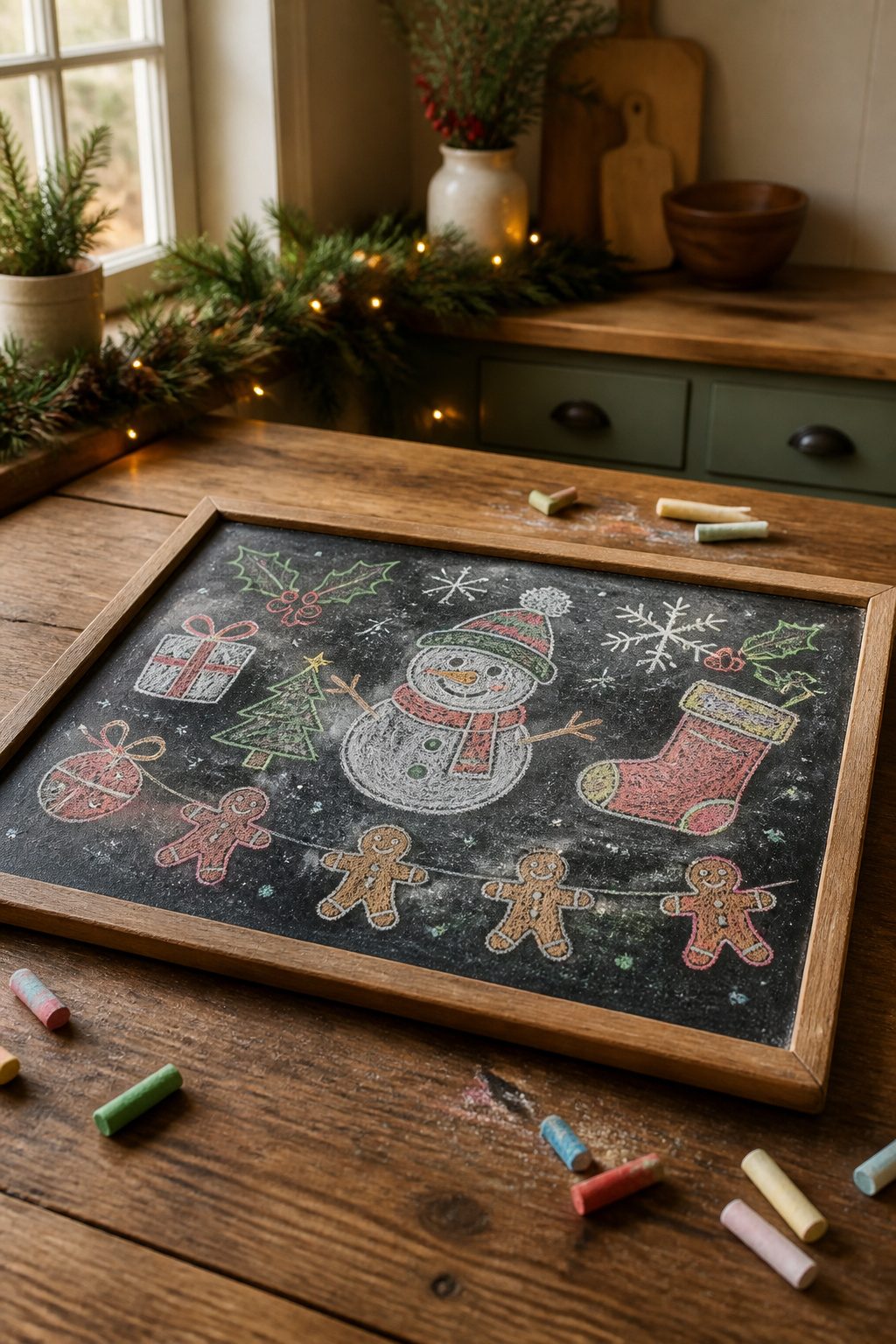
Kids under eight treat a chalkboard like a finger-painting station, which is exactly why the simpler designs in this list work best as group projects. The snowman sketch, stocking trio, and gingerbread garland all survive a heavy hand because their charm comes from round shapes and thick outlines, not precision.
I learned the hard way that adults should handle all lettering and fine-line work first, before any small helpers arrive. Once the framework is set, children can fill blocks of color, smudge snow effects, or dot berries onto holly branches. The filling stage is where they shine; my niece spent twenty minutes happily overloading a gift box with chalk dust until it looked almost velvety, and that texture turned out better than my careful version.
The nativity scene and star of joy are poor choices for mixed-age nights. Both collapse if a single line wanders, and neither forgives a wiped-clean restart well. Save those for solo drawing, or trace them lightly in advance so the group only fills predetermined spaces. A traced pine branch outline, by contrast, becomes almost impossible to ruin; extra needles just read as fuller foliage.
For the actual session, one board laid flat on a kitchen table beats a wall-mounted version. Elbows bump less, kids can lean in, and you avoid the smear cascade that happens when a child reaches upward with chalk-covered palms.
Frequently Asked Questions
How do I create chalkboard art for Christmas?
Start with a printed outline blown up to the size you need, rub chalk across the back, tape it chalk-side-down to your board, and trace with a pencil. Lift the paper and faint chalk guides remain ready to darken. A damp paper towel cleans stray dust and any lines you want to lose.
What materials do I need for chalkboard art?
You need chalk, a chalkboard surface, and printed outlines if you want to transfer designs rather than draw freehand. Engineer prints at copy shops run cheap and work well for large transfers. A damp paper towel handles cleanup and corrections.
Can I use chalkboard printables instead of drawing?
Yes, printables work well for transferring designs you do not want to sketch freehand. Bold black-and-white clip art transfers cleanly, and the same chalk-rub method applies: cover the back in chalk, tape face-up, trace with pencil, and lift.