
A styled fall mantel can run from free gathered branches to a $72 set of velvet pumpkins, and the deciding factor is usually whether you rent or own. Wax drips on a landlord’s finish turn real candles into a liability, which is why LED versions with warm color temperatures anchor most of these arrangements. The 72-inch dried garland that pools at the ends works on either budget, held by museum putty that lifts off without residue when the lease ends.
1. Real or Faux Pumpkins
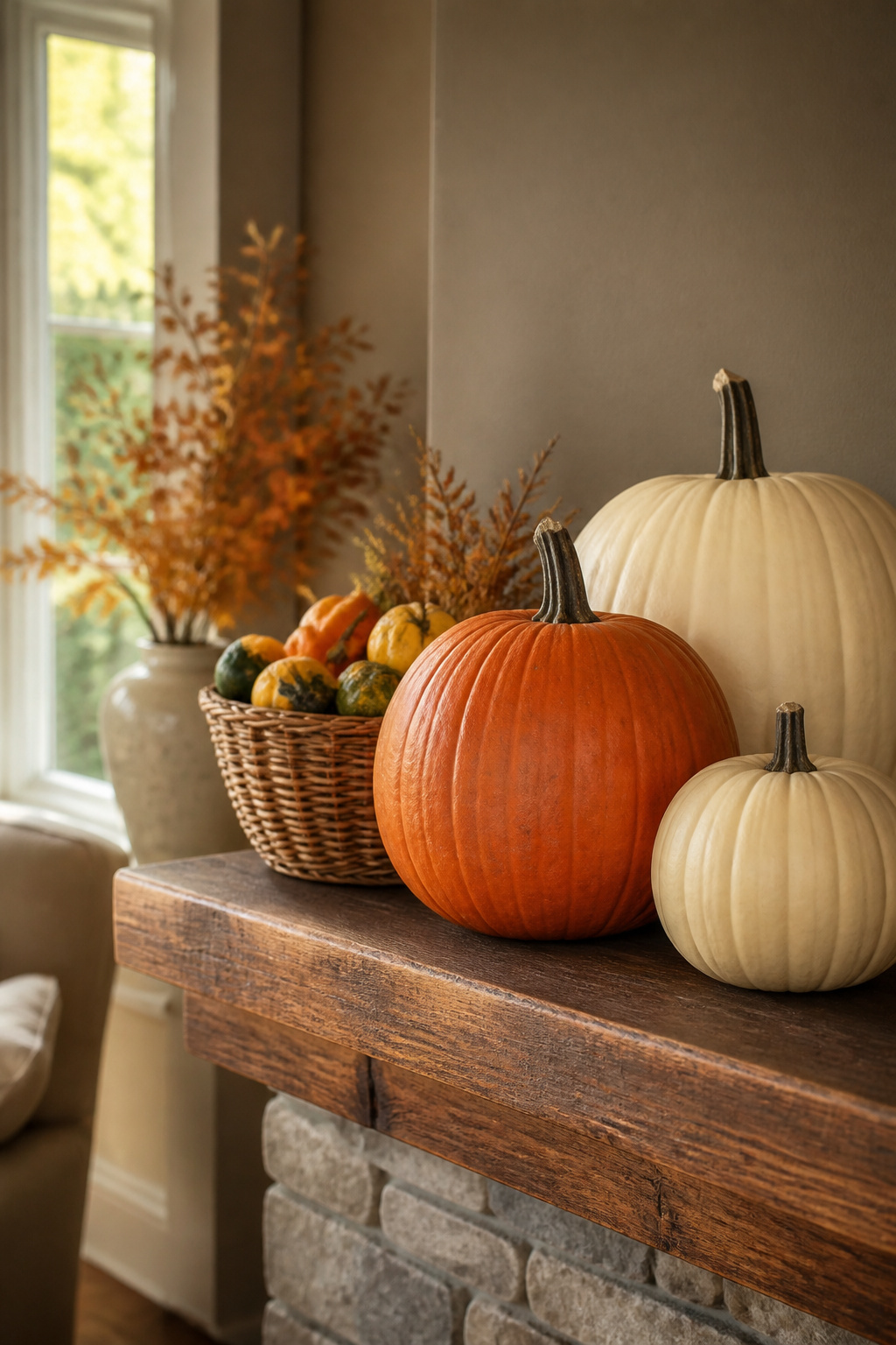
A trio of small pumpkins along the mantel adds seasonal charm without overwhelming the space. The question of real or faux comes down to budget and reuse plans. Fresh pumpkins run a few dollars each and last a few weeks; faux versions cost more upfront but store flat and come back out every September.
Orange reads loud on a mantel, especially under television glare. White and cream pumpkins keep the feeling calm and let the eye rest. One crisp example I keep in mind pairs cream pumpkins with wicker textures and a simple "give thanks" sign. The neutral palette still reads fall, just quieter.
For something more refined, small velvet pumpkins in white, gray, or cognac scatter well across a narrow mantel and group cleanly with gold candlesticks. An 18-piece set covers multiple surfaces if you decide to carry the look beyond the hearth. The weight is negligible, so they sit steady without knocking into each other.
2. Candlesticks and Candles
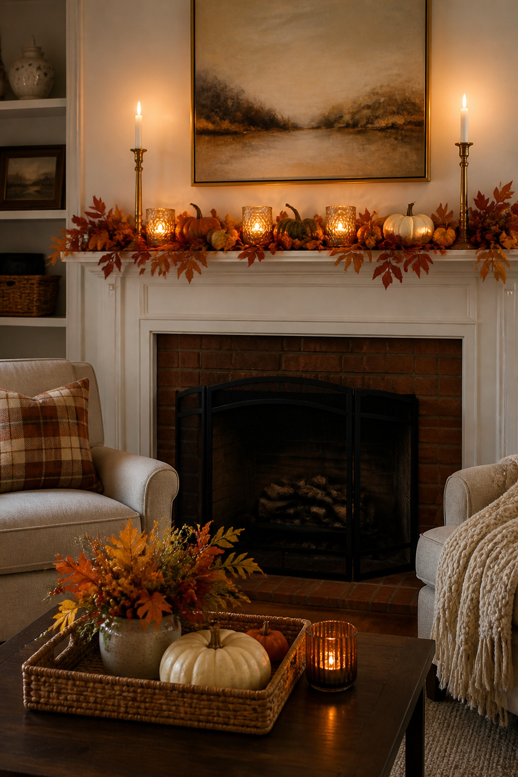
Tall brass candlesticks flanking the mantel draw the eye upward and give the whole arrangement its backbone, while shorter votives or pillars scattered in front soften the line and actually let you use the light. The mix is what keeps a fall mantel from looking like a catalog spread: the height variation creates movement, and the lower glow gives you something to look at once the sun drops.
For renters, wax drips are a real liability on a landlord’s finish. LED candles with a warm color temperature solve this without reading as plastic. The flickering flameless wax versions from Pottery Barn pass for real at a glance, and you can leave them running through a whole evening without hovering over a drip cloth. I group them in odd numbers, three or five, the way you would with live flames, and let the tallest pair anchor the ends.
3. Garland
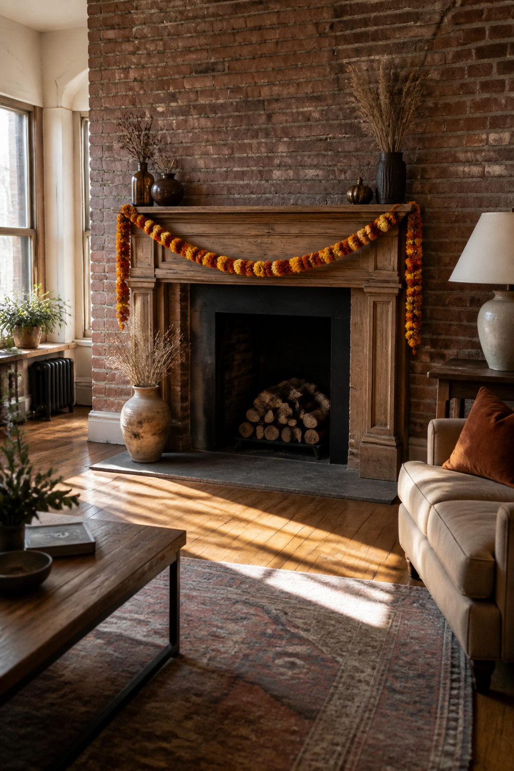
A 72-inch strand of dried marigold and strawflower garland gives most standard mantels enough length to pool slightly at the ends, which looks intentional rather than stretched. The warm, fall-toned colors in that particular handcrafted style read as a natural glow against both painted brick and raw wood.
Securing it without leaving marks comes down to weight distribution and the right anchor. Command hooks sized for garlands, placed on the underside of the mantel lip where they never show, hold lighter dried florals cleanly. For heavier weaves, a strip of museum putty behind the thickest cluster points keeps the strand from sliding without adhesive touching the mantel surface itself. The putty lifts off with no residue, which matters when your lease runs on a deposit.
Draping works best with a shallow scallop, three to four inches of dip between attachment points, rather than pulling it tight like a clothesline. Tight garlands flatten to a ribbon and lose the texture that justifies using one. If the mantel sits below a television, keep the drape low enough that stems do not cross the screen edge; nothing breaks the seasonal mood like brushing petals out of the way to read subtitles.
4. Fall Stems and Branches
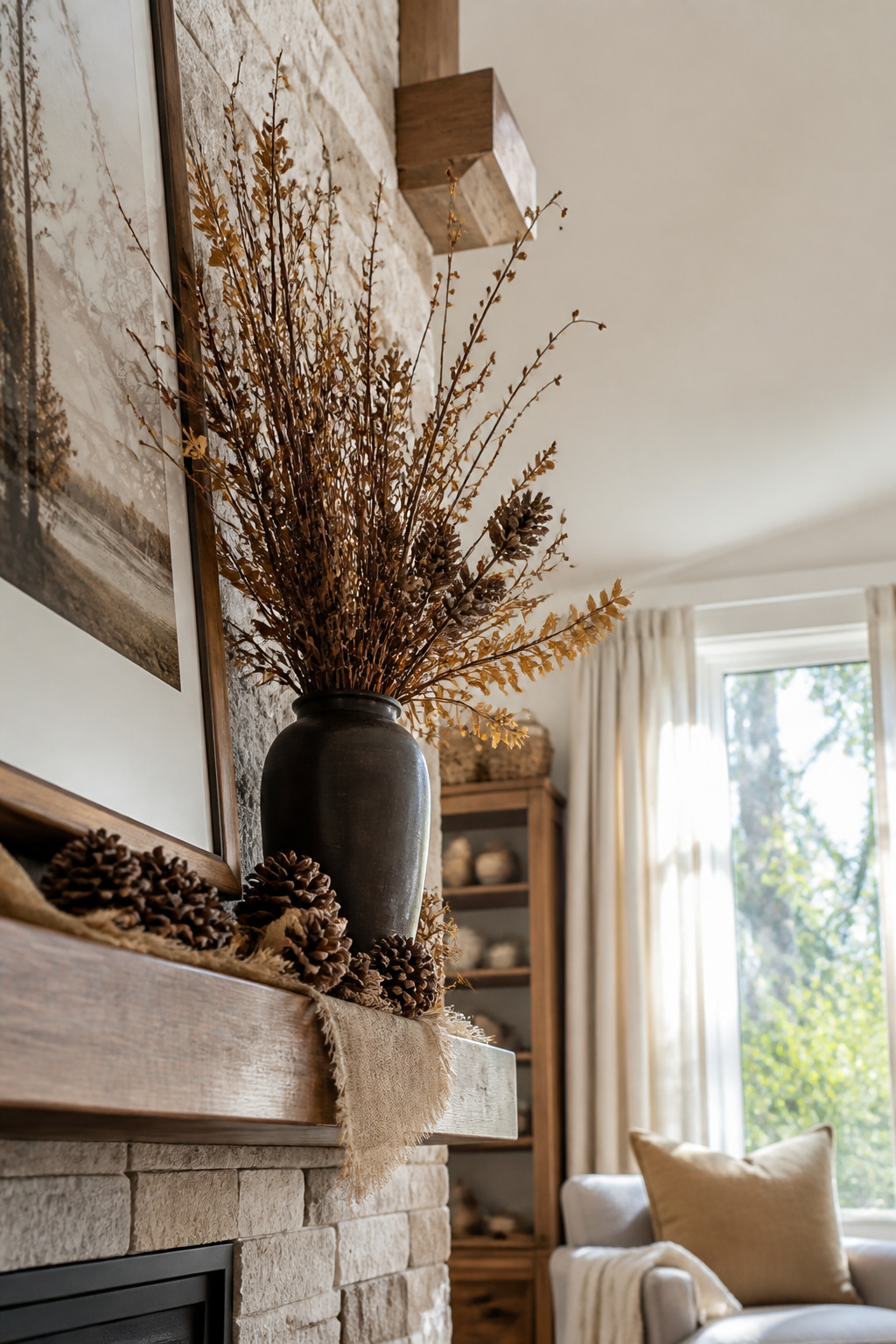
Tall branches in a vase do more of the visual work than almost anything else on a mantel, and the cost can be nothing if you time it right. Last October I walked the edge of a park after a windstorm and came home with enough fallen branches and dried grasses to fill two containers. The hydrangeas and goldenrod were already browning, which was the point; that faded color reads as intentional fall rather than failed summer.
A vase around 18 inches tall sits cleanly on a standard mantel without crowding the mirror or art above it. Anything shorter gets lost against the wall, and much taller starts to feel like it belongs on the floor. The branches themselves should extend another 12 to 18 inches above the rim for real height variation, which matters more than symmetry on a mantel this time of year.
Weathered wood and dried grasses give that rustic look without trying hard. Pinecones or acorns scattered at the base finish it, though a few stems alone can be enough if the shape is interesting. The free part is genuine: gathered nature costs nothing, lasts the season, and goes straight to compost after.
5. Natural Elements
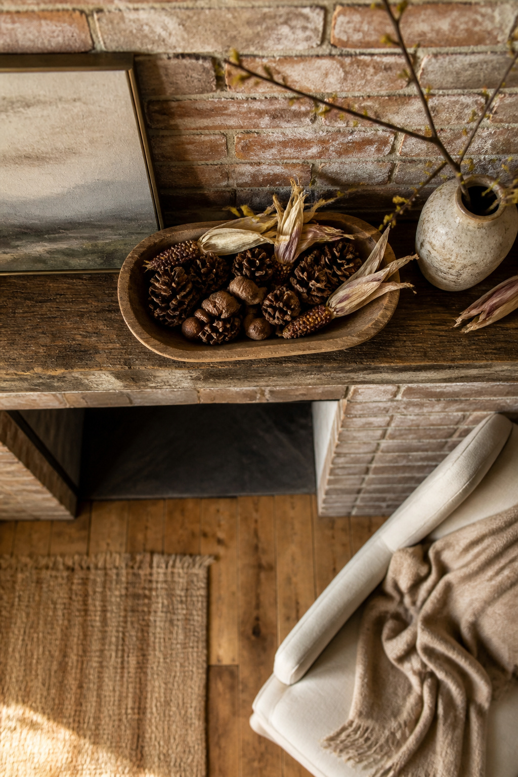
Pinecones, acorns, and dried corn husks are the one fall mantel decoration that costs nothing if you have access to a yard or a nearby park. The collecting itself becomes half the project. I spent about twenty minutes on a Saturday morning gathering fallen branches and a handful of pinecones from the edge of my property, then filled in with a $4 bag of dried corn husks from the grocery store because the real ones I found were too brittle to hold their shape.
The key is mixing what you gathered with one or two purchased items so the mantel does not look like a nature diorama. I arranged the corn husks in a low wooden bowl, tucked the pinecones around the base, and leaned the branches against the wall behind a pair of metal candlesticks I already owned. The whole thing took under an hour and the only cost was those corn husks.
Weathered materials read as intentional on a mantel, not messy, but only if you limit the color range. I kept mine to browns and faded golds, and left out the bright red leaves I had collected because they fought everything else. The branches worked because they were thin and wiry; thick, leafy ones would have crowded the shelf.
6. Magnolia Leaves
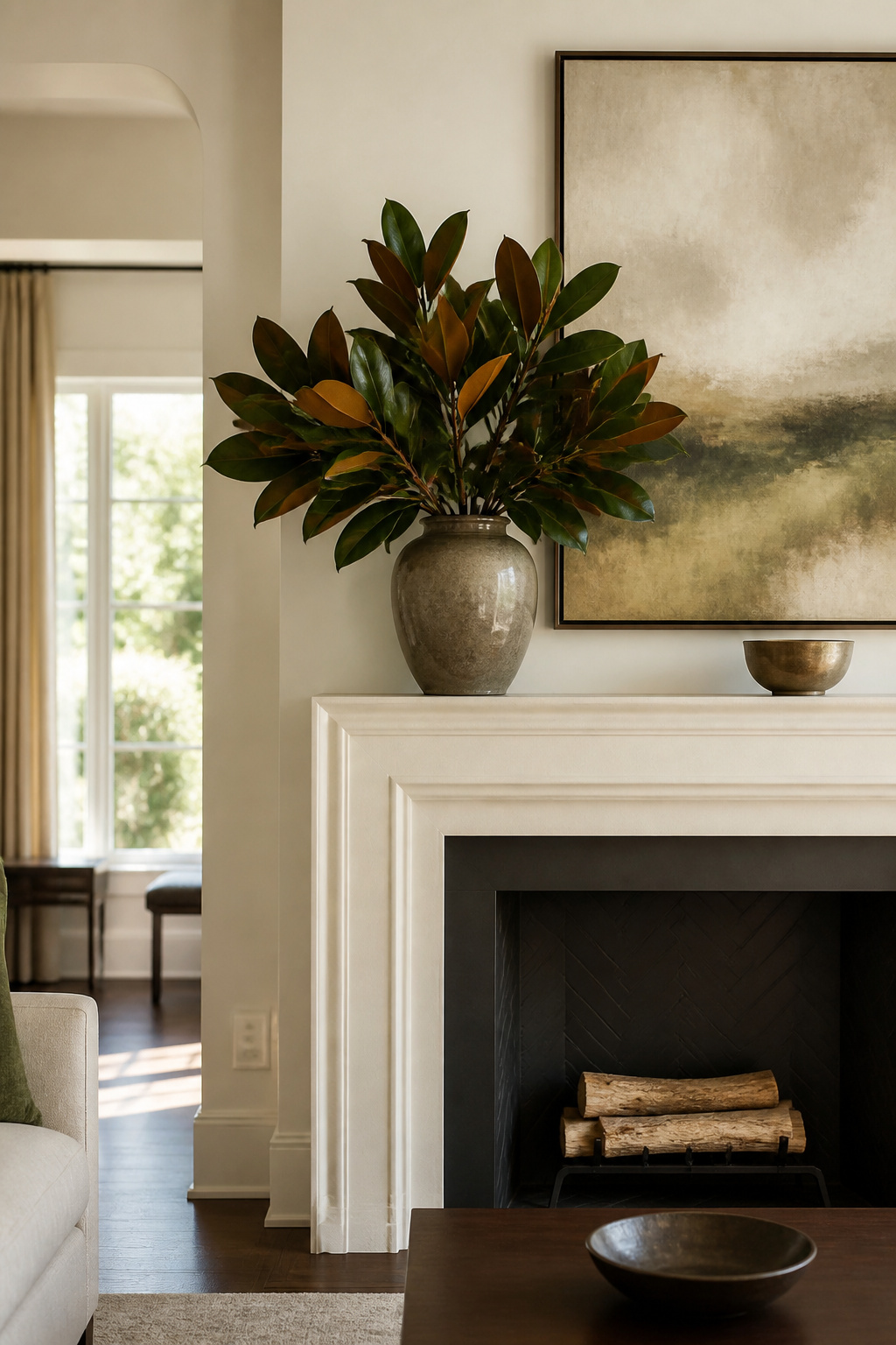
Magnolia leaves bring a weight and polish that most fall foliage never quite reaches. The deep green surface catches light like leather, and that gloss reads as intentional rather than rustic. I first noticed the difference at a nursery outside Richmond where a bucket of clipped branches sat ignored beside the brighter mums. The leaves were already the color of old money, no amber or rust needed.
A single branch in a heavy ceramic vase anchors a mantel without any other props. The stems are thick enough to stay put without florist foam, and the leaves hold their shape for two to three weeks before the edges curl and the color shifts to a muted bronze. For a garland, wire the stems in pairs so the glossy faces alternate direction; the back of a magnolia leaf is dull brown and breaks the effect if too many show.
The catch is water. The leaves drop fast if the stems dry out, so a vase needs a fresh cut and a deep drink every four days. Dried, they turn brittle and shed, so this is strictly a fresh-cut choice for the season.
7. Lanterns
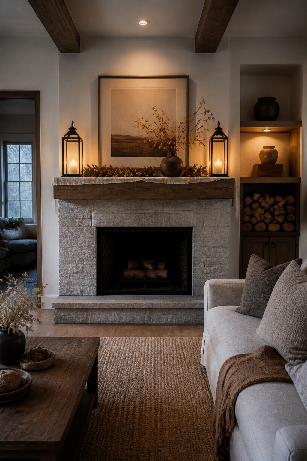
Lanterns at the mantel edge add weight and a working glow that candlesticks alone rarely manage. The trick is scale. A lantern whose base sits inside the mantel line but whose roof overhangs the front edge reads as precarious, especially on a standard 6- to 8-inch deep shelf. Keep the total footprint under 5 inches deep and the piece stays planted without crowding the wall.
Battery-operated candles inside solve the renter problem outright. Open flame on a narrow shelf above electronics or drywall is a negotiation with a landlord or a fire code most people would rather skip. The flickering wax pumpkins from Pottery Barn run on the same small batteries and give the same warm pulse without the wax drip or the watchful eye. Two lanterns, one at each end, frame the mantel like bookends and cast light toward the center rather than straight up. That sideways glow is what makes the room feel occupied in the evening, not just decorated.
8. Vases or Jars
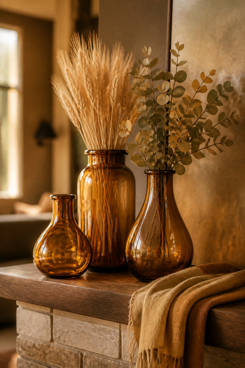
Amber bottles pull more weight on a mantel than their size suggests. The ones on mine are $8 apiece from a flea market in Ohio, and they sit on my kitchen windowsill holding dish soap the other eleven months. Come September I rinse them out, strip the labels, and fill two with dried wheat stems and one with a few branches of faux eucalyptus. The glass catches late-afternoon light in a way ceramic never manages, and the narrow necks keep even cheap stems from splaying everywhere.
Mason jars work the same trick for less if you already have a box in the basement. A coat of off-white paint and a handful of dried sunflowers or corn husks turns them into something that reads intentional rather than leftover. The key is clustering: three jars of slightly different heights, none of them matching, grouped tight enough to read as one shape from across the room.
Dried flowers in amber or clear glass give you texture without the water-stain maintenance of fresh stems. The color builds itself, bottle brown against stem gold, no arrangement skills required.
9. Books
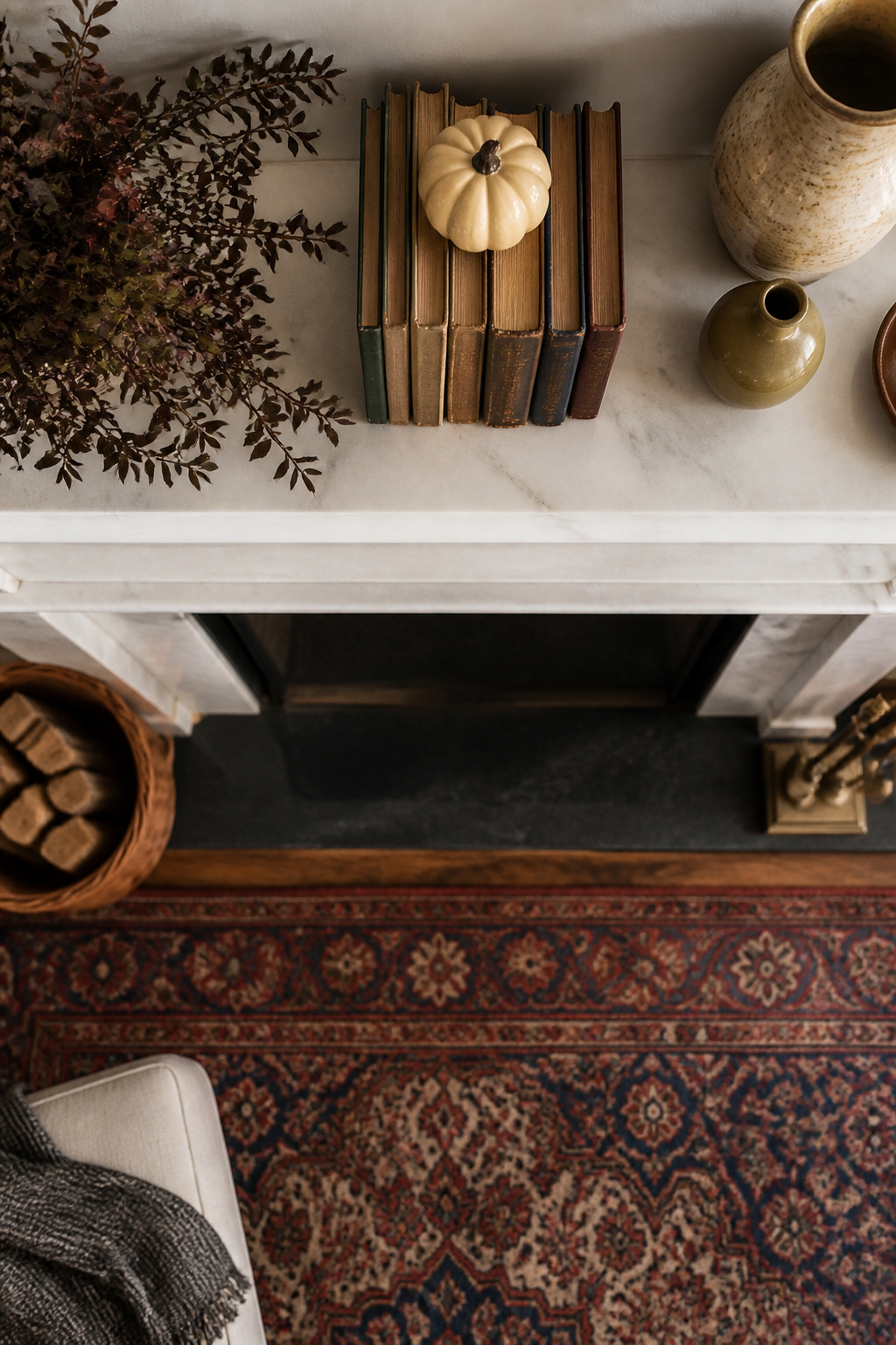
A flat mantel leaves every object at the same plane, which reads as a shelf rather than a scene. Stacking books horizontally builds platforms that lift smaller pieces into the sight line and let taller ones sink back without disappearing. Three or four books laid spine-down create a low riser; a stack of six to eight gives you enough height to set a candle or small pumpkin above the mantel surface while keeping the whole arrangement inside a single foot of depth.
Paperbacks work for the lowest lifts, but hardcovers hold steadier once you go above four. Vintage books bring that worn color and texture sources keep reaching for, though I keep a set of Reader’s Digest condensed volumes from a thrift run for this exact purpose. They cost a few dollars, the bindings already match, and I do not have to risk my own copies under wax or moisture. The trick is turning the spines away from the room so you see pages and deckle edges instead of clashing titles.
10. Small Framed Artwork or Prints
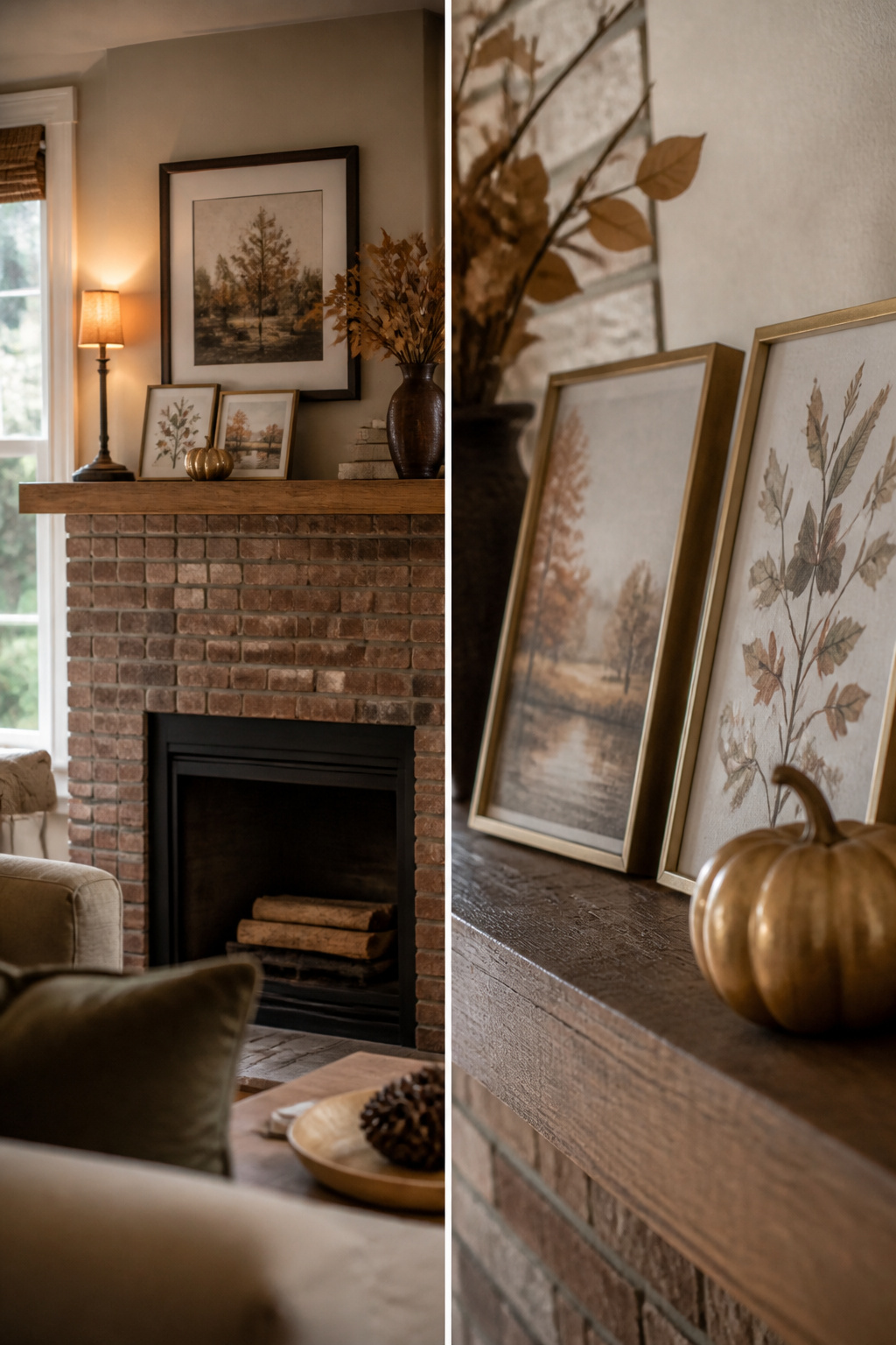
Small framed prints let you treat the mantel like a shelf instead of a wall. I lean a 5×7 or 8×10 frame slightly forward against the TV bezel or an existing canvas, angling it so the glass catches lamplight rather than glare. Two frames staggered, one taller and one wider, read as a deliberate grouping from sofa distance; anything smaller than 5×7 disappears against the scale of a hearth.
This is where renters get the most mileage. No holes, no command strips fighting textured plaster, just gravity and a ledge deep enough for the foot of the frame. I swap in autumn prints on ordinary printer paper when the season turns, keeping the same black or walnut frames year-round. The paper curls if the room runs humid, so matting to 8×10 with a cardboard backer keeps it flat through October without buying archival anything.
The risk is clutter. Three frames across a narrow mantel starts looking like a windowsill, not a styled surface. Two, spaced with a candlestick or a small pumpkin between them, usually fills the width without crowding the TV.
11. Chalkboards
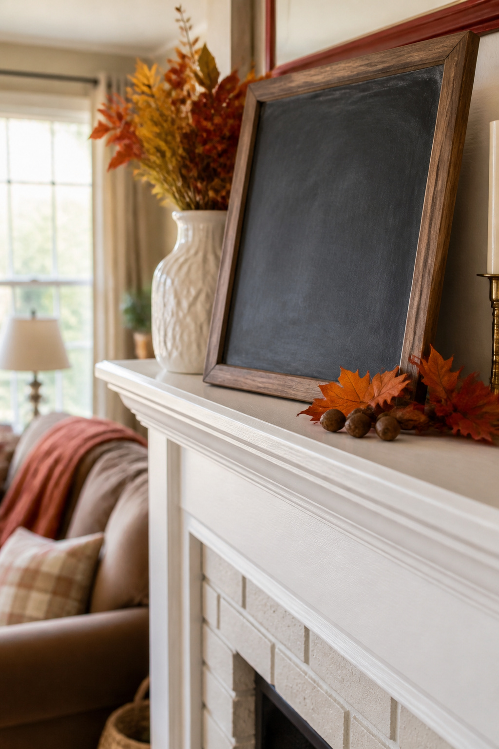
A small chalkboard propped on the mantel gives you somewhere to write the date of the first fire, a grocery list for Thanksgiving, or a quick sketch of leaves. Mine stays up from September through November, which means the message changes more often than anything else on the shelf. I rewrite it every two weeks or so: early fall gets a running countdown to Halloween, then a single pumpkin after that, then a turkey outline that my niece drew and I copied badly.
The size matters more than the frame style. Anything over 14 inches tall starts blocking the lower edge of the TV screen, and a board wider than 20 inches competes with the television for attention no matter what you write on it. I use a 12-by-16-inch framed board that leans against the wall without hanging hardware, which saves the security deposit and takes thirty seconds to move when football season needs the full screen.
Chalk markers wipe off with a damp cloth, so the transition from fall greeting to Halloween countdown to Thanksgiving gratitude list happens in one evening. Real chalk reads softer from across the room but dusts the mantel every time you erase it. The markers cost a few dollars more and last a full season.
Color Palette

The first year I tried a fall mantel, I bought every orange and burgundy candle the store had and lit them all at once. The two colors sat on the same surface like an argument, neither one winning, and the whole thing looked accidentally patriotic rather than autumnal. Warm tones need a bridge, not a collision.
Now I pick one dominant hue and let everything else whisper around it. Burnt orange works best when it shows up in three places, not six. Deep red belongs in the room, but rarely on the mantel itself if the art above already carries it. Neutrals do the actual heavy lifting: cream, taupe, and the pale gray of dried grass give the eye somewhere to rest.
The garland I drape across the stone is 72 inches of marigold and strawflower, and its warm fall tones fade naturally into the background rather than announcing themselves. That length lets it pool slightly at each end, which reads as abundance without clutter.
If the painting above your mantel already holds jewel tones, echo one of them in a small pumpkin or a candle and stop there. Complement the artwork; do not compete with it. The seasonal display should feel like it grew out of what was already in the room, not like a separate event that arrived in a tote bag.
Balance and Symmetry
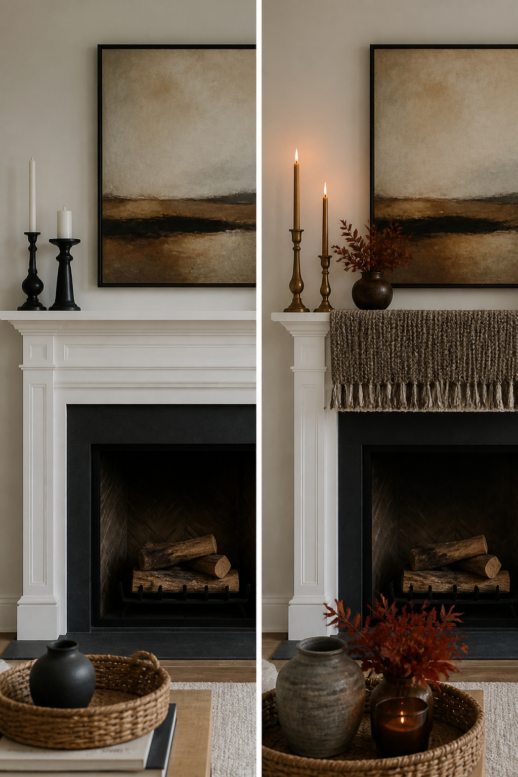
A mantel with matching candlesticks on both sides of a framed print looks finished, but it can also look like a hotel lobby. Two years ago I set up exactly that: identical brass holders, identical cream tapers, identical spacing. The symmetry was mathematically perfect and emotionally flat. Nothing drew the eye inward; the whole thing just sat there.
The fix was to keep the frame dead center but let the sides rhyme instead of mirror. I swapped one candlestick for a slightly shorter ceramic vase in a similar tone, kept the other candlestick, and added a single dried stem to the vase. The weight stayed even, but the small difference created tension that made the arrangement feel lived-in.
I break symmetry intentionally when the room itself is already busy. If the TV above the mantel is asymmetrical, or the wall has an off-center window, rigid matching feels like you’re fighting the architecture. In those cases I offset the heavier piece toward the visual anchor and let the other side stay lighter. The balance reads as calm, not calculated.
Layering Textures

Smooth surfaces fight each other on a mantel. Last year I tried a lineup of ceramic vases, glass candleholders, and a lacquered tray, and the whole thing looked like a showroom display that nobody lived with. Nothing caught the light differently, nothing invited a hand to touch it. The eye slid right across.
The combination I keep coming back to is rough wood, matte ceramic, and a nubby textile. A reclaimed wood candle base, a hand-formed bud vase, and a linen runner folded at one end gives the eye three places to rest, and the difference between them makes each texture read more clearly than it would alone. The textile matters more than you expect; even a narrow strip of heavy linen breaks up the hard plane of the mantel and catches shadow in a way glaze never will.
This is where the budget constraint becomes an advantage rather than a limit. The best sources for these textures are thrift stores and estate sales, not decor shops. A $4 ceramic bowl with a deliberately imperfect glaze and a scrap of washed linen from the remnant bin outperform a matched set that costs ten times as much. The wood can be anything from a driftwood piece to a rough-hewn cutting board stood on edge. What you are paying for is contrast, not provenance, and contrast is cheap when you are willing to hunt for it.
Height Variation
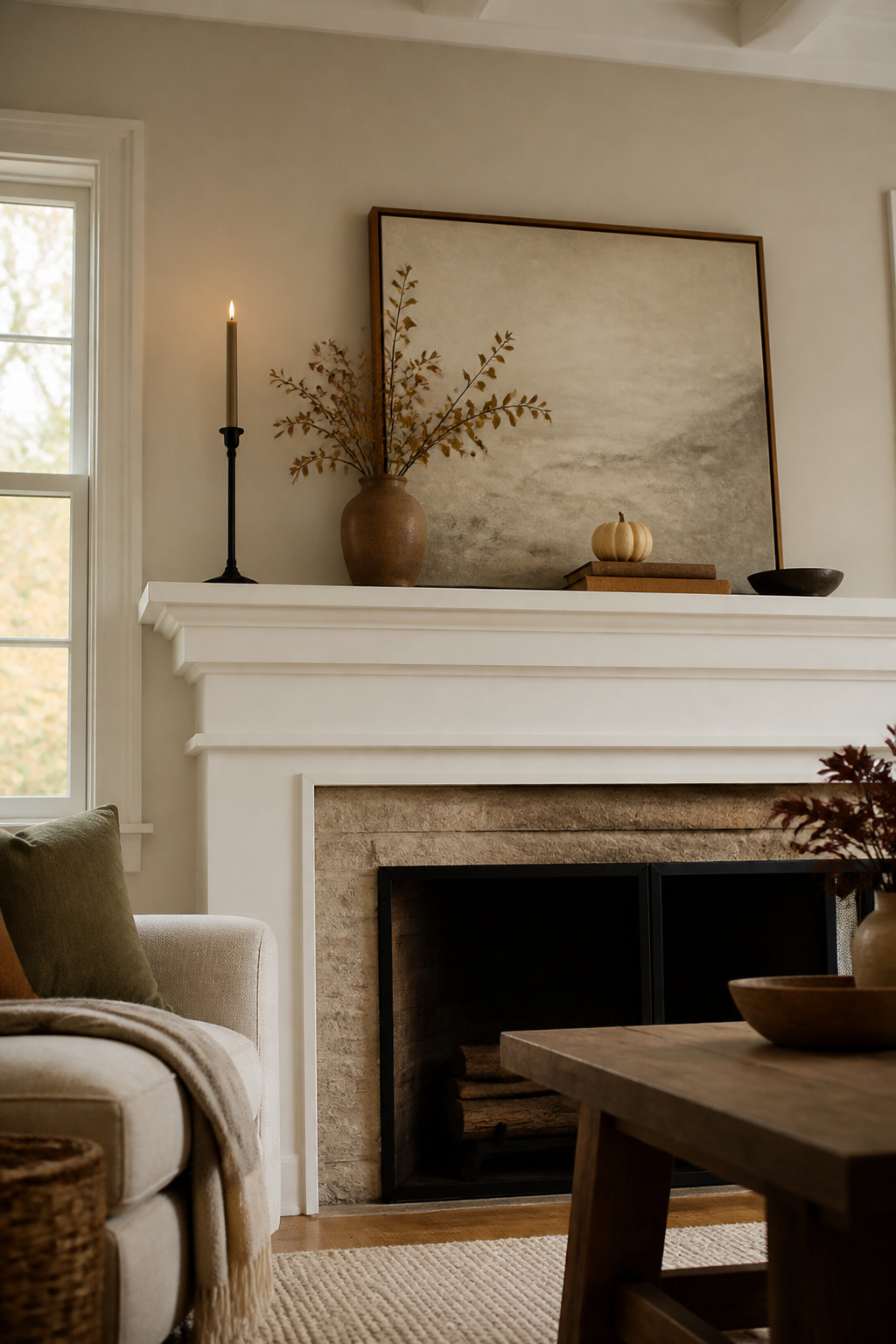
A flat mantel reads like a shelf at a big-box store, not a styled hearth. The eye needs somewhere to travel, and the tallest piece should sit roughly 1.5 times the height of your shortest to keep the whole arrangement from collapsing into a single dull band. On a standard mantel, that usually means ranging from about six inches at the low end up to eighteen or twenty at the peak.
I learned this the hard way in 2019, when I lined up three brass candlesticks, a ceramic pumpkin, and a framed print at nearly identical heights. From across the room they looked like a police lineup, every suspect the same height and equally guilty of boring me. The fix took ten minutes: I swapped the middle candlestick for a taller taper holder, set the pumpkin on a stack of old books, and suddenly the mantel had depth without costing a dollar more.
Start with your anchor, the tallest item, slightly off-center. Build downward in steps rather than smooth slopes, or the result still flattens out. A five-inch difference between neighbors is enough to register; anything closer and the eye glazes over.
Frequently Asked Questions
How do I style a mantel?
Build your arrangement around an anchor piece placed slightly off center, then add height variation so your tallest item sits about one and a half times the height of your shortest. Layer in greenery or dried stems, mix textures like wood and linen, and let the sides rhyme rather than mirror for a lived-in feel.
What are some easy fall mantel decor ideas?
Gather pinecones, branches, or dried grasses from outside and pair them with one or two store-bought items so the mantel does not look like a diorama. Add battery-operated candles or lanterns for warm light, and drape a 72-inch dried floral garland across the front with shallow scallops instead of pulling it tight.
Can I decorate my mantel without pumpkins?
Yes. Tall branches in an 18-inch vase, magnolia leaves in a heavy ceramic vessel, or amber bottles filled with dried wheat stems all read as fall without a single gourd. Lanterns, stacked books, small framed prints, or a chalkboard with a seasonal message work too.
What colors should I use for fall mantel decor?
Pick one dominant warm tone such as burnt orange and let it show up in three places, not six. Fill in with neutrals like cream, taupe, and pale gray so the eye has somewhere to rest. If artwork above the mantel already carries jewel tones, echo just one in a small pumpkin or candle rather than competing with it.