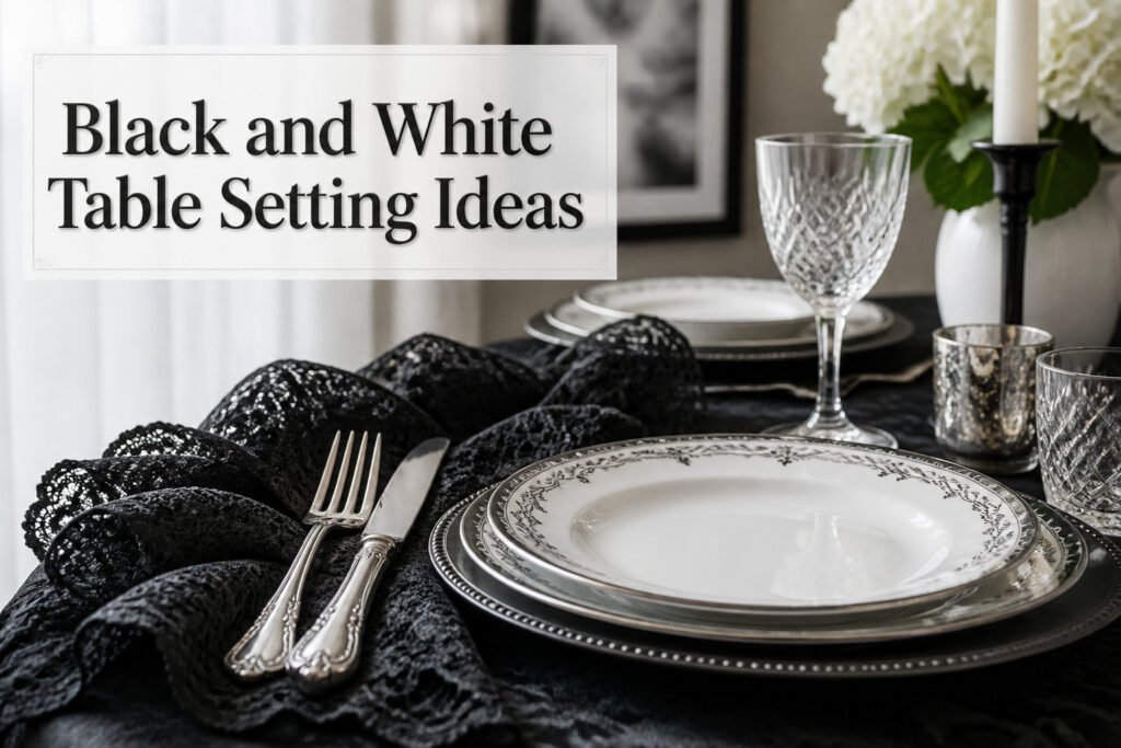
A black and white table setting can read as formal Sunday dinner or casual weeknight cleanup in five minutes flat, and the difference is almost never the plates. The white base stays; everything else, the chargers, the napkins, the flatware, steps up or down around it. I found my own Black Lace Noritake china at an estate sale for next to nothing, then learned the hard way that stacking too many competing patterns turns curated into cluttered faster than you’d think.
1. Layered Textures
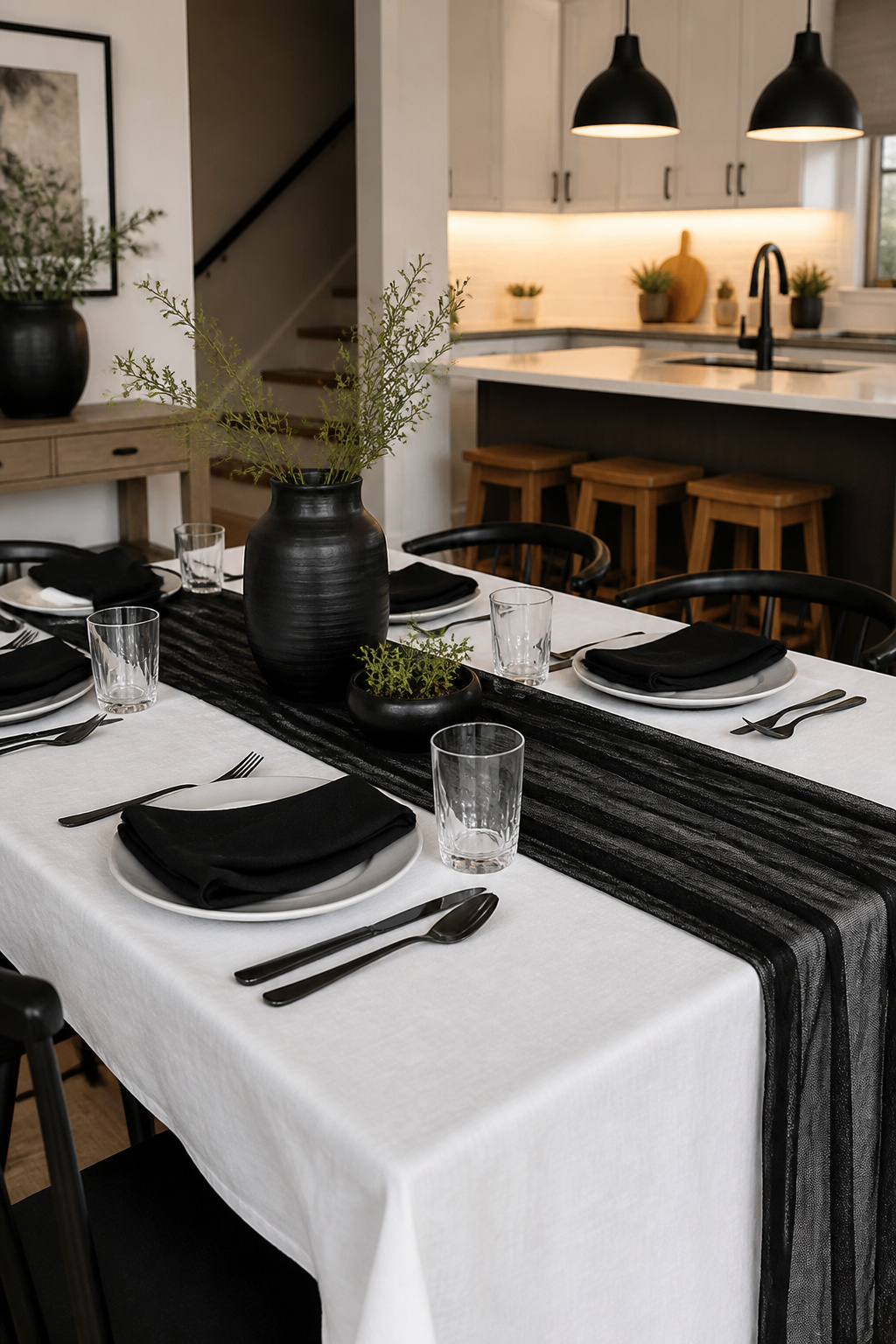
A white tablecloth is the only base worth buying if you are starting from zero. It bounces light upward, which matters more than you think in apartments with a single overhead fixture, and it forgives mismatched chairs or a scuffed table underneath. Everything else layers on top.
Black gauze table runners are the workhorse I did not expect. The weave is loose enough to read as casual for a weeknight dinner, but the color keeps it from looking like you forgot to dress the table. I have run mine across a white cloth for everything from a birthday brunch to a Halloween setup where the gauze looked intentionally thin and ghosted rather than cheap. It costs less than a solid linen runner and stores in a drawer without creasing.
The flatness that kills these settings usually comes from matching finishes. Glossy black plates on glossy black chargers read as one solid slab. What held up in my own attempts was pairing matte and shine in the same color: a matte white napkin against a glossy white plate, or a satin-black ceramic bowl on that gauze runner. Glass is the third texture that breaks the monochrome into actual layers. A simple water glass with some weight to it catches light differently than either linen or ceramic, and it costs nothing extra if you already own basic tumblers.
You do not need to replace your whole collection. One runner, one set of napkins in the opposite finish of your plates, and the glasses you already own will do what a full catalog order promises.
2. Floral Arrangements
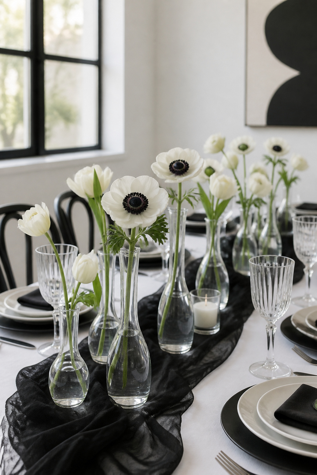
Panda anemone flowers carry the black and white theme straight into the centerpiece, their white petals and dark centers picking up whatever china pattern sits beneath them. The bud vases I keep reaching for are small, which helps. A single stem in a narrow opening stays upright through dessert; a heavy bloom in a wide-mouthed vessel starts leaning by the time bread hits the table.
White tulips behave better than most spring options. They do not drop pollen on the runner and their stems stay rigid about three hours longer than ranunculus, in my experience. Dark calla lilies last longer still, though their glossy surface can read as almost purple under warm bulbs. Test your lighting before guests arrive.
The bolder move is letting color crash the party. A saturated arrangement against a black runner or dark linen snaps the eye toward the center of the table and keeps the monochrome from feeling like a rule rather than a choice. The trick is limiting it to one hue, not a mixed bouquet. A cluster of deep red roses or orange zinnias against black reads intentional; a rainbow arrangement reads like you forgot the theme.
Eucalyptus garlands bridge the gap if fresh flowers feel like too much spending for one evening. They survive the full meal, they fill horizontal space between scattered bud vases, and they cost less than a dozen stems at most craft stores.
3. Tableware Choices
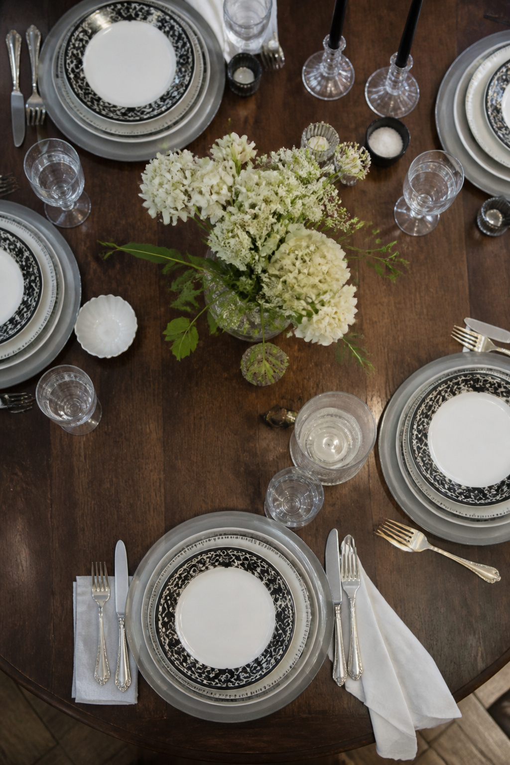
Mixing vintage and modern plates is where a black and white table setting gets its personality, but the line between collected and chaotic is thinner than you’d think. I built my own stash almost entirely from estate sales and Facebook Marketplace, where full china patterns turn up for next to nothing if you check regularly. The piece that anchors everything is a set of Black Lace Noritake I found at a shop called Hoffman’s Patterns of the Past: stark black floral detail on white bone china, formal enough for holidays but simple enough for Sunday dinner.
The trick is using one consistent element to bridge eras. Silver flatware does this better than anything else. I picked up mismased Georgian and mid-century pieces from the same estate sale haul, and the shared metal finish pulls them together even though the patterns differ. Glassware works the same way: crystal stemware adds weight and sparkle that makes paper-thin modern plates feel intentional rather than cheap.
What failed for me was stacking too many competing patterns. I once layered a bold geometric salad plate over the Noritake dinner plate, then added a bread plate with a different border detail. The table looked cluttered, not curated. One statement piece per place setting is the limit. A solid white salad plate or a plain glass charger gives the eye somewhere to rest. Without that breathing room, even expensive pieces read as junk-shop random.
4. Centerpiece Ideas
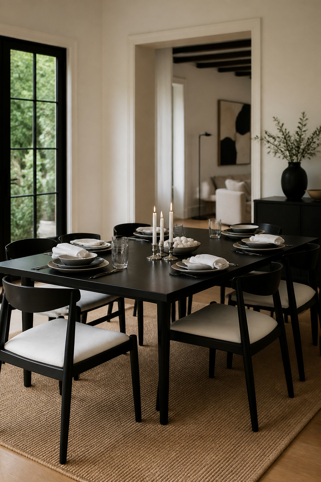
Beeswax candles in silver candlestick holders anchor a black and white table without stealing the show. The warm tone of the wax softens the contrast just enough so the palette reads intentional, not stark. I learned the hard way that height matters more than width. One Thanksgiving I used a pair of brass candlesticks I found at a flea market, both over twelve inches, and spent the whole meal leaning around them to talk to my sister across the table. Keep the total height under nine inches, or set taller pieces at the ends, where they frame the conversation instead of blocking it.
A low, wide bowl of white river stones with a single black taper laid across the rim solved the sightline problem for me last spring. It filled the middle third of the table, gave everyone something to look at, and cost about what two decent bottles of wine would have. The stones came from a garden center bag; the taper was leftover from a batch of beeswax I rolled myself after watching a video that made it look easier than it was. The wax cracked on three of my first four attempts. The fifth held together long enough to burn for dinner.
Silver holders catch the light even in a dim room, which means you can get away with fewer candles than you’d think. Two matched pairs, set diagonally, do more than a straight line of six ever could.
5. Color Accents
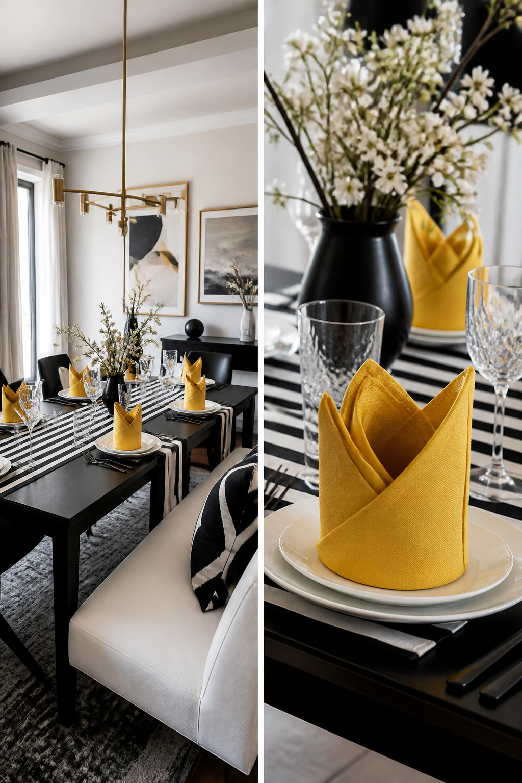
A black and white table setting lives or dies by what you let interrupt it. The monochrome itself is almost too easy; the risk is that everything goes flat, or that one red candle turns the whole thing into a pizza restaurant.
The Bishop’s Hat napkin fold is where I first saw this go right. It needs a 20" x 20" cotton linen napkin, nothing smaller or the proportions collapse. Folded with the front sides pulled down, it reads almost like a butterfly standing at attention on the plate. A golden yellow napkin against black and white plates gave the table height without breaking the scheme, because the shape itself stayed architectural.
Black and white striped runners work the same way for a modern look, whether you cut fabric off the bolt or use paper. The stripe is already part of the vocabulary, so it adds rhythm rather than color chaos.
Where I pushed too hard was a centerpiece with full, heavy hydrangea heads in a large glass urn. Fifteen stems of fresh blue against the monochrome didn’t accent; it took over. The table became about the flowers, not the setting. Two ways to play this: keep the accent in the napkin or the runner, where the geometry controls it, or let the color run wild and accept that you have built a different table entirely. The runner wins if you want the black and white to still read as a decision.
6. Seasonal Adaptations
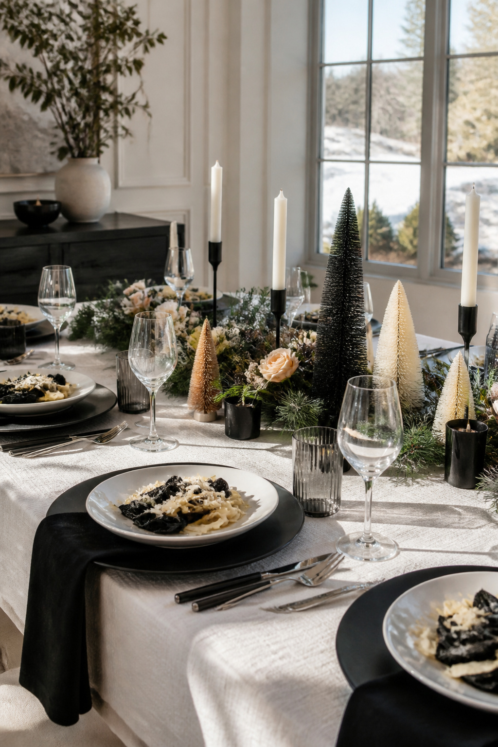
A winter black and white table setting gains depth from what you serve, not just what you lay down. Two years ago I tried a January dinner with black and white pasta in alfredo sauce, found in the gourmet section at Home Goods, alongside roasted cauliflower and a dark chocolate layer cake. The pale food against matte black charger plates and a white tablecloth read as intentional, not sparse, and the room felt warmer for the contrast.
That same approach collapsed come July. The heavy chargers and dense menu sat wrong in the heat; guests picked at the pasta and the visual weight felt oppressive instead of cozy. The fix was swapping the chargers for black and white gingham napkins and trading the alfredo for a fig and spinach starter salad, keeping the color story but letting the table breathe. Silver and white scattered votives replaced the pillar candles, and the whole thing felt like the same idea adapted rather than abandoned.
Seasonal florals help bridge the gap. Peach-toned flowers with roasted carrots brought a soft warmth to that winter table, while summer asked for nothing more than the pattern in the napkins and the natural light. The black and white palette survives both because it is a frame, not a finish.
Formal Against Casual
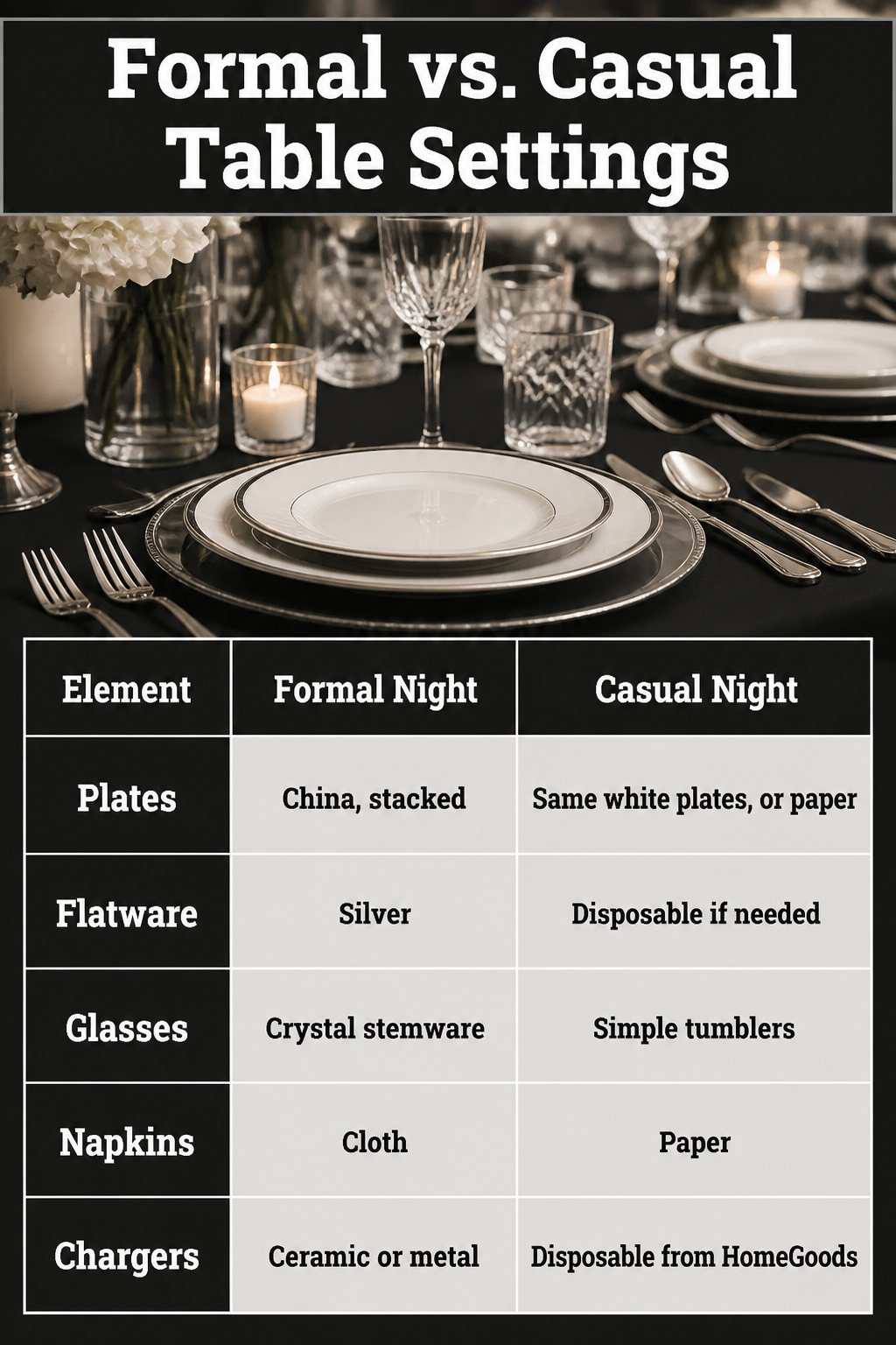
The same black and white pieces behave completely differently depending on what surrounds them. For a dinner party, stacked china with silver flatware and crystal stemware reads as intentional; the night I used those same white plates with paper napkins and disposable chargers from HomeGoods, the table still looked cohesive but the cleanup took five minutes instead of forty. Glass plates catch candlelight in a way ceramic never does, yet ceramic survives a dishwasher and a clumsy guest.
| Element | Formal Night | Casual Night | Carryover? |
|---|---|---|---|
| Plates | China, stacked | Same white plates, or paper | White base carries over |
| Flatware | Silver | Disposable if needed | n/a |
| Glasses | Crystal stemware | Simple tumblers | n/a |
| Napkins | Cloth | Paper | n/a |
| Chargers | Ceramic or metal | Disposable from HomeGoods | Black/white palette only |
I bought my silver and china at estate sales and through Facebook Marketplace, so the investment was minimal compared to retail. The lesson after doing both settings back to back: the white plate is the only piece that must stay. Everything else can step up or step down around it.
What I Found at Estate Sales
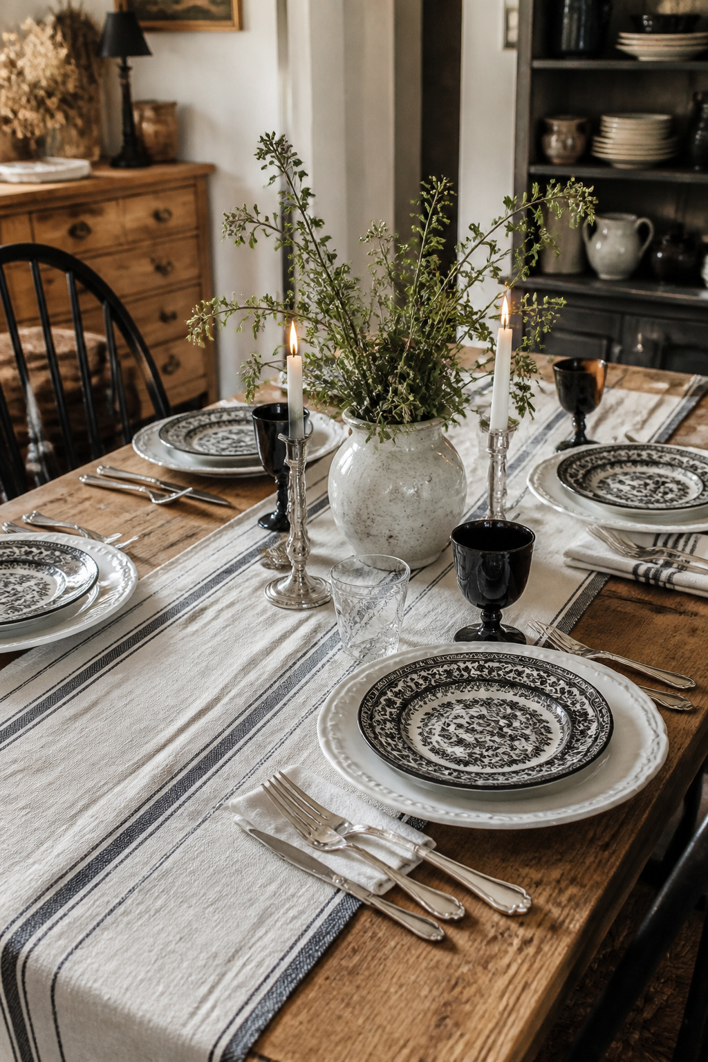
Estate sales and Facebook Marketplace have been where most of my black and white tableware actually came from, not a boutique. The Black Lace Noritake china I use for formal dinners turned up at Hoffman’s Patterns of the Past, but the pieces that get used every Saturday, the mismatched salad plates and bread-and-butter plates that layer under them, cost under a few dollars each from estate bins and Marketplace lots. A white plate underneath a black patterned plate reads intentional; two random black plates beside each other read like you ran short.
Silver flatware from these same sources is generally very inexpensive, and it lifts the whole setting without requiring a full matching set. I look for weight in the hand and one consistent finish, not one maker. If the china or silver does not fit the theme, paper plates with disposable charger plates work; I have used ones from Home Goods that cost next to nothing and saved the cleanup time entirely. Cloth napkins and crystal stemware still make the cut even on a budget, because they add the detail that makes the table feel finished. Crystal wine glasses actually do enhance aroma and flavor, so they earn their shelf space beyond looks alone.
The One Napkin Fold I Actually Use
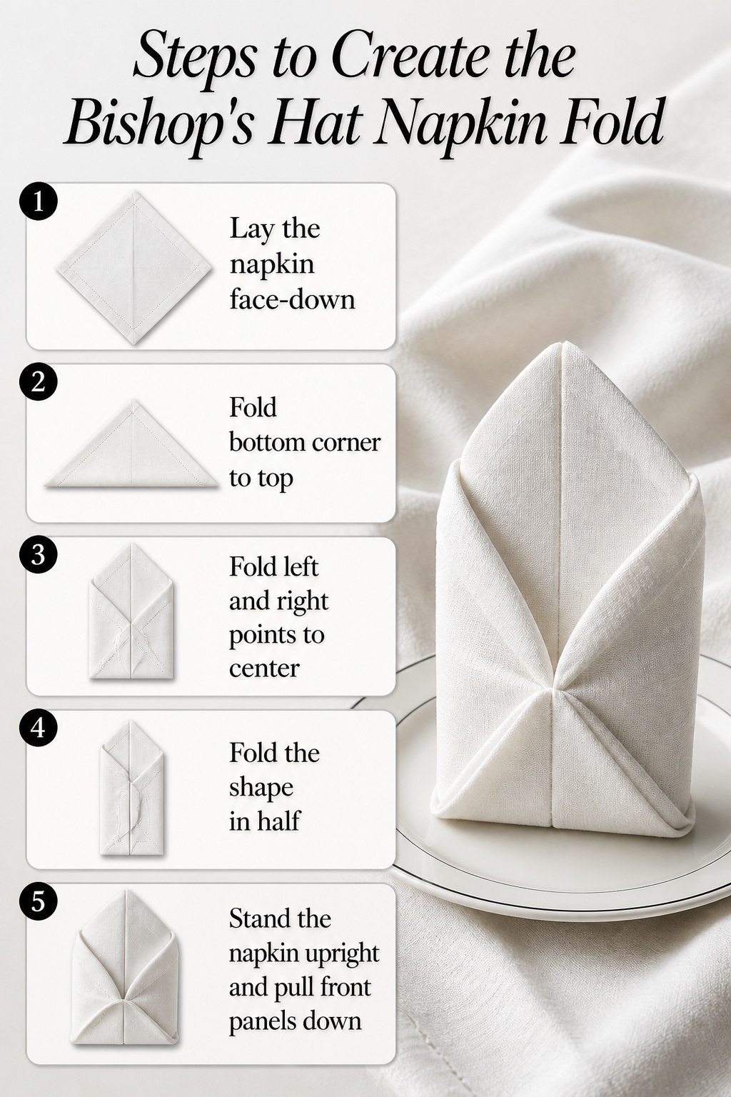
Most napkin folds look impressive in a photo and collapse the moment someone pulls out a chair. The Bishop’s Hat is the one I keep coming back to because it actually survives dinner.
A 20" x 20" cotton linen napkin is non-negotiable here. Anything smaller or stiffer won’t hold the standing shape, and polyester slips against itself and loosens within minutes. Cotton linen has enough grip and body to stay crisp through salad and main course.
The fold itself takes three distinct looks depending on which panels you leave standing and which you fold down. I use the variation with the front panels pulled down into a kind of butterfly shape; it sits lower and wider, so it doesn’t block sightlines across the table the way the full upright version can.
- Lay the napkin face-down in a diamond orientation.
- Fold the bottom corner up to meet the top, forming a triangle.
- Fold the left and right points in toward the center line, overlapping slightly.
- Fold the resulting shape in half, bringing the bottom edge up behind.
- Stand the napkin upright and pull the front panels down to create the butterfly shape, or leave them up for the classic mitre.
The standing shape adds height to a black and white table without needing a tall centerpiece that gets in the way of conversation. I’ve tried it with black napkins on white plates and the reverse; the contrast reads clean either way, and the fold does the visual work so the rest of the setting can stay simple.
Frequently Asked Questions
What types of tableware work best for a black and white table setting?
A white plate underneath a black patterned plate reads intentional, while silver flatware and crystal glassware pull mismatched eras together. One statement piece per place setting is the limit; pair matte and glossy finishes in the same color to keep the monochrome from flattening into a single slab. Estate sales and Facebook Marketplace are where most of my actual tableware came from, not boutiques.
How can I create a stunning centerpiece for my black and white table?
Keep the total height under nine inches, or set taller pieces at the ends where they frame conversation instead of blocking it. Beeswax candles in silver holders, or a low bowl of white river stones with a single black taper laid across the rim, fill space without stealing the show. Two matched pairs of candles set diagonally do more than a straight line of six.
What are some budget-friendly options for a black and white table setting?
Estate sales and Facebook Marketplace turn up full china patterns for next to nothing if you check regularly; silver flatware from these sources is generally very inexpensive and lifts the whole setting without requiring a matching set. Paper plates with disposable charger plates from Home Goods work when cleanup matters more than heirloom appeal. The white plate is the only piece that must stay; everything else can step up or step down around it.