
A black-and-white room can run anywhere from a $12 clipboard project to a refinished dresser and back again, and the only thing that decides which idea is yours is whether you are renting or staying put. The cost of getting it wrong is not money; it is the flat, clinical feel of a space that photographs well and lives badly. The fix that comes up across every room below is texture your fingers can find: a $35 bouclé throw, a hand-me-down knit, leather creases from a secondhand ottoman. Without that contrast, the palette collapses into a showroom.
1. Geometric Shapes
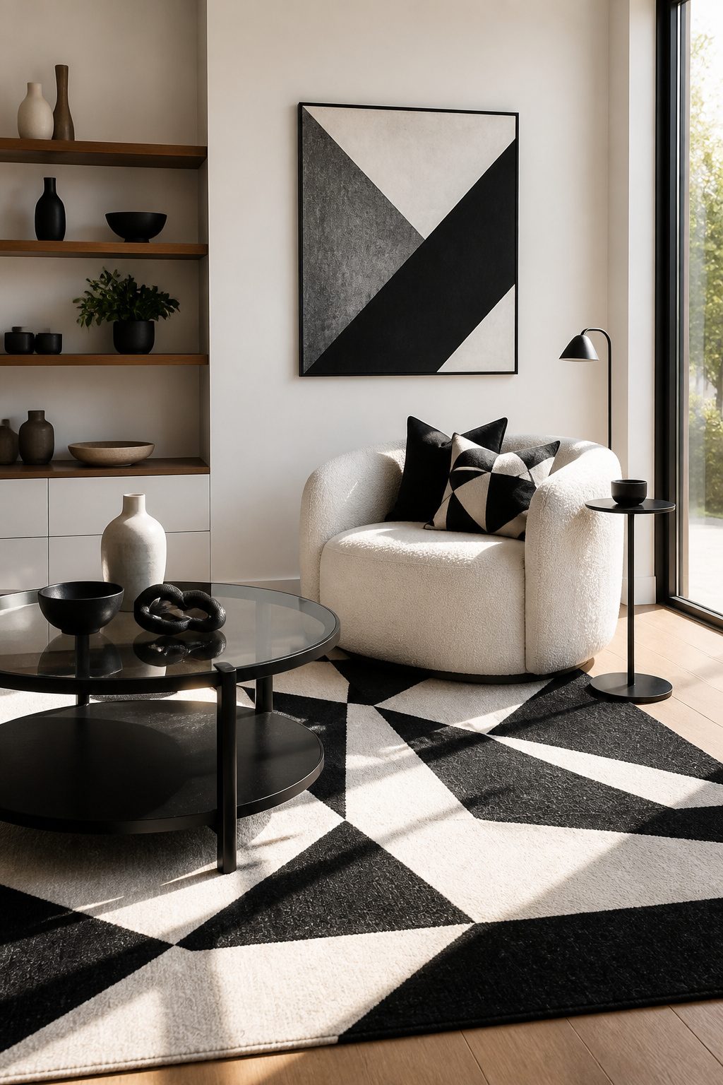
Sharp angles and repeating shapes keep a black-and-white room from flattening into a two-tone box. In my own living room, a rug with bold triangles sits under a curved chair and round coffee table; the geometry fights the curves just enough to give the eye somewhere to land. Four approaches back this as a core fix: rugs, pillows, wall decals, and the lines of the furniture itself.
A single geometric piece anchors the room; two compete. In a small space, a striped or triangular rug under white furniture adds energy without demanding extra floor area. Throw pillows with angular prints repeat the idea at lower commitment. Wall decals work the same way on a blank surface you cannot repaint. If the room still reads too stark, wood furniture with clean lines introduces a mid-tone that softens the contrast without adding color. The one move I would skip: covering every surface in pattern. One strong shape, one place, and the room holds together.
2. Artwork as Focal Point
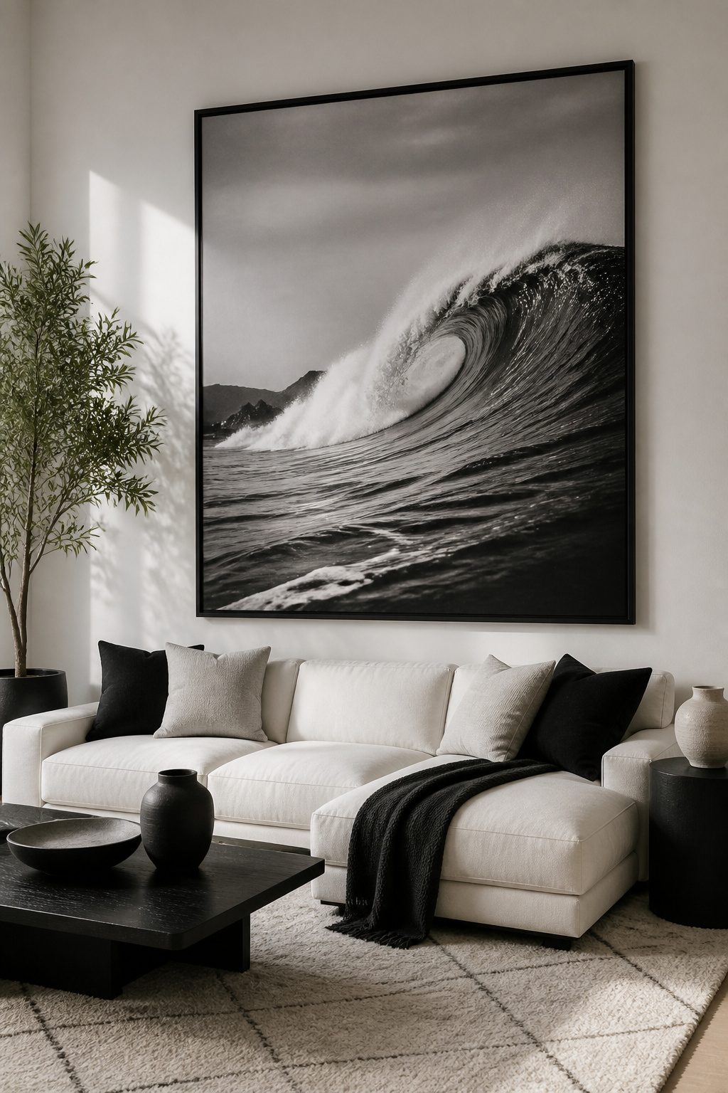
A single oversized black and white photograph does more to settle a monochrome room than any furniture arrangement. The eye travels straight to it, and everything else, sofa, rug, side table, falls into place around that center of gravity. Hang it alone on the wall, not clustered, and the piece becomes the star without competition.
Two ways to build outward from there. One approach keeps the palette strict: soft white upholstery, subdued pattern in the rug, and nothing else fighting for attention. A creamy neutral throw and one oversized plant in scale with the painting add warmth without introducing new colors. The other route lets the artwork itself supply the accent. An oversized post-modern piece with a single caramel spot, for example, gives you a third tone to repeat through the room, a Bauhaus table on a rustic informal rug can pull all three colors into one grounded palette.
Either way, the artwork sets the tone and the room follows. A black sofa, a white credenza with black pulls, walnut side tables, linen throws, a round mirror, matte black lamp, these supporting pieces work best in natural finishes that do not try to become heroes themselves.
3. Textured Layers
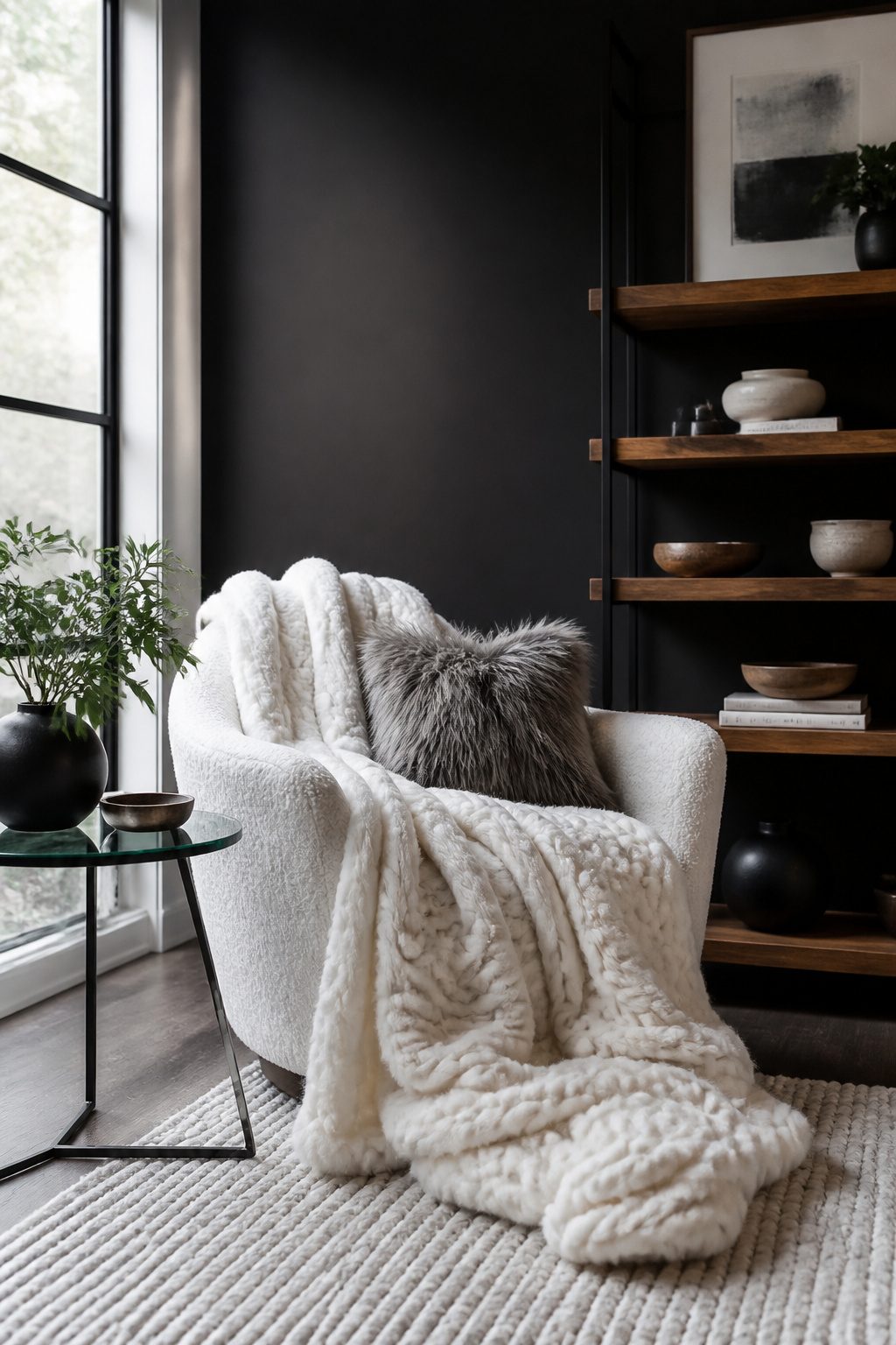
Black and white rooms live or die by what you can actually feel under your hand. A lacquer table or glass surface catches light and bounces it around, but without something nubby nearby, the whole space reads as a showroom. I learned this the hard way in my own living room, where a glossy white console against matte black walls looked polished in photos and sterile in person.
The fix cost less than a dinner out. A bouclé throw from Target’s Threshold line, maybe $35, draped over the nearest chair. A faux fur pillow from HomeGoods, another $20. The difference was immediate: the same eye now stopped at the textile instead of sliding across the wall. Leather entered through a secondhand ottoman, $45 on Facebook Marketplace, its creases softening the room’s geometry. Wool came last, a hand-me-down blanket my mother had knitted years ago, its uneven stitches doing what machine perfection cannot.
The sources all point to the same combination: smooth against nubby, reflective against matte, natural against sleek. What they do not always say is how little of each you need. One nubby textile per seating area is enough. One reflective surface per room. The goal is contrast your fingers can find, not a museum of every texture on the list.
4. Natural Elements
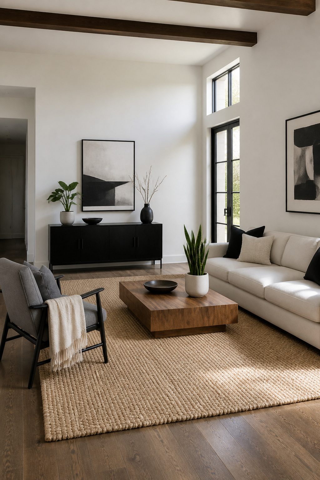
A black and white room can turn gallery-cold fast, and the fix is not more color. Wood tones, rattan, cane, and leather add instant warmth against white walls without muddying the contrast. In my own reading, the finishes that work best read distinctly warm: honey oak, walnut, or a mid-tone maple that sits between the two extremes. Chrome and black iron feel crisp and contemporary, but brass and bronze bring a softer glow that keeps the palette livable.
Living greenery does the same job. The plants that survive low light and irregular care matter here, because a dead fern undermines the look faster than no plant at all. Snake plants, pothos, and ZZ plants handle north-facing windows and the occasional missed watering. Their green reads as a neutral against black and white, not a color statement.
Texture on furniture helps too. Linen, bouclé, and knit throws on sofas and chairs break up the flat planes. A stone or marble coffee table adds subtle pattern that plays well with the graphic scheme without introducing new hues. The goal is softness, not distraction: wood frames in the same shade as the furniture keep black and white art from seeming disconnected from the rest of the room.
5. Accent Colors
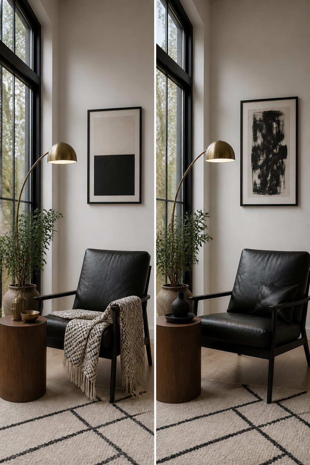
Natural wood, warm brass, muted greens, and soft gray all pair well with black and white, but limit the accent to one hue and repeat it two or three times for clarity. I learned this the hard way in my own living room, where a sage green throw and a matching ceramic vase looked promising in the cart but fought each other once the afternoon light hit. The green read too close to the black in shadow and too minty against the white walls by evening, so the room felt unsettled rather than intentional.
The three-color rule helps here: let white lead at roughly sixty percent, black support at thirty, and the single accent fill the remaining ten. After the green failed, I switched to warm brass. A slim floor lamp, two small frames, and the hardware on a side table carry it. Repeating the brass at different heights draws the eye around the room without letting any one piece dominate. Plants, leather, or rattan can add warmth too, but they stay neutral enough that the brass keeps its place as the single deliberate note.
6. Layered Rugs
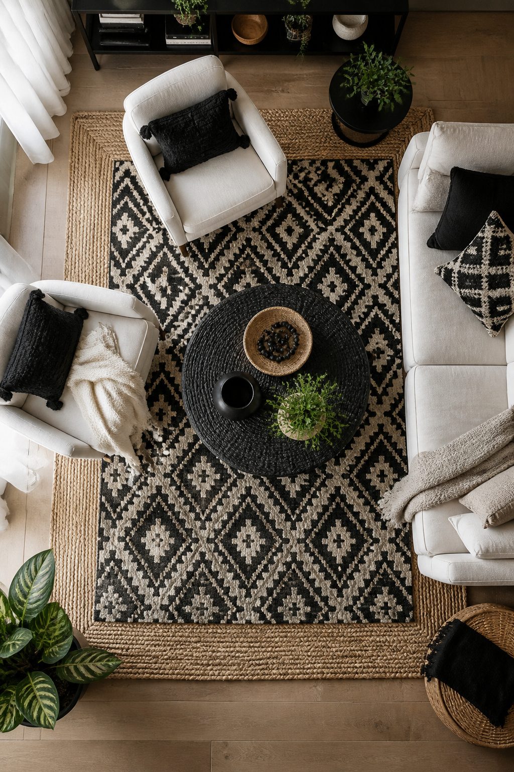
Layered rugs pull a black and white room together without demanding a single perfect piece. The trick is starting with a large natural-fiber base, something flat and hard-wearing like jute or sisal, then dropping a smaller patterned rug on top. In my 12 by 15 foot living room, an 8 by 10 foot base with a 5 by 7 foot top layer hit the right proportions: the border of exposed base framed the seating area, and the patterned top carried the black and white motif without overwhelming the floor. Leave at least eighteen inches of the base rug showing on every side or the layering looks accidental.
The base handles traffic and the top handles style, which means you can swap the pattern seasonally or when it wears. I tried matching the top layer to the exact room dimensions once and the effect flattened out; the stepped border is what makes the eye read it as intentional design rather than a rug that shrank. For renters, this setup also protects the flooring you’re stuck with and rolls up in ten minutes when you move.
7. Gallery Walls
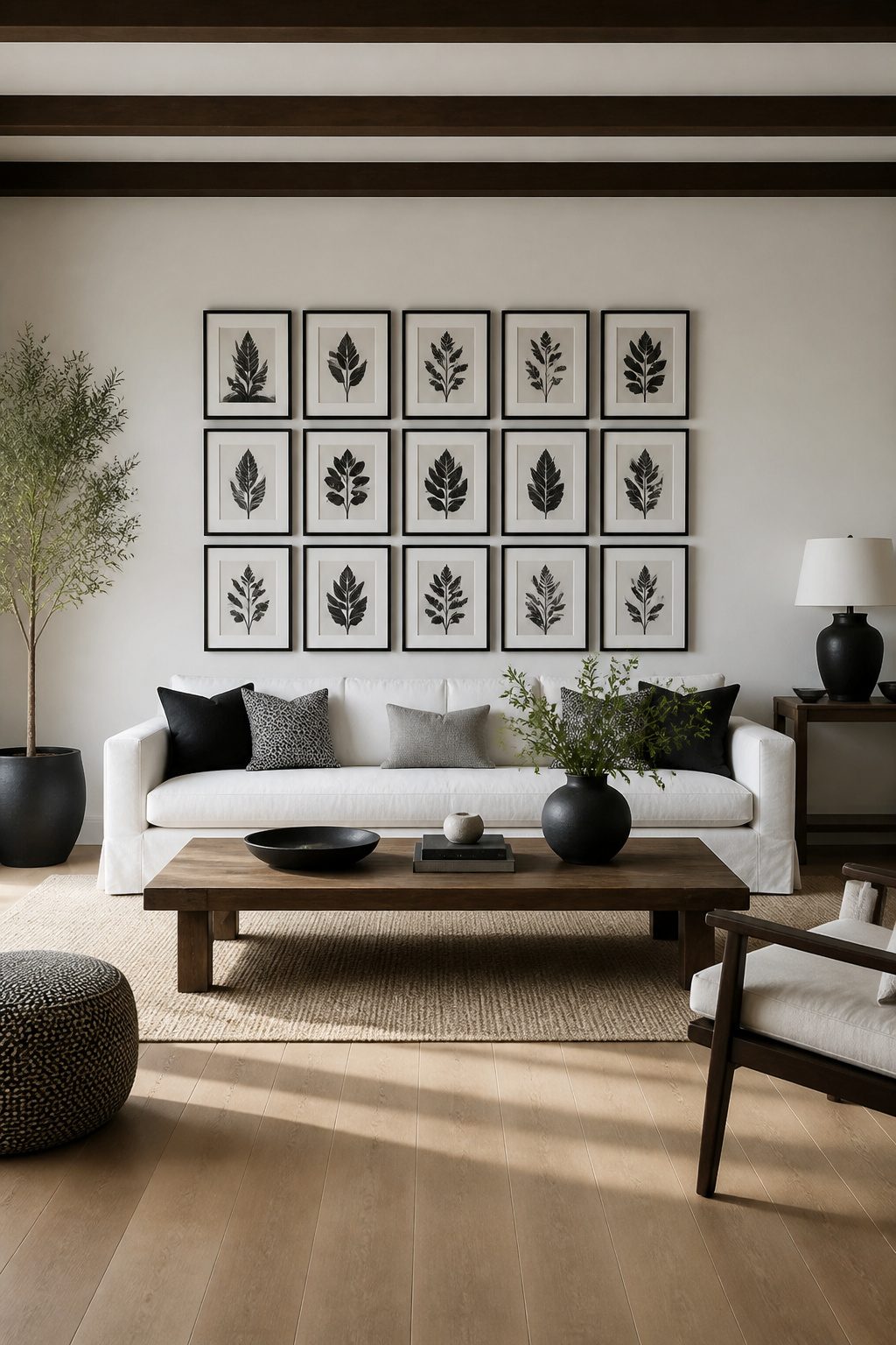
Black and white gallery walls work best when the photos share a single theme, not just a color scheme. Portraits from one trip, architectural details from your own city, or a series of botanical prints all hold together better than a random mix of subjects. The layout matters too: a vertical stack of six frames fits narrow walls or the space between windows, a nine-tile square grid anchors a sofa or console, and a twelve-frame corridor run turns a hallway into an actual gallery.
Paper templates and painter’s tape save the wall from extra holes. I trace each frame onto kraft paper, mark where the hook sits, and tape the shapes to the wall for a day or two before committing any nails. Lightweight adhesive tiles that re-stick without damage make this even faster if you are renting, though standard frames with white matting and simple black borders keep the look cleaner for a permanent install. Either way, the goal is the same: adjust until the spacing feels right, not mathematically perfect. A quarter inch one way or the other matters less than whether your eye settles when you walk into the room.
8. Minimalist Approach
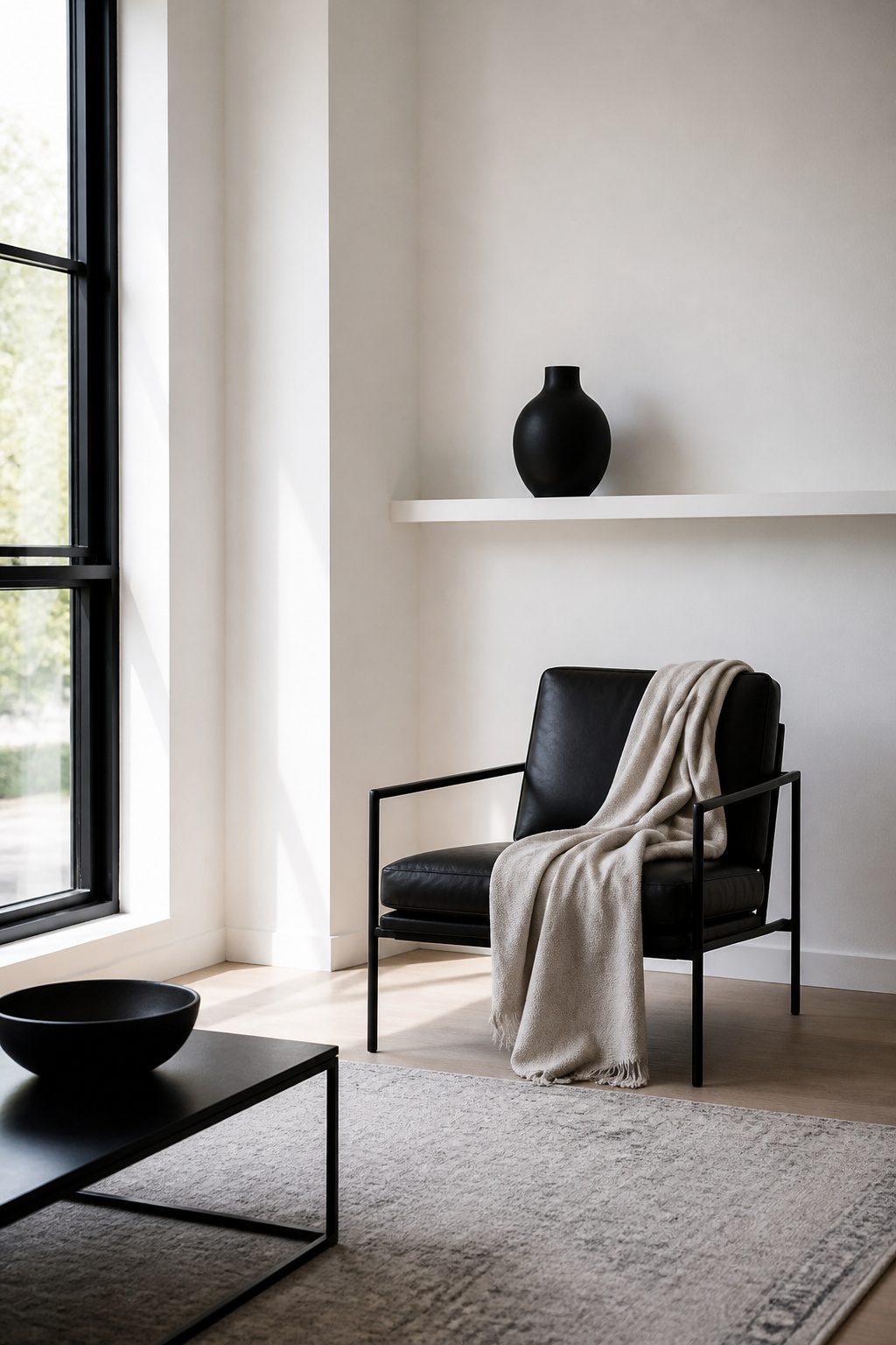
Clean lines do the heavy lifting in a black and white room. Without color to hide behind, every object you add gets full attention, which is exactly why restraint matters. A single ceramic vase on a bare shelf reads as intention; the same vase crowded by three candle holders and a stack of books reads as clutter that happens to be monochrome. Three objects on any surface is my ceiling, sometimes two, and that rule has saved more rooms than any paint choice.
The wall itself can stay completely empty in a small space. I used to think minimal meant gallery walls with thin black frames, but that is just a controlled busyness. True minimal here is letting the contrast between a white plaster wall and a black floor lamp be the whole statement. The lamp’s silhouette does the decorating.
Where I draw the line is texture. A room with only flat white planes and glossy black accents starts to feel like a showroom, not a home. A nubby linen throw on a black leather chair, or a matte ceramic bowl with visible throwing rings, keeps the space human without adding visual noise. Warmth lives in texture, not in extra stuff.
9. Statement Furniture
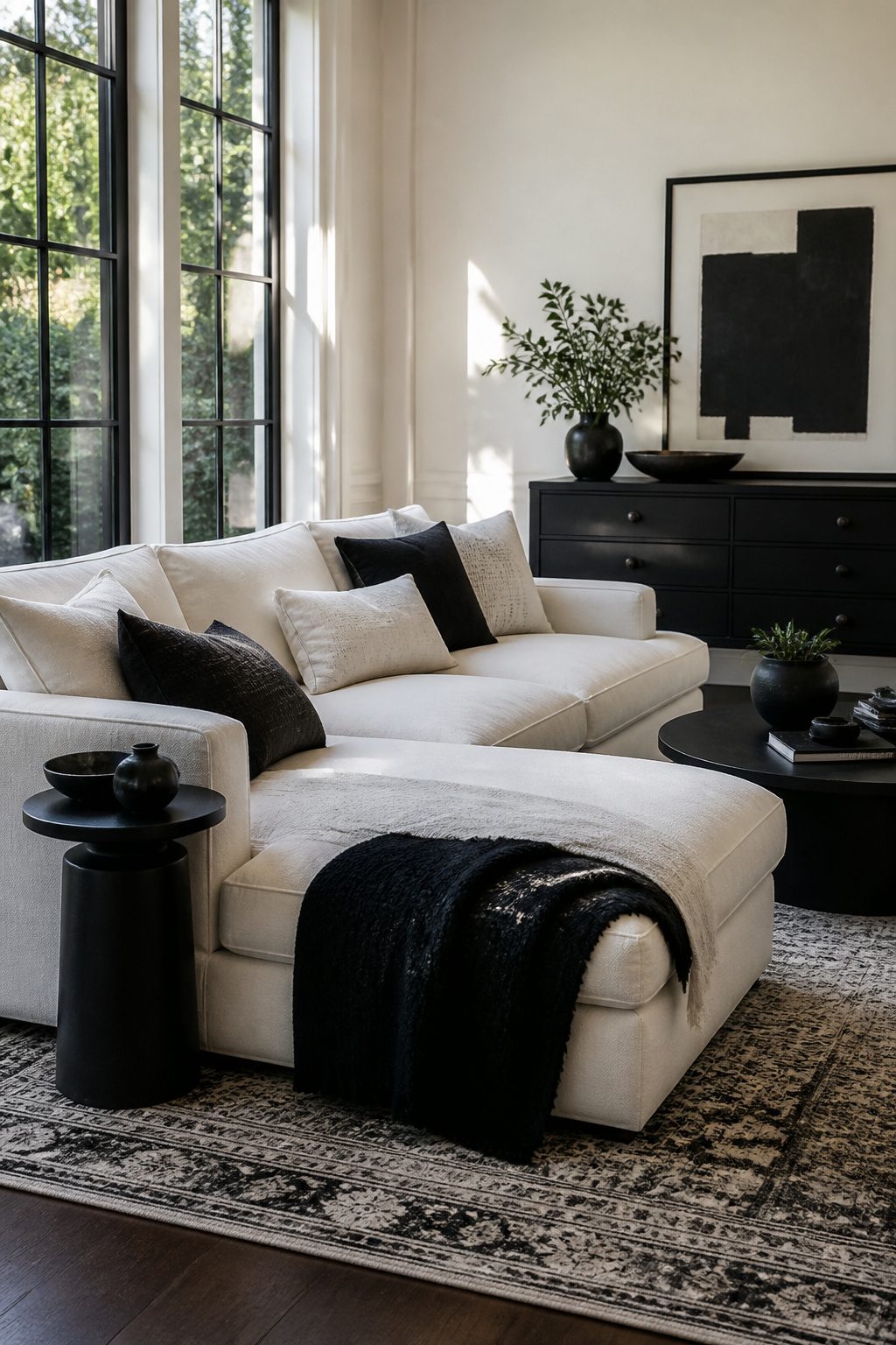
A black and white room lives or dies by whether it feels collected or staged, and the difference usually comes down to one piece that actually cost someone something. Four out of the five rooms I studied while planning my own space anchored on a single bold item: a sofa, a credenza, a rug, or an oversized photograph. Everything else stayed quiet. The moment you try to make every piece compete, you get the showroom effect, where nothing looks chosen because everything looks purchased at once.
My own anchor came from two separate secondhand finds. The first was a white sectional with rolled arms sitting on a platform base, bought years ago as a splurge that has since separated into two chairs plus an ottoman for smaller layouts. The second was a dresser I refinished in Sherwin-Williams Tricorn Black, a paint color that reads as true black without the blue undertone that cheapens cheaper blacks. The white platform base of the sofa and the matte black of the dresser do the heavy lifting; walnut side tables and linen throws fill in without announcing themselves. One statement piece carries the room; the rest just support it.
10. Lighting Choices
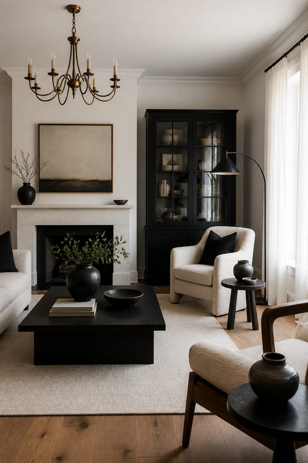
Black and white rooms flatten after sunset without deliberate lighting. The contrast that reads as crisp in daylight turns harsh under a single overhead bulb, so 2700 to 3000 K bulbs are what I look for, the warm end of the spectrum that keeps the palette livable rather than clinical.
Overhead lighting alone won’t do it. In my own setup, that ceiling fixture handles general visibility, but a table lamp at the reading chair and a narrow-beam accent on a textured wall do the actual work of making the room feel inhabited. Three sources minimum: overhead for baseline, task for what you’re doing, accent for what you want to notice. The temperature stays consistent across all three, or the warmth looks painted on rather than ambient.
Wood tones, a brass lamp base, a curved ceramic base rather than something angular, these pair with that light temperature to soften the graphic edges black and white insist on. The bulbs are cheap, the swap takes a weekend afternoon, and the difference is immediate enough that guests notice without knowing why.
11. Seasonal Decor
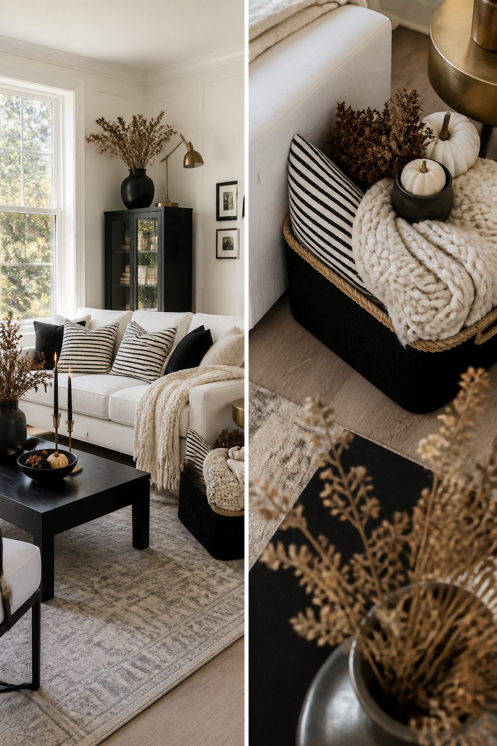
A black-and-white base makes seasonal swaps easier than most people expect. I keep a single storage bin labeled October through December, and inside it are only pillows, a couple of small centerpieces, and a brass candlestick set that all stay within the palette. Nothing red, nothing orange. The brass reads as warmth without breaking the scheme, and repeating that metal two or three times around the room keeps the eye moving.
In October the bin comes out: black-and-white striped pillow covers, a small bowl of matte black ornaments, and a white ceramic vase I fill with dried branches. December swaps the stripes for a chunky black knit cover and trades the branches for white paperwhites in that same vase. The brass candlesticks stay put both months.
The trick is limiting the accent to one hue. Natural wood or muted green would work too, but mixing them turns the room into a checklist instead of a look. Brass at two heights, minimum, or skip it entirely. That rule has saved me from the scattered, thrift-store effect I used to end up with every November.
12. Personal Touches
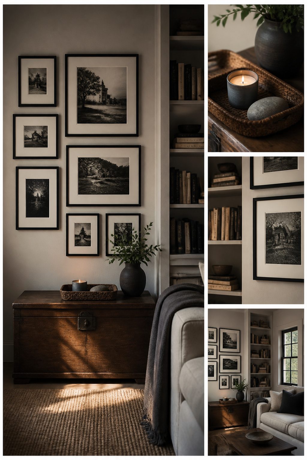
A black and white room risks reading like a showroom floor unless something in it carries your history. The fix is smaller than people think. In my own living room, a cluster of family photos in simple black frames with white matting does more to warm the space than any throw pillow could. The monochrome treatment keeps them from looking like a bulletin board of competing colors, and the white border between image and frame lets each shot breathe even when the wall is crowded.
Collected objects matter too, though the temptation is to style them too carefully. A ceramic piece from a roadside stop, a stack of books with worn spines, a tray holding a candle and a found stone: these things carry weight because they arrived one at a time. The black and white palette actually helps here. It quiets the visual noise so an odd shape or a personal story can register.
One inherited piece anchors the whole thing. Mine is a mirror in an ornate dark frame that belonged to my grandmother. Against the stripped-back palette, it holds its own without fighting anything else. The rule I follow: keep the furniture and rugs around it simple. The mirror is the event; everything else steps back. Without that piece, or something like it, the room would still look decorated. It just would not look lived in.
Texture and Warmth

Smooth surfaces in a black and white room read as cold unless something breaks them up. The fix is pairing a hard, reflective plane with a nubby textile that catches light differently and gives your hand somewhere to linger.
I learned this the hard way with a lacquered side table and a black metal lamp that turned a corner of my living room into something closer to a clinic waiting area. The shift came when I laid a heavy bouclé throw across the chair beside it, not folded neatly but dropped so the loops caught shadows against the gloss. The same principle works with a marble-look surface against a knit pillow, or glass shelving backed by a deep-pile rug that triangles its pattern across the floor.
Wood furniture with clean lines adds the mid-tone warmth that keeps contrast from flattening into two dimensions. A rattan basket against a matte black frame, leather pulls on a white cabinet, tweed seating against velvet cushions: each pairing works because the eye travels from slick to grabby and back again. The room stops being a photograph and starts being a place you enter.
The mistake is overloading every surface. One nubby element per sightline is usually enough. Two compete; three look curated by algorithm. Pick the spot where you actually rest, and make that the textured one.
Color Accents
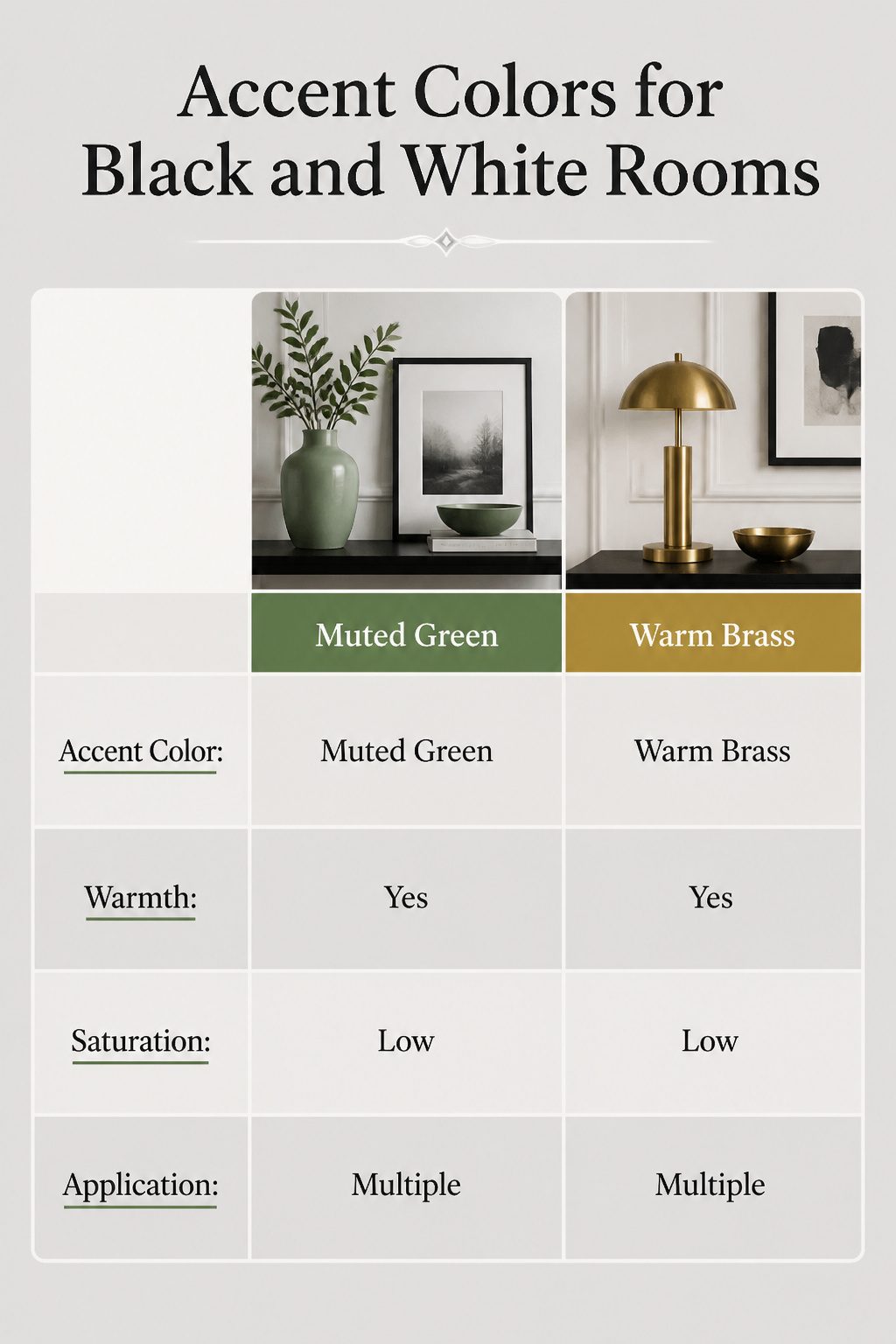
One accent color is the only rule that actually holds up in a black and white room. Natural wood, warm brass, muted greens, or soft gray each add warmth without competing for attention, and the key is repeating that single hue two or three times so the eye travels instead of landing in one spot and staying there.
I learned the hard way that muted beats bold every time. Emerald green on a black and white base looked like a costume, not a room. The saturation fought the palette instead of supporting it. Sage green, on the other hand, settles in the way wood grain does: it reads as texture more than color, which is exactly what a monochrome space needs.
The 60-30-10 split still applies even with only two colors in play. White carries the 60 percent, black sits at 30, and your single accent fills the remaining 10. Brass lamp bases, a caramel leather pillow, a single raffia frame: each piece draws the eye to a different height so the room feels walked-in rather than staged. Keep the accent consistent and the black white decor ideas stay clean without going cold.
Furniture Choices

A black and white room lives or dies by whether the furniture looks collected over time or bought in one afternoon. The safest move is mixing pieces that read as bold singles rather than a matched set. A solid black dresser against a white wall already carries enough weight to anchor a bedroom; swap it for a white dresser in a black-walled room and the effect holds.
Paint is where thrifted pieces become intentional. Tricorn Black SW 6258 and Extra White SW 7006 are the two colors I keep on hand for refinishing. I used Tricorn Black on a thrifted dresser last spring, and the finish shifted the whole room from scattered to deliberate. The piece had water rings and a missing pull, nothing $6 in hardware and two coats of paint couldn’t fix.
For your biggest investment, a neutral base wins. A sectional or bed frame in gray, natural wood, or even a soft charcoal gives you freedom to move the black and white accents around as the room evolves. The platform sectional I bought years ago still works because the frame is quiet; the black and white lives in the pillows, the throws, the painted pieces that cost less to swap.
DIY Tips

A matte black dresser with white ceramic knobs sits in my bedroom because I got tired of hunting for the right piece in budget range. The frame was a $45 flea market find, already solid wood but drowning in a cherry stain from the 1990s. Two coats of Benjamin Moore Advance in satin black, a day of drying between them, and the grain still reads through just enough to keep it from looking plastic.
Skip the brush and buy the foam roller. I tried a brush first on the drawer fronts and the strokes telegraphed through every layer. The foam left a factory-flat finish that reads as intentional, not crafty.
For wall art, a roll of black contact paper and a cheap aluminum clipboard became the geometric piece above my sofa. I cut the paper into irregular angles, stuck them straight to the metal, and hung it with a single nail. Total time: forty minutes, $12, and it peels off clean when the lease ends.
What I would not repeat: the black-and-white striped accent wall I attempted with painter’s tape. The bleed at every edge required five touch-up hours. A single bold stripe, or a framed panel you can move, saves the weekend you actually have.
Frequently Asked Questions
Which accent colors pair best with black and white decor?
Natural wood, warm brass, muted greens, and soft gray all work well. The key is picking just one hue and repeating it two or three times around the room so the eye travels instead of landing in one spot. Muted tones read as texture rather than color, which keeps a monochrome space from feeling like a costume.
How can you add depth with texture, materials, and contrast?
Pair smooth, reflective surfaces with nubby textiles your hand wants to linger on. One bouclé throw or knit pillow per seating area is enough; two textures compete and three look algorithm-curated. Wood furniture with clean lines adds mid-tone warmth that keeps black and white from flattening into two dimensions.
What type of rug works in a black and white room?
A rug that is mostly black with colored accents will ground the space, while a lighter background makes the room appear bigger. For layered looks, start with a large natural-fiber base like jute, then add a smaller patterned top layer and leave at least eighteen inches of the base showing on every side.
How do you create a striking gallery wall in minutes?
Pick one theme, not just a color scheme, then trace each frame onto kraft paper and tape the shapes to the wall with painter’s tape before driving any nails. Lightweight adhesive tiles speed this up for renters. Adjust until your eye settles when you walk in; a quarter inch either way matters less than how the overall spacing feels.