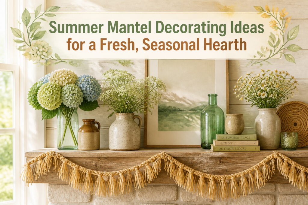
The best summer mantel decorating ideas run from a thrifted $4 cylinder vase to a hand-built raffia garland that sheds like a golden retriever, and the one that wins depends on how much imperfection you can stand. Real hydrangeas wilt inside a week, but they also breathe in a way silk peonies never manage, and that tradeoff between effort and life is what separates a seasonal hearth from a craft-store explosion.
1. Natural Elements
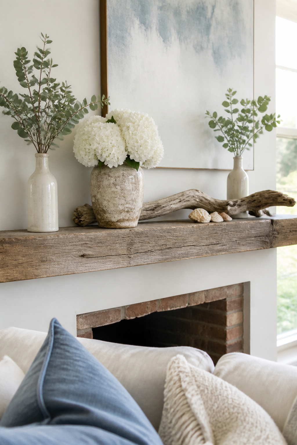
Fresh hydrangeas, peonies, or sunflowers on a mantel do more than add color; they mark the actual season in a way fake stems never quite manage. I learned that the hard way one July when a cluster of silk peonies sat so still they looked like leftovers from spring. Real blooms wilt, but they also breathe.
The trick is keeping the arrangement from turning into a craft-store explosion. One generous bunch of white hydrangeas in a weathered ceramic vase anchors the whole surface. Add a few eucalyptus branches in a slim milk bottle for contrast, and the green does the work of ten accessories. Driftwood laid flat or propped at one end carries the beach feeling without needing anchors or glass bottles filled with sand. A handful of seashells tucked near the base of the vase, not scattered across every inch, reads as found rather than staged.
Potted succulents or a small bowl of smooth stones can balance the softness of peonies on the other side. The asymmetry keeps it casual, which matters for a summer look that only stays up for a couple of months. Stop at one flower type and one hard natural element; the restraint is what makes it feel organic rather than assembled.
2. Colorful Accents

Aqua, sunny yellow, and soft green read as summer without turning the mantel into a nursery. The trick is keeping the saturation low and the finish matte or weathered. A faded aqua bottle or a chipped ceramic in pale chartreuse carries the season; the same hue in high-gloss resin looks like party-store decor.
I learned this the hard way with a set of lemon-yellow candlesticks that seemed cheerful online. On the mantel, under evening lamplight, they glowed like traffic cones. Swapping them for a single forsythia stem in a dull ochre vase fixed the balance. One bright element, surrounded by quieter tones, says summer. Three competing brights say carnival.
Pastels work the same way. A line of vintage bottles in washed-out turquoise, a few stems of whatever flowers the grocery store has, and maybe one sea urchin or piece of beach glass: that is enough. The sources that stuck with me kept the palette to two colors plus wood or white, never a full rainbow.
If your room already runs neutral, these accents layer in and out in a weekend. No paint, no commitment. Come September, the bottles move to a bookshelf and the mantel goes back to its calmer self.
3. Nautical Themes
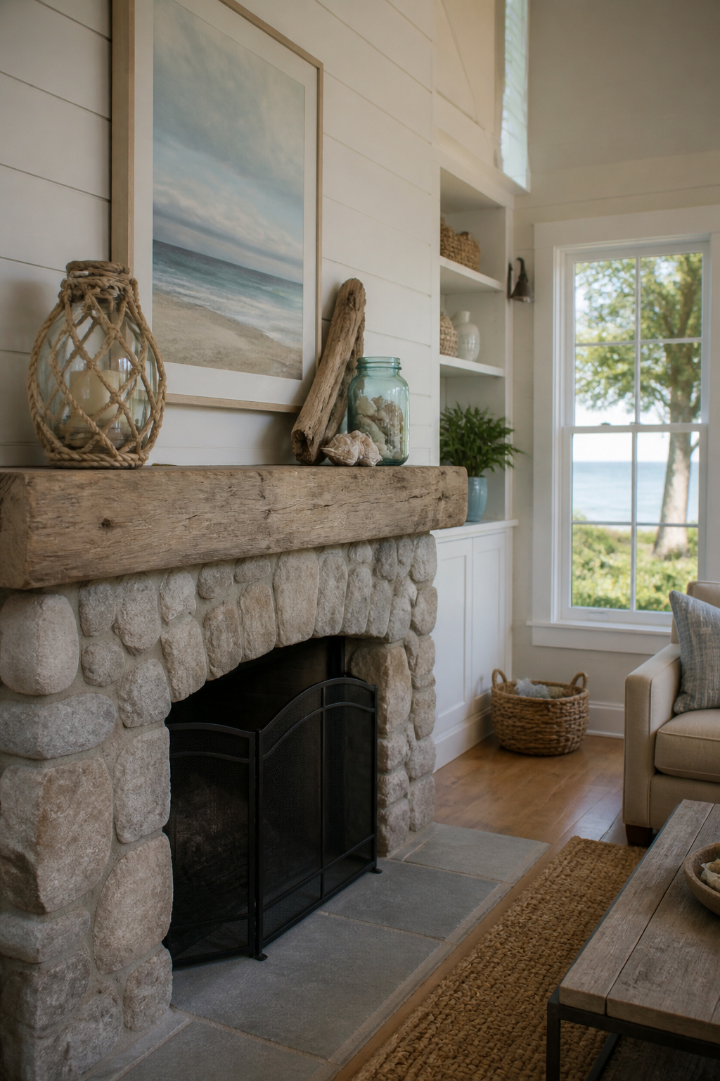
The summer I tried a full nautical mantel, the line between coastal and costume-y sat about three objects past where I thought it did. Anchors, lanterns, starfish, seashells, and a straw beach hat all made it up there, because each piece worked in isolation. Together they read like a seafood restaurant menu board. The hat was the last straw, or maybe the first one I should have questioned.
Pulling back meant removing anything that literally said "beach." The anchor went. The hat went. What stayed were textures: weathered wood, rope-wrapped lanterns, a single starfish paired with a piece of driftwood. The shells stayed too, but only three, tucked inside a vintage blue mason jar rather than scattered like a gift shop display.
A summer garland made from beach finds works if you keep the craft materials minimal, which in practice means stopping before the twine gets crowded. One source approach I have watched work is letting a beach canvas painting carry the theme alone, then adding almost nothing else. The mantel itself and the painting do most of the work that way.
For renters especially, this is low-stakes territory. Nothing is mounted; everything lifts off in September. The mistake is thinking more objects add more atmosphere. They add more clutter, and clutter on a mantel reads kitsch faster than anywhere else in a room.
4. Layered Textures
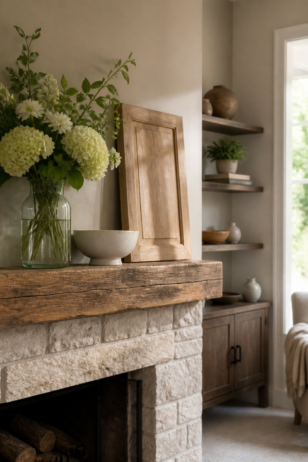
The mantel in my old apartment taught me that matching finishes read as a single blob from across the room. I had lined up three ceramic vases, same height, same glaze, and the result was so flat I might as well have left the shelf empty. Wood, glass, and ceramic each catch daylight at their own angle, and that variation is what keeps a summer arrangement alive from morning to evening.
The real mistake is making everything the same height and finish. A tall glass piece, say a cabinet door stripped back to bare wood and leaned upright, throws reflections that shift as the sun moves. Ceramic holds steady and absorbs light. Wood splits the difference with softer shadows. The trick is placing them so no two similar textures sit next to each other; let the eye travel across contrasts instead of settling on sameness.
Jaimee Longo, who runs The Layered House, keeps her mantels from looking overstuffed by avoiding identical accessories on both ends. Less is more for everyday styling, she says, and the height variation matters more than the number of pieces. I follow that loosely now: one tall anchor on the left, a low ceramic bowl on the right, something glass in between to catch what light remains after lunch. The arrangement looks different at 5 p.m. than it did at 10 a.m., which is the point.
5. Candles and Lanterns
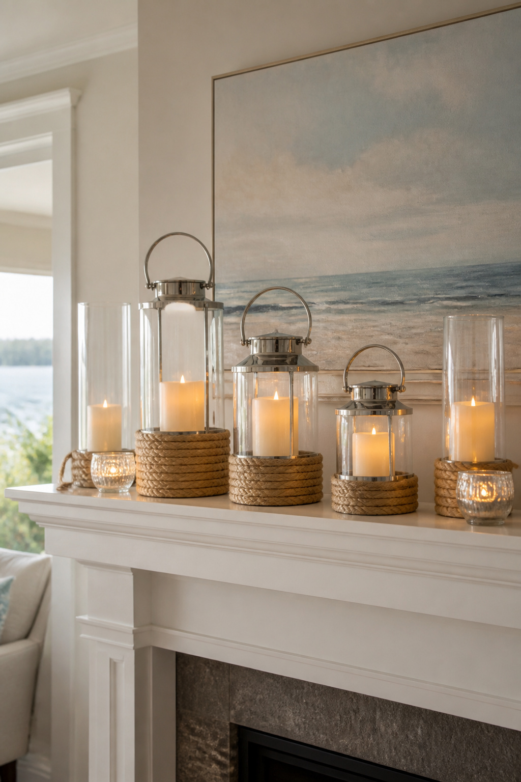
Three lanterns in graduated sizes, two slim hurricanes, and a pair of glass votives at the ends: that is the height story that keeps a summer mantel from going flat. I set the tallest piece off-center, never dead middle, and let the eye travel in a loose triangle rather than a straight line. The sources lean coastal on this, and I follow them there. Rope-wrapped bases, brushed nickel, plain black iron all read summer if the shapes are simple.
Scent matters when the candles are real. Citrus carries; ocean breeze reads clean rather than perfumed. Both fade fast in a room with the windows open, which is the point. You want to notice them when you walk past, not when you walk in.
The fire-code side is where I had to change course. An open flame beneath a working flue is not the same as a flame on a dining table. Clearance rules vary by municipality, but the general standard runs 18 inches minimum from combustible material to an open flame, and a mantel shelf counts as combustible even when it is stone-faced. I switched to battery-operated pillars with a flicker setting and a timer. The good ones run about six hours on, eighteen off, and the wax shell still smells if you buy the scented kind. The effect is the same after dark. The fire inspector sleeps better.
6. Seasonal Wreaths
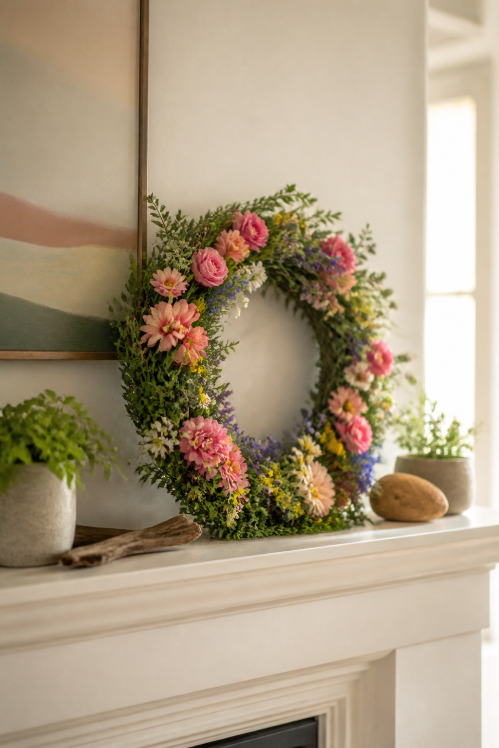
A wreath above the mantel reads as summer the moment someone walks in, but the proportions have to be right or it throws the whole wall off. I learned this with a 24-inch wreath on a 36-inch mantel, a pairing that looked fine online and ridiculous in person. The wreath swallowed the space and left almost no visible wall on either side, so the eye read it as a mistake rather than a focal point. For that width, something in the 18-inch range leaves breathing room and still registers as the anchor piece.
Flower and leaf wreaths work for inland summers; seashell and starfish versions carry the same weight for a coastal mood. The material matters less than the scale and the color against whatever sits below it.
Where there is no wall above the mantel, the wreath can still sit on the mantel itself, leaned against the chimney breast or propped in a stand. I have also seen them hung from a narrow ribbon dropped from the ceiling, though that only works with a light frame and a secure hook. The lean is simpler, and it keeps the wreath at eye level rather than floating in midair.
7. Personal Touches
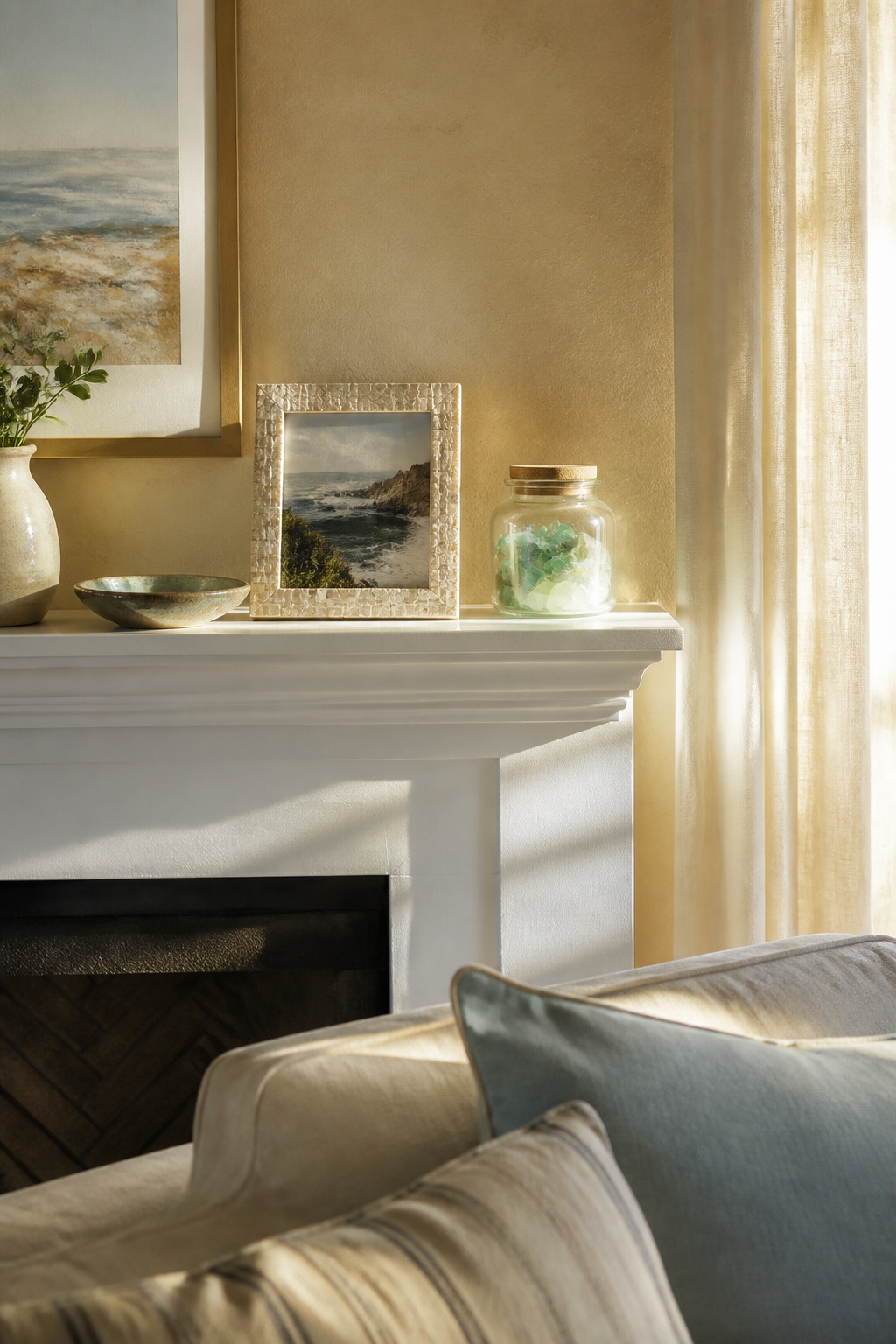
The mantel in our living room carries a framed photo from a trip to the Oregon coast, a piece of sea glass, and a small ceramic dish my grandmother made. That is the full list for July, and the rule I keep is three objects, no more, rotated rather than accumulated. Anything that stays year-round starts to read like a shrine instead of a shelf.
The sea glass jar is the one piece that comes back every summer. It sits in a plain cylinder vase I bought at a thrift store for $4, no label, no story card propping it up. Guests ask about it maybe once a season, which is about the right frequency for a personal object in a shared space.
"Bringing in locally inspired touches instantly transports guests and fosters authenticity."
What this means practically: one local item, bought or found, beats a mantel crowded with vacation souvenirs. A single framed photo from your area, one pressed flower, one piece of regional pottery. The rest of the summer stays light enough to actually dust.
8. Minimalist Approach
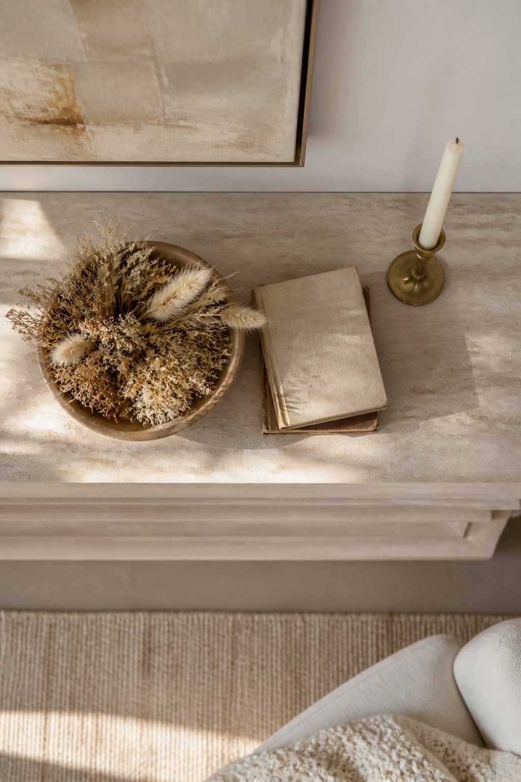
A three-object mantel sounds easy until you try it. The first time I cleared everything off and set down a mirror, a vase, and one candle, the result felt abandoned, not intentional. What changed was learning to treat the empty space as an active part of the design.
The 60-30-10 rule helps here, applied to surface area rather than color. One piece takes up roughly 60 percent of the visual weight, a second piece about 30 percent, and the last item fills the remaining 10. On my mantel, that meant a wide, low bowl of dried grass at 60, a single taper in a slim holder at 30, and a small stack of old books at 10. The books worked as a riser elsewhere before, but here they sat flat, just adding a low block of tone.
The catch is placement. Two items on one side and one on the other keeps the eye moving; matching heights on both ends reads static fast. Candle holders in clusters work for this, maybe two on the left and one on the right, depending on your mantel width. Faux stems or a single seasonal branch can stand in for the large piece without adding clutter. Move what you already own around the same space until the balance clicks; buying new pieces is rarely the fix.
Theme and Color Palette
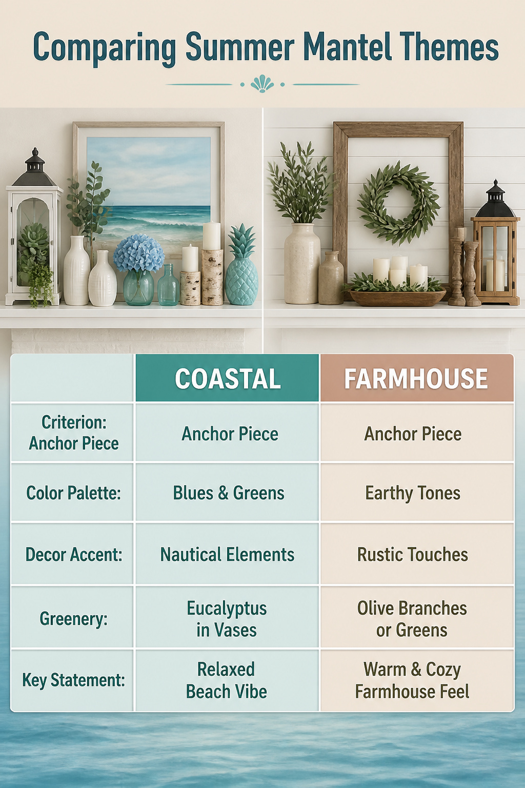
A summer mantel needs a single, clear direction before anything else lands on it. Coastal, farmhouse, and minimalist each work, but the real problem starts when you mix two without meaning to. Last year I almost bought three different versions of the same blue because I had not settled on whether I was building a beach scene or a clean, airy space. The painting pulled toward water, the lantern read nautical, and the glass cake stands I already owned sat somewhere in between. Nothing matched because nothing was chosen.
The one-palette rule that stopped the bleeding: pick your anchor first, one piece that carries the colors you want, and let every other item answer to it. For a wide mantel, that anchor usually sits in the center. A large painting, a mirror, or even an empty frame works. Once that piece is fixed, the rest of the mantel becomes a question of balance, not of taste. I needed height on one end, so I used a lantern with faux succulents. The other end got a resin pineapple. Both pulled from the same blues and greens in the painting. The white vases and birch candle holders lightened the area without introducing a new conversation.
Greenery helps, but it needs to earn its place. Eucalyptus branches in milk bottle vases gave me the dark contrast I wanted against lighter pieces. A faux blue hydrangea and an aqua glass vase added depth without wandering off into a second theme. If you are drawn to beach elements, driftwood or seashells work, but commit to them. Half-measures read as clutter.
Focal Points
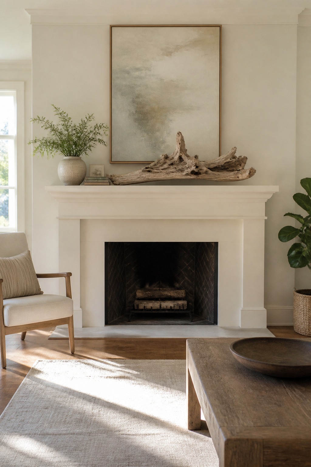
A mantel without a focal point is just a shelf, and a shelf is where mail goes to die. The first summer I tried this, I hung a mirror I’d found at a flea market and immediately felt the room tilt wrong. The center sat six inches too high, above eye level from the sofa, so the whole wall felt like it was leaning away from you. Dropping it to where the bottom edge hit roughly 57 inches from the floor fixed the proportion overnight. That number isn’t universal; ceilings and furniture heights shift it, but the rule of thumb is to let the mirror’s center settle near standing eye level or the mantel’s own midpoint, whichever reads calmer in the room.
Large art works the same anchoring job. A single 24-by-36 print or a horizontal piece about two-thirds the mantel width gives the eye somewhere to land before the smaller stuff registers. The same sources that suggest driftwood or a sunburst mirror for summer energy also keep returning to this: once the anchor piece is right, the surrounding objects can shrink by half and still read as intentional. I used to crowd both ends with equal-weight vases and candles to balance the mirror. The mirror already did the work. One small stack of vintage postcards, one ceramic pot, and the arrangement felt finished rather than empty. Less isn’t more because it’s virtuous; it’s more because the focal point is already carrying the conversation.
Height Variation
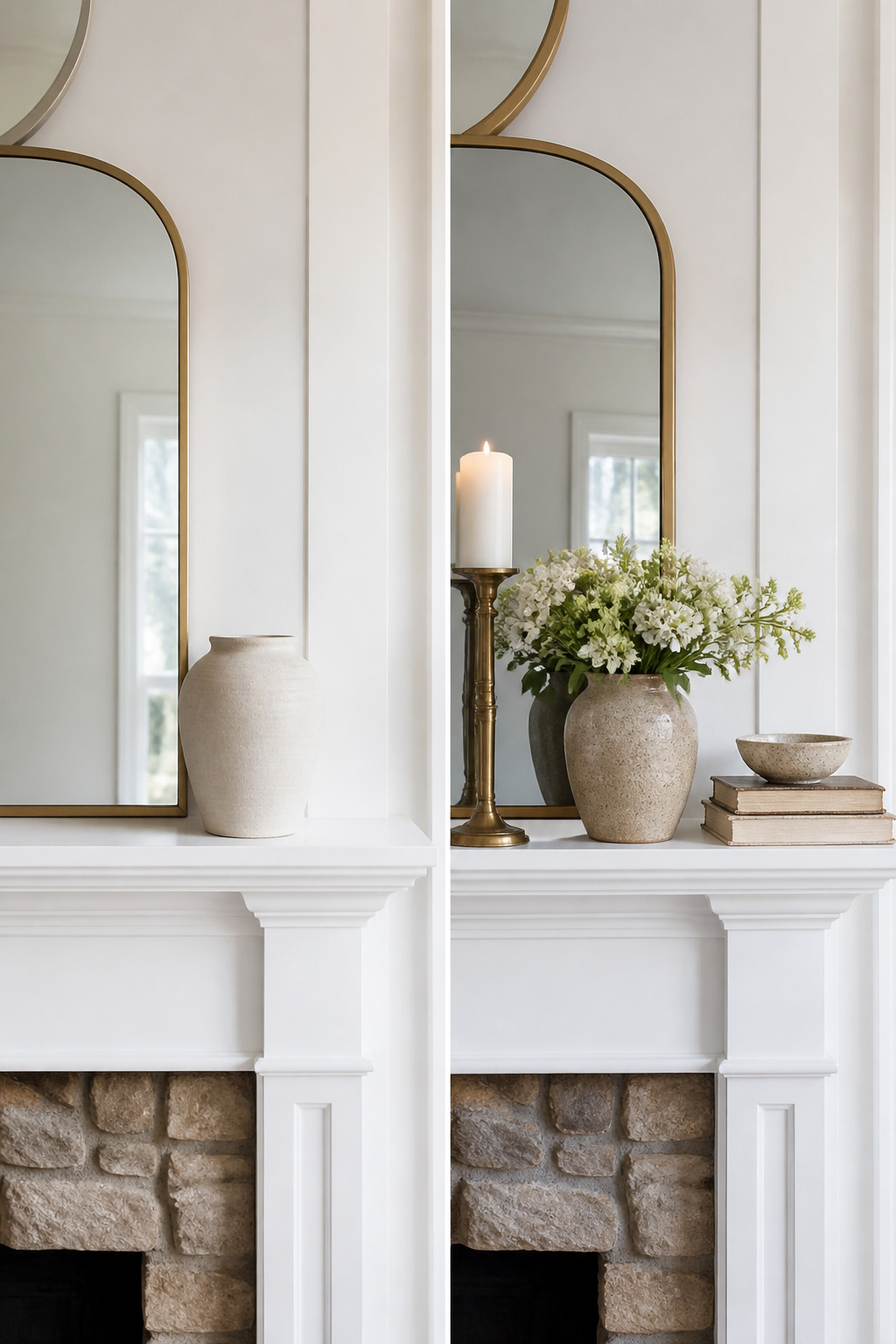
A mantel where every piece sits at the same eye level goes flat fast, no matter how pretty the objects are. The fix is height variation built from the actual dimensions of what you own.
Nothing under 4 inches belongs next to anything over 18 inches. That spread, 4 to 18, is the working range for a standard mantel. Below 4 inches reads as clutter that disappears; above 18 inches fights the mirror or art above the shelf and starts to look like it’s escaping upward.
Tall candlesticks carry most of the load for me, the way a set of brass or painted ones in graduated sizes can step up from one end. Vases do the same work with a softer line, especially a single narrow-neck piece holding a stem or two.
The problem is most of us collect objects that cluster in the middle, 8 to 12 inches, and the whole arrangement turns into a plateau. Old books solve this cheaply. I stack two or three as risers under a shorter vase or bowl, which lifts it into a new tier without buying anything new. The books can face spine-out, page-out, or even backward if the color works better that way; the point is the lift, not the reading.
Less is more at the ends. Overstuffing both sides of the mantel makes the height variation itself look like clutter rather than intention. One tall anchor on the left, a mid-height piece with a book riser on the right, and the eye moves across without getting exhausted.
DIY Elements

A summer garland built from dollar-store raffia and a wire hanger took me about three hours one Saturday, and from five feet away it passed for something from a boutique. Up close the strands shed like a golden retriever in July, so budget DIY means testing materials before you commit them to the mantel. The wire frame bent easily into a gentle arc, and wrapping raffia in uneven bundles hid every imperfection. Total cost sat around eight dollars against thirty-five for a comparable store-bought version.
Wreaths follow the same math. A grapevine base from the craft aisle, some dried hydrangea from the yard, and twenty minutes of tucking stems gets you a door-worthy piece. The catch is longevity: my raffia garland lasted one season before the shedding made it unusable, while a store-bought seagrass garland I bought the following year is on its fourth summer and still tidy. For a weekend project you plan to replace annually, DIY wins. For something you want to store and reuse, the hours rarely pay off unless you already own the supplies.
Vintage and Local Finds

The chipped green pottery on my summer mantel came from a garage sale three blocks away, and it carries more weight than anything I have ordered new. A local maker’s stamp on the underside dates it to the 1970s, and the glaze misses in spots where someone else’s hands wore it thin. That imperfection is the whole point.
Old picture frames and vintage books stack well against newer pieces without looking like a showroom. The contrast gives the eye somewhere to land. One designer I follow mixes antique mantel standards with modern objects for what she calls "edge," though I think the real draw is that the old items already hold stories. A fishnet draped behind a shell wreath does the same for a coastal summer setup: texture first, narrative second, and neither requires a catalog.
Sourcing close to home keeps the budget in check and the result specific. Thrift store finds that celebrate your location beat mass-market trends because no one else will have the same chipped pot or regional photograph. The goal is a mantel that feels lived in, not decorated.
Frequently Asked Questions
What are some summer mantel decorating ideas?
Start with fresh flowers in a weathered vase, add one hard natural element like driftwood or a few seashells, and stop there. Keep the palette to two colors plus wood or white, vary heights from 4 to 18 inches, and let one piece carry 60 percent of the visual weight. For a coastal feel, use rope-wrapped lanterns and weathered textures rather than literal beach objects.
How can I make my mantel look summery?
Bring in real blooms, one generous bunch of white hydrangeas or whatever is fresh, paired with a single hard element like driftwood or smooth stones. The asymmetry and the living quality of the flowers do what silk cannot. One local found object, rotated in for the season, reads as authentic where a shelf full of souvenirs reads as a shrine.
What colors are best for summer mantel decor?
Aqua, sunny yellow, and soft green work when the saturation stays low and the finish is matte or weathered. A faded aqua bottle or chipped ceramic in pale chartreuse carries the season; the same hue in high-gloss resin looks like party-store decor. Keep the palette to two colors plus wood or white, never a full rainbow.