
The difference between a shelf that looks collected and one that looks staged usually comes down to whether the books were ever meant to be opened. Real vintage spines sit at slightly different angles because they have been read; factory-distressed sets ship uniform. If you actually pull books down, color-coordinated shelves will cost you time every search. A $2 estate-sale field guide with foxed pages and deckled edges carries more warmth than a $40 curated bundle with glued-shut pages, and the only question is whether your room needs storage that shows its use or display that hides it.
1. Vintage Books

The best vintage books come from places where nobody has already picked the winners. Thrift stores and estate sales stack hardcovers three deep for a dollar or two, and the foxing on a 1920s novel beats the uniform distressing on a $40 "decorative book" bundle every time. What I look for are the accidents of age: a spine softened to the color of old brick, deckled edges that catch lamplight unevenly, pages mottled brown where the acid has worked long enough to look intentional. Those pages are usually thicker than modern stock, and the rough cut gives you something to display even with the cover turned away.
Skip the curated sets sold by color online. The same titles show up in every bundle, and the distress is applied, not earned. A real shelf of mismatched antiques carries the warmth of actual use; the spines sit at slightly different angles because they have been opened, not because they were shipped that way. If you want cohesion, tie a small stack with twine and set it beside a family photo or a chipped ceramic. The twine holds them together without hiding the wear, and the pairing tells a story that a factory-aged set never will.
2. Color Coordination

Arranging books by color turns a shelf into something closer to art than storage. The rainbow shelf trend lines spines up like a gradient, and in the right room it can pull a whole color scheme together without buying a single new object. Sources describe it as playful and modern, a way to add brightness that still reads clean.
The catch is that finding the book you need becomes harder when titles are sorted by cover instead of subject. I tried this in a living room with already-busy walls, and the color-blocked shelves fought everything else for attention rather than grounding the space. The rainbow read as one more layer of noise. In a calmer room, or with a more limited, monochromatic scheme, the same approach would have worked; burlap-wrapped books or a single-tone cluster can bring texture without the full spectrum. For renters and weekend projecters, the real question is whether you reach for these books often enough to care. If they are mostly display, color wins. If you actually reference them, the visual payoff may not survive daily use.
3. Removing Covers

Stripping the dust jacket off a hardcover changes the whole presence of a shelf. What sits underneath is usually a cloth-bound spine in a single muted color, sometimes with foil stamping, sometimes plain. The exposed boards at the corners give a book the look of something chosen for itself rather than for the cover art it came wrapped in.
This only works for hardcovers with sewn bindings. Paperbacks have their cover art printed directly onto a flimsy outer layer; remove that and you have exposed glue and cardboard, not a design choice. Even with proper hardcovers, some modern editions glue the dust jacket flaps down so aggressively that pulling them free tears the endpaper or lifts the cloth from the board underneath. Library discards add another problem: many stamp the spine with ownership marks that the jacket was hiding, so what you reveal is a call number or barcode, not clean linen. Check the spine before you commit.
4. Using Books as Risers

A single thick book under a candle or a small plant usually leaves the piece looking squat, like an afterthought. Three books of graduated size, stacked largest to smallest, give you a stepped base that reads as intentional and lets the object on top sit at a height where you actually see it against the wall behind. Hardcovers with solid bindings are the practical choice here; paperbacks sag under any real weight, and after a humid week they can warp into a slope that sends your candle drifting toward the edge. For framed photos, the stack wants to lift the frame above the surrounding clutter of a desk or side table without putting the glass at risk of a knock. Two to three inches of lift is usually enough to let light hit the frame and to keep the photo from disappearing behind a lamp. The same stack on a shelf breaks up a row of vertical spines and gives that small object a natural resting point, which keeps the whole line from feeling flat or overly styled.
5. Creative Wrapping
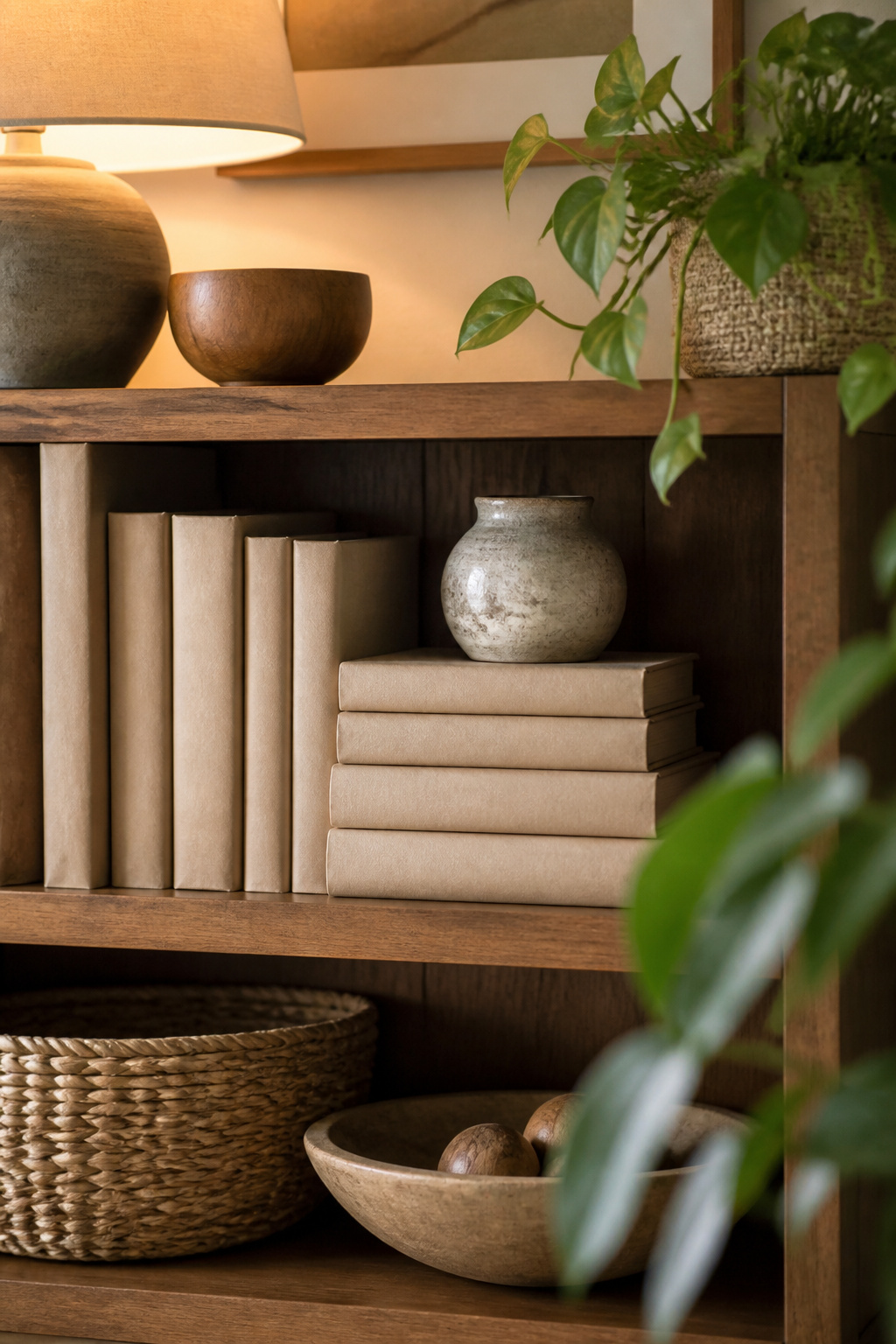
Wrapping a shelf of mismatched paperbacks in brown butcher paper turned out to be the cheapest cover-up I have tried. A roll from the grocery supply aisle ran me about eight dollars and covered twenty-odd books with paper left over. The method is simple: lay the book spine-down, fold the paper around like a present, crease the edges sharp, and tape the seam on the back. The result reads as a single warm block of color instead of a clutter of competing covers.
Fabric sleeves cost more but behave differently. A yard of medium-weight linen set me back closer to twenty-five dollars, enough for six or seven books depending on the size. The linen held up better over two years; the butcher paper started picking up oils and corner wear after about eight months of regular handling. Fabric makes sense for books you actually pull down and open; paper works for display-only rows.
I reach for wrapping when I need a set to disappear visually, not when the books themselves are the point. Hiding a row of beat-up mass-market thrillers behind clean kraft paper let me use a high shelf as a neutral backdrop for a ceramic vase. For a valuable dust jacket I want to protect, a removable fabric sleeve beats permanent adhesive every time.
6. Displaying Unique Books

Art books, vintage cookbooks, and small press runs have the advantage of covers someone actually designed to be seen. The spine of a mass-market paperback is an afterthought; the face of a 1960s Julia Child or a limited-run photography collection is the whole point. Face-out display matters more for these than spine-out, because one striking cover draws the eye faster than a uniform row of titles.
I learned this after stacking a shelf spine-out for months and watching guests walk past it. The same books, turned forward, started conversations. A cover with bold typography or an unusual illustration works like a small piece of art; the spine reads like a filing system.
To spot candidates, thrift stores and library sales are the obvious hunting grounds, but don’t ignore your own shelves. That textbook with the gorgeous linocut you kept from college, the cookbook your grandmother gave you with the hand-drawn fruit on the cover: these are the keepers. The condition of the pages matters less than the impact of the front face. One or two strong covers per shelf is plenty; more than that, and they compete instead of anchor.
7. Book Pedestals
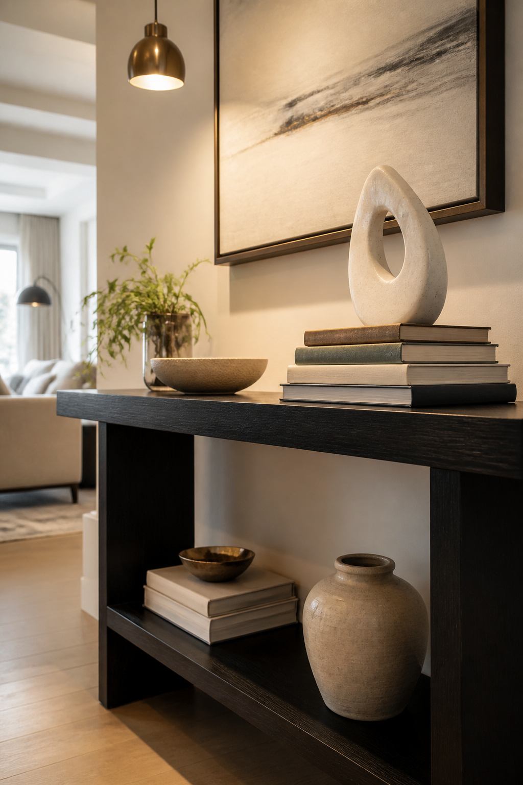
A book pedestal is not the same thing as a riser. A riser lifts a lamp or a bowl a few inches so it reads against taller neighbors; the books are support, and the object was going on that table anyway. A pedestal is the point. The stack stands alone, tall enough to be noticed, with one thing crowned on top: a vase, a sculptural piece, a small plant. The books are the architecture.
The first time I tried this, I built a tower. Six books, narrow spines, stacked straight up like a column. It looked dramatic for about six hours, then leaned, then slid apart across the console table. Wider base than top is the rule that matters. Start with two or three oversized art books laid flat, add a smaller hardcover or two, then place the single object. The weight settles downward, and the silhouette stays steady.
Color or theme links the stack. Several books connected by a palette, or by subject, read as intentional rather than leftover. On a console table, two or three of these pedestals spaced apart look considered; too many and the room becomes a yard sale of vertical piles.
The living room coffee table is the forgiving test space. Two to four oversized books with neutral covers, subtle contrast between them, and one sculptural object on top. The stack anchors the surface without demanding the whole table. That is usually enough.
8. Mixing with Other Decor
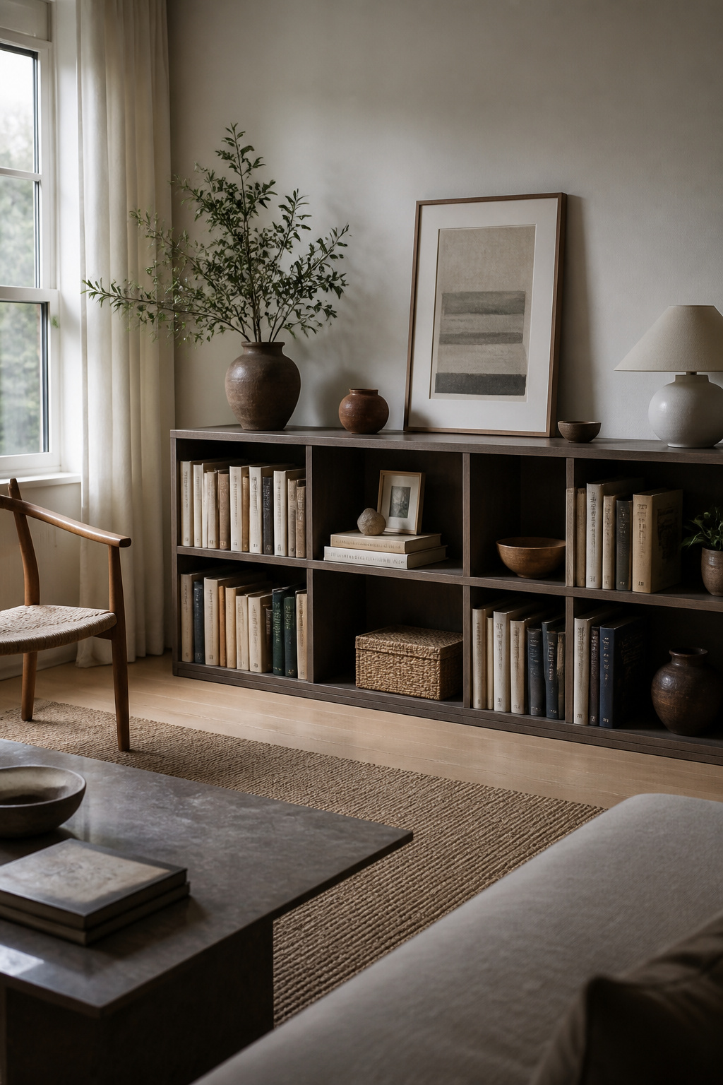
A shelf of nothing but upright books looks like a filing system. The trick is treating the books as part of a larger still life. I stack two or three books horizontally and set a small ceramic or a framed photo on top; the stack becomes a pedestal and the shelf gets layers instead of stripes.
Odd numbers rule here. Three objects grouped together hold the eye differently than two or four. A single trailing pothos dropping over the edge of a horizontal stack softens the whole line, and one small sculptural piece between vertical spines breaks the rhythm without starting a collection. Two of anything looks like a pair waiting for its mates.
Breathing room matters more than I expected when I started. Crowded shelves look full for about a week, then the dust settles and every object seems to shrink into the clutter. Six months in, what read as abundant reads as neglected. I leave at least an inch of empty shelf between groupings, sometimes more. The books look chosen instead of stored.
Color helps tie it together. Warm-toned ceramics pulled from nearby spines, as one designer does with an orange typewriter against orange bindings, make the mix feel found rather than arranged. I keep the palette loose but not random: cool with cool, warm with warm, one section at a time.
What to Avoid

A shelf of books bought by the foot, all spine and no story, reads like a set dressing warehouse. The color-matched rows some sellers bundle on Etsy look striking for about a day, then the eye catches the repetition and the whole thing flattens into wallpaper. Real books carry wear, notes, dog-ears; manufactured uniformity undoes that charm.
Stacking too high is the other trap that turns a display into a hazard. Anything above three or four books in a vertical pile starts asking for a fall every time someone walks past or a door slams. The sources that suggest turning spines to the back for a "manuscript feel" rarely mention that you now cannot identify a single title without unstacking the whole tower. If you cannot pull one book out without toppling the rest, the stack is too tall.
Ignoring whether you will ever read the book again is the quieter mistake. Chatbooks stacked spine-out in a case, vintage finds wrapped in burlap, re-covered paperbacks in white or brown kraft: all of it looks cohesive until you need the recipe on page forty-seven and have to unwrap half the shelf. Cohesion is worth something, but a library that fights its own use becomes clutter with pretensions.
Seasonal Shifts
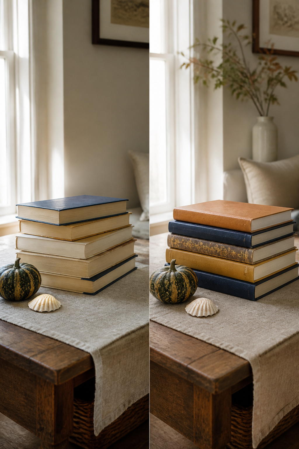
Books shift with the seasons more easily than almost anything else on a shelf. The same stack that reads cozy in January, paired with a dark candle and a scrap of wool, feels heavy by June. Swap the cover facing out and the mood changes without spending on new decor. A spine in warm ochre or faded navy leans autumnal; turn the cream or sage cover forward and the same stack belongs to spring.
Small objects finish the turn. A few seed heads, a single gourd, a shell from a weekend trip, tucked beside the stack do more than a full shelf reset ever could. The trick is keeping the rotation small. A single surface, maybe two, holds the seasonal books; the rest of the library stays put. Whole-shelf overhauls exhaust a Saturday and rarely look settled by Sunday night. A tight collection, five or ten books at most, moves in minutes and looks intentional because it is limited.
Where I Find Mine

Estate sales are where the best cloth-bound finds hide, though you have to dig past the book-club editions everyone already passed over. Last spring I pulled a 1952 Peterson field guide from a cardboard box in a Bloomington garage for $2, spine intact and the color plates still bright, while a 1960s art history volume with marble-patterned endpapers cost me $8 at the same sale. Library sales run cheaper, sometimes $1 for hardcovers, but the selection turns over fast and the interesting bindings go in the first hour. Thrift stores are more reliable for volume, less so for character; the books are there, yet the truly odd or beautiful pieces get skimmed off by resellers who arrive before the shelves are stocked.
Bookstore clearance tables sit at the opposite end of the price spectrum, and I have learned to skip them for decorating purposes. A remaindered novel at $12 still looks like what it is: a mass-market paperback with a cracked spine and a barcode sticker that will not peel clean. The decorative sets sold online fall into the same trap. They arrive color-matched and uniform, but the pages are often glued shut or the spines are printed fabric over hollow boards. They read as props from across the room, and guests who actually pull one down notice the difference immediately.
Arranging by Height and Size
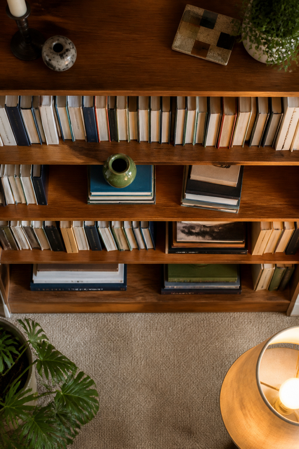
A shelf of books lined up like soldiers looks flat before it looks organized. The eye reads that rigid vertical edge as a single block, not as individual volumes with stories inside them. Breaking that line is what makes a bookcase feel inhabited rather than staged.
The simplest break is a horizontal stack of two or three books dropped mid-shelf, with a small object, a vase or a framed photo, settled on top. The stack creates a platform, a change in elevation that interrupts the tall-short-tall rhythm without requiring you to own anything expensive. Michele Lorenz, a designer who arranges by height in her own work, still builds in these horizontal moments for the personal touch they add. Place the largest books on the bottom shelves, both for visual weight and because oversized volumes warp upper boards over time. Gravity pulls at wide spines; the lower shelf carries that load without sag.
Sorting higher tiers by height, taller to shorter, keeps the upper lines cleaner and more level than a random mix. The zigzag of tall and short still happens, but it happens across the whole case, not in every inch. Step back every few minutes while you work. The balance you felt up close shifts at distance, and the shelf that looked layered can turn chaotic from across the room.
Small DIY Projects

Painting the page edges of a hardcover with acrylic is the fastest way to force a thrift-store find into your color scheme. Mask the covers with painter’s tape, lay the book flat, and brush the three exposed edges. Two thin coats beat one heavy one; the paper drinks paint, and pooling leaves ridges that catch the light wrong. I learned that after watching a dollar-sale mystery novel dry for three days with a sticky, mottled spine. Spray paint on old paper is a gamble: the solvents can wick into the pages and never fully set, especially on pre-1960 stock with different sizing. Fabric wraps are safer. A fat quarter from a craft bin, folded around the cover like a dust jacket and held with double-sided tape, takes ten minutes and peels off clean when you move. Brown paper or vellum works the same way if you want the muted, deliberate look of a re-covered library. Either approach keeps the weekend honest: no glue drying overnight, no tools beyond scissors and a straight edge.
Frequently Asked Questions
What are some creative ways to decorate with books?
Stack books in graduated sizes to create stepped risers for candles or plants, wrap mismatched covers in butcher paper or linen for a unified look, or strip dust jackets to expose muted cloth bindings. Face out art books and vintage cookbooks whose covers were designed to be seen, and build wide-based pedestals with oversized volumes topped by a single sculptural object.
How do I choose books that fit my decor style?
Pick books whose colors already live in your room, and let wear and age do the work that factory distressing fakes. Skip curated color-matched bundles sold online; real mismatched spines carry warmth that applied distress never earns. If your walls are already busy, avoid full rainbow arrangements and try a single-tone cluster or burlap wrap instead.
Can I use books in places other than bookshelves?
Yes. Coffee tables take two to four oversized books with neutral covers and one sculptural piece on top. Console tables hold wide-based book pedestals, while side tables lift a lamp with a short stack. Horizontal stacks on desks or mantels give framed photos height and break up flat surfaces without requiring new furniture.